

- BACK TO CONTEST
- CREATIVE BRIEF
- ENTRY # 22599


Comments for entry # 22599
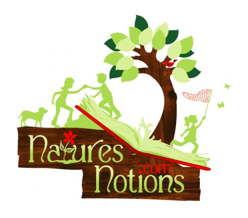
I'm looking at this from a distance and it's missing one thing. You just can't see the name well at all. Let make the letters WHITE. Either that or the lightest shade of green known to humankind. (Maybe post both of them with the other changes mentioned.)
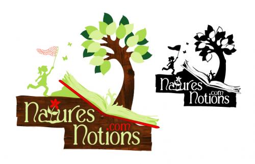
This nice work overall. You know I just noticed that ".com" was used with the dot on the "i". I couldn't see that before. Very, very clever with that. I'm sure that one on the left is better than the one on the right, so lets focus on that one. I'm also sure that the lack of color use is just about right. (Fine tuning) 1. The "com" needs to show up better. It's still too weak from a distance. 2. Remove the bump from the outside right border of the tree trunk. 3. The inner spine of the pages area near the "V" of the tree and the background. That top page shows both brown and white background on their respective sides. Try to fill that in. (I'm still debating on the girl being brown.) Nice work thus far.
On this version I've removed the flower for the "t", removed the rock under the book, and eliminated the red from the design. I rounded the edges on the sign a bit, and I also changed the silhouette of the girl to brown.
Browse other entries from this Logo Design Contest


Fast. Awesome. Affordable
About the Creative
8
Similar Entries