

- BACK TO CONTEST
- CREATIVE BRIEF
- ENTRY # 22570
Comments for entry # 22570
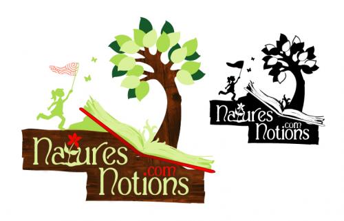
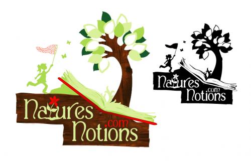
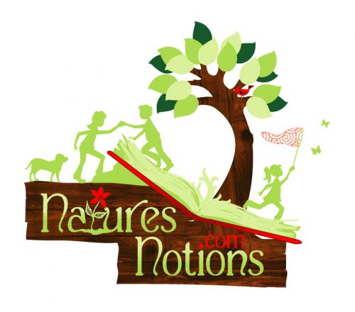
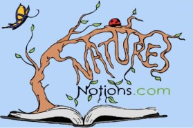
Yes, we are improving here. The blakck and white one actually look better than the color one, but I'm looking for color since it "sells" you band better. Here's my thoughts: 1. As creative as it is, you don't need the flower in that "t". 2. I don't like the red for ".com" 3. There is a white gap between the sign and the book above the last "S" in "Notions". 4. The sign can be more rounded. I don't like the square edges. 4. The green glob below the book next to the girl is not needed. 5. The grass growing out of the book next to tree trunk is not needed. Let's start with this and see where we are.
One other thing to note... I also removed the gradient in "Natures Notions" and made it one solid color.
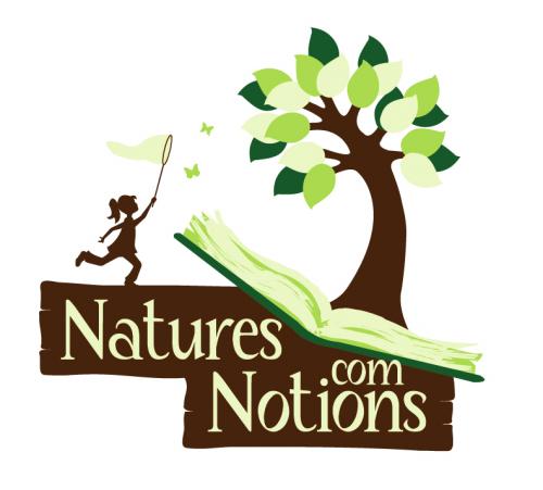
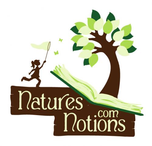
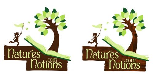
I have taken away all of the silhouettes of the children except for 1. I have also added shadowing behind the "Natures Notions" text to make it stand out against the background more. I've also included a black and white version. Thank you for your comments! Let me know what you think.
Browse other entries from this Logo Design Contest


Fast. Awesome. Affordable
About the Creative
8
Similar Entries