

- BACK TO CONTEST
- CREATIVE BRIEF
- ENTRY # 22722


Comments for entry # 22722
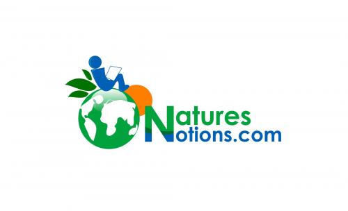
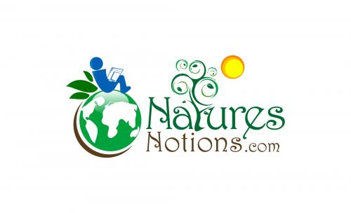
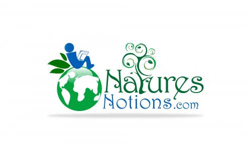
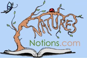
Oh, make "atures" line up witht the end of ".com". I'm just concerned it's too long, which I don't like. We may expand the letters vertically and compress them hortizontally to see if that works better. We have some room if we bump it up a tad and extend it to the bottom of the globe.
Yes, I think we will have to stick with this alignment. 1. PUll the "N" just a smidge closer to the globe and over the sun. 2. Make the "N" ALL GREEN. It might be done then.

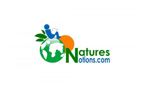
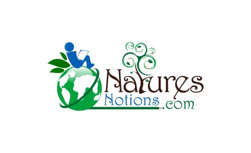
This one?
Browse other entries from this Logo Design Contest


Fast. Awesome. Affordable
About the Creative
14
14
62
Other entries by ongyudicandra:
Similar Entries