

- BACK TO CONTEST
- CREATIVE BRIEF
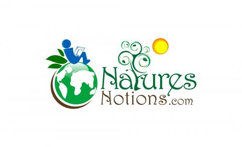
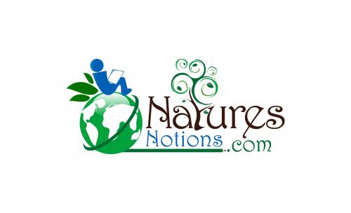
- ENTRY # 22303


Comments for entry # 22303
My suggestions are probably responsible in part for this logo. I don't like it as much as the first one. The first one was simple. I just wanted to somehow connect the name with the image. In a sense, less is more. 1. Start with the original entry. 2. Add a "thin" green line from the left below where the leaf rest is, then over the globe (convex) acting as the equator, and then between the names to their end. I does not have to be green, but some color that works around the globe and between the colors of the words. That's it. Sorry for the confusion.
Browse other entries from this Logo Design Contest


Fast. Awesome. Affordable
About the Creative
14
14
62
Other entries by ongyudicandra:
Similar Entries