

- BACK TO CONTEST
- CREATIVE BRIEF
- ENTRY # 22429


Comments for entry # 22429
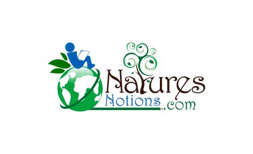
If I was to play with this any more it would just be the name as mentioned above. I also wonder now that you are leading the name to left what it would look like to Join the "N" together as one bit "N" and then let the rest fall out as mentioned. Now sure if we will pull it up into the sun a tough.
This is a whisker from a score of 5.
Now this an interesting twist. Put the log name to the left. Very nice thought. I still think the "Notions.com" is too light and hard to pick up for a distance. How about bold it at its current size? Great optimization of colors!

How about the backward? Icon at the left?
Browse other entries from this Logo Design Contest


Fast. Awesome. Affordable
About the Creative
14
14
62
Other entries by ongyudicandra:
Similar Entries