

Graphic Design Entry # 292691
by traceygl- BACK TO CONTEST
- CREATIVE BRIEF
- ENTRY # 292691


Comments for entry # 292691
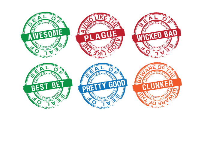
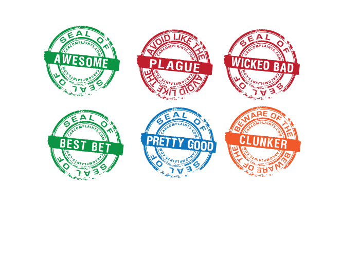
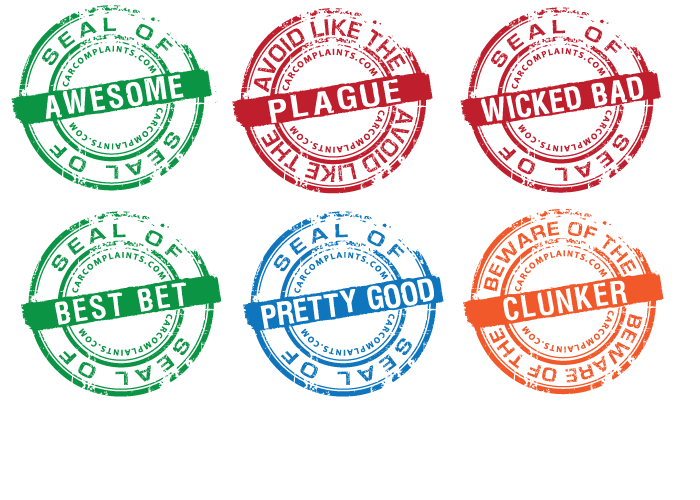
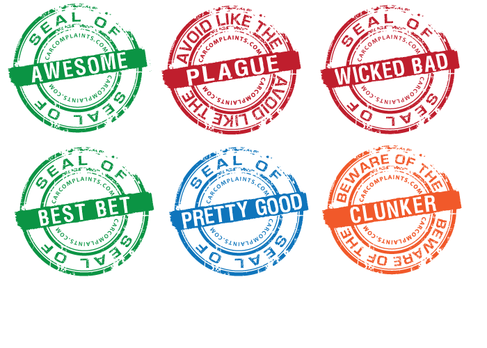
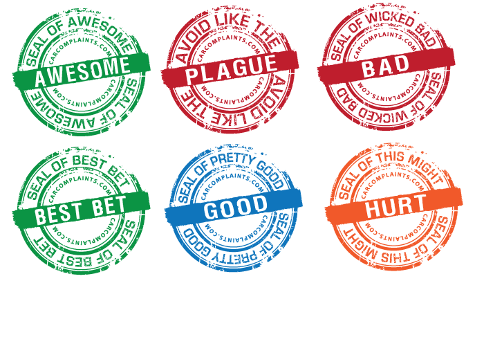
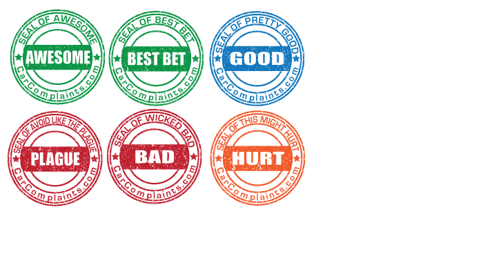
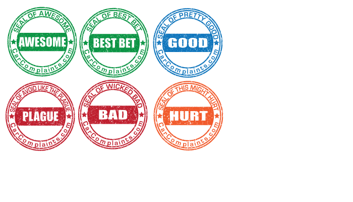
Just noticed on Beware of the Clunker, the end of "CarComplaints.com" (top & bottom) touches the middle stripe... the other seals look good
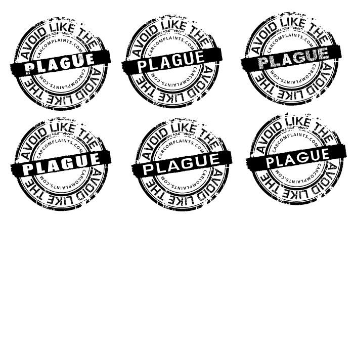
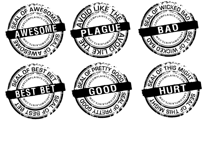
Ack, decided we'd like the stamps angled to the right rather than left, but that should take about 2 seconds right? ... not worth another entry, unless you want to. The distressed part of the stamp edge will end up at the bottom rather than lower/right corner but that still works okay. Those came though at about 165x155 but like you said we can just republish after the contest ends. Thanks again for everything, these are great.
oh and forgot made the center bar a little taller :)
here they are again at 150 px ( These are vector so can be resized without any quality loss) flipped the stamp so the distressed corner is at the bottom moved the center text over 1px to make central Only thing I could not really do was alter size of the center text because closing the space between the letters made it unreadable and there is no room to make it larger
Browse other entries from this Graphic Design Contest


Browse other Graphic Design Contest


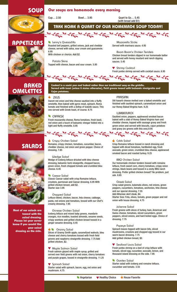
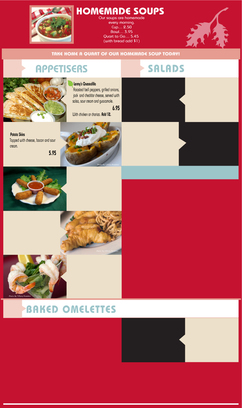
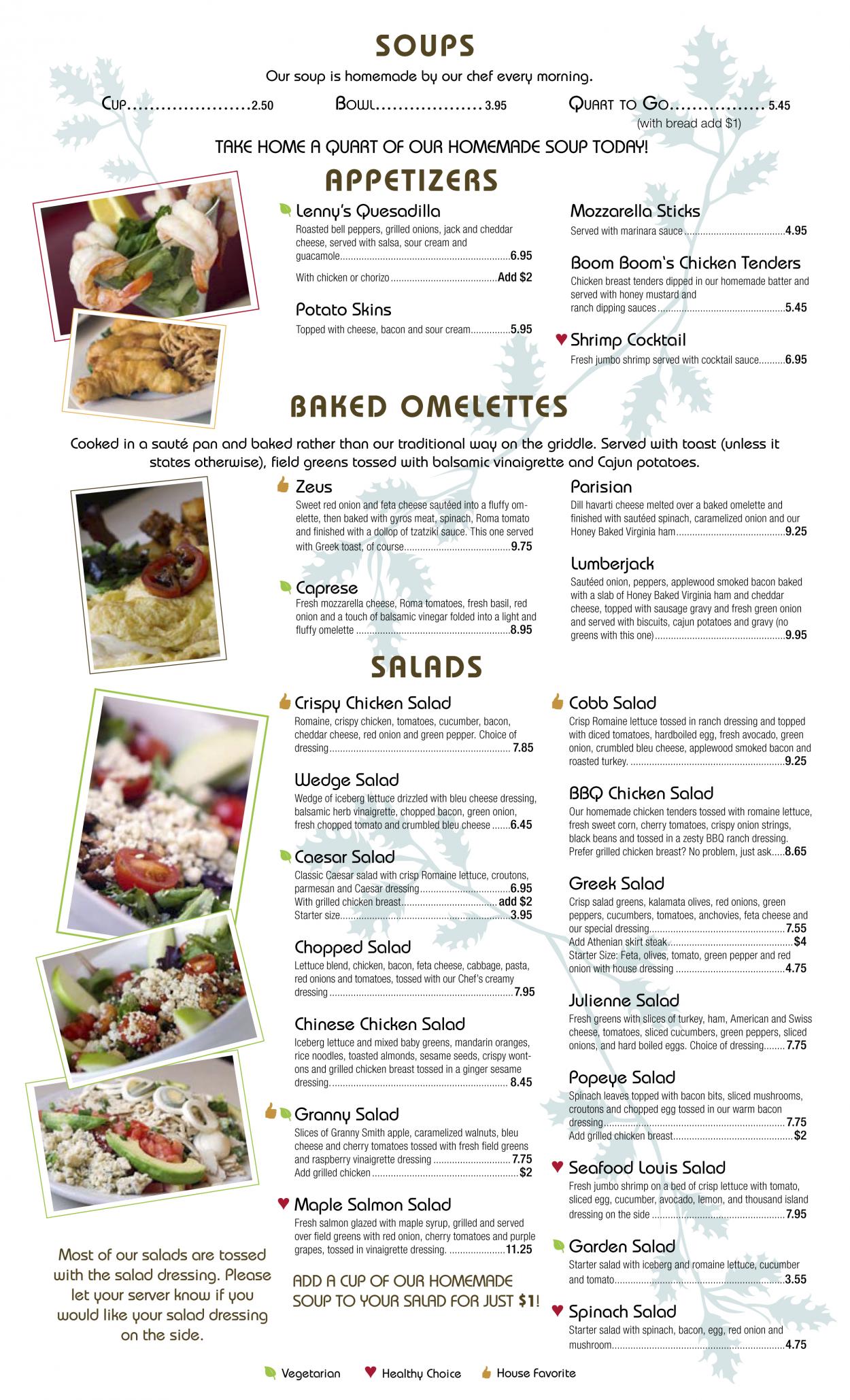

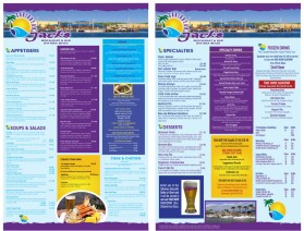
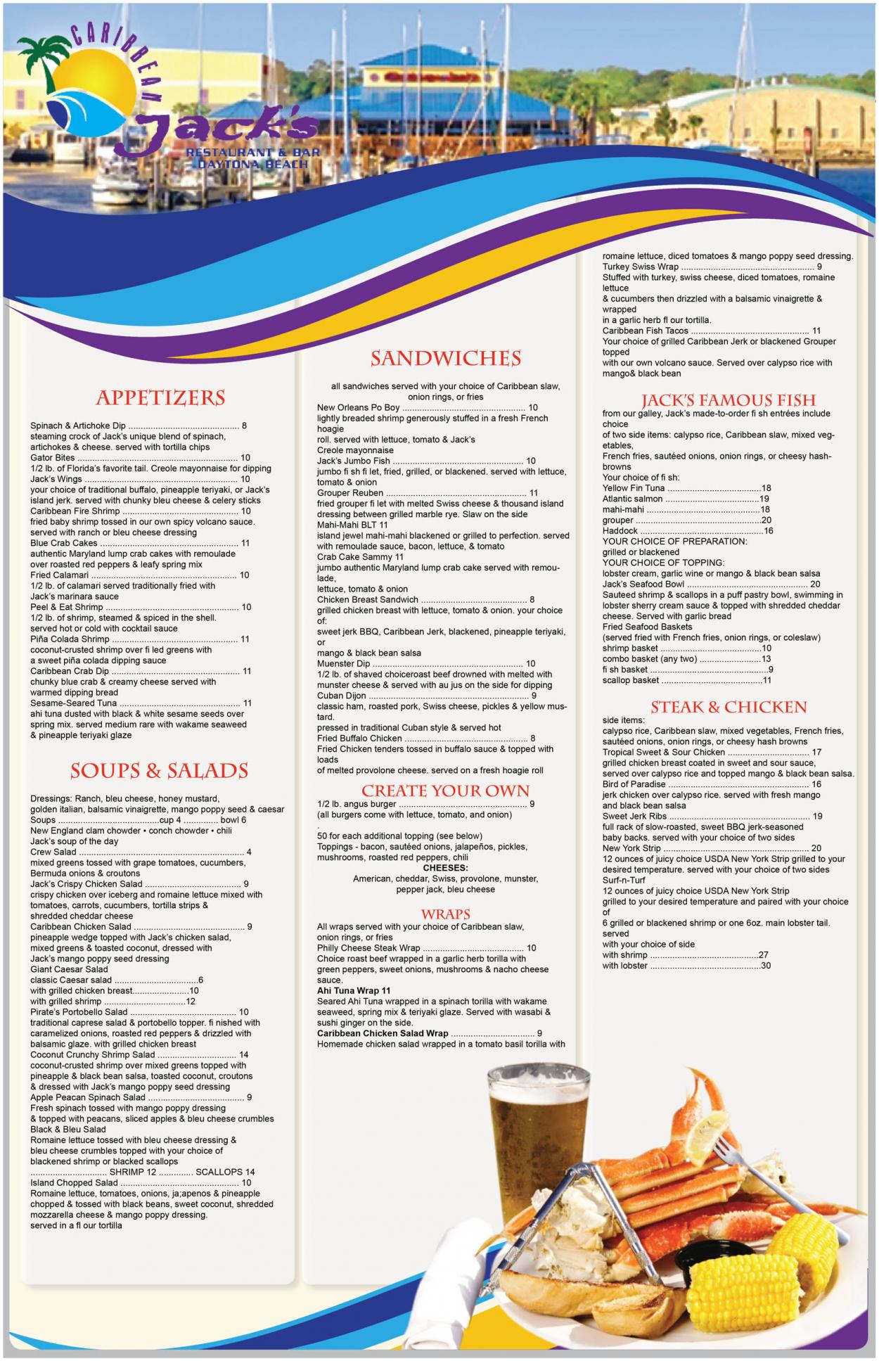
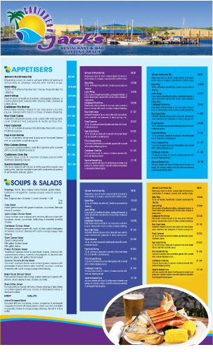
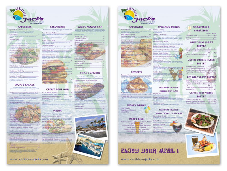
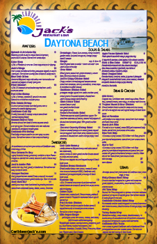
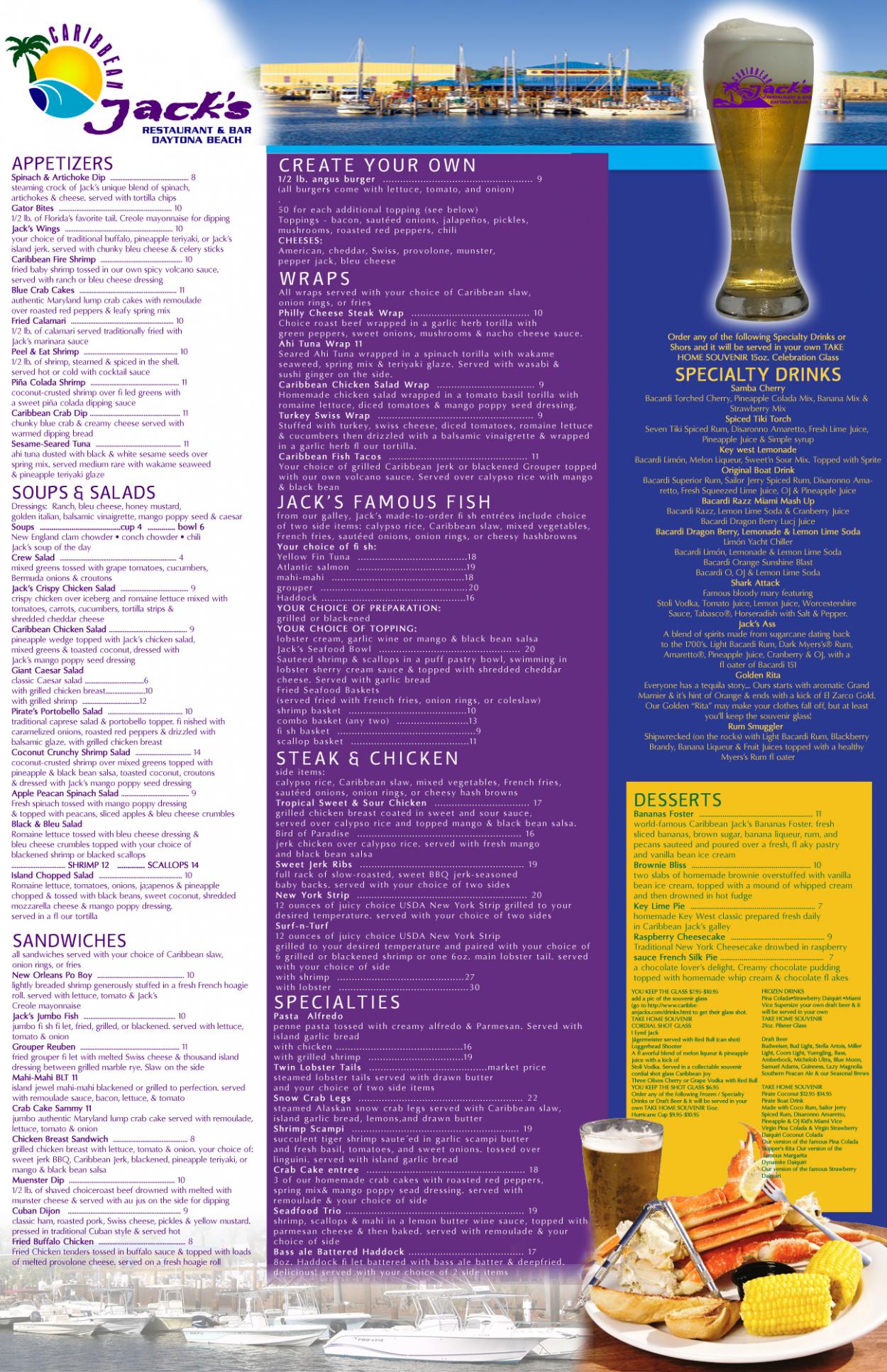
Graphic Design Contest: Caribbean Jack's Restaurant & Bar
Menu for Caribbean Jack's Restaurant
$400.00 Prize
72 ENTRIES


Graphic Design Contest: Sweet Flava
A white/black/pink sexy smiling robot.
$200.00 Prize
46 ENTRIES

Fast. Awesome. Affordable
About the Creative
35
36
181
Other entries by traceygl:
Similar Entries