

Graphic Design Entry # 288602
by traceygl- BACK TO CONTEST
- CREATIVE BRIEF
- ENTRY # 288602


Comments for entry # 288602
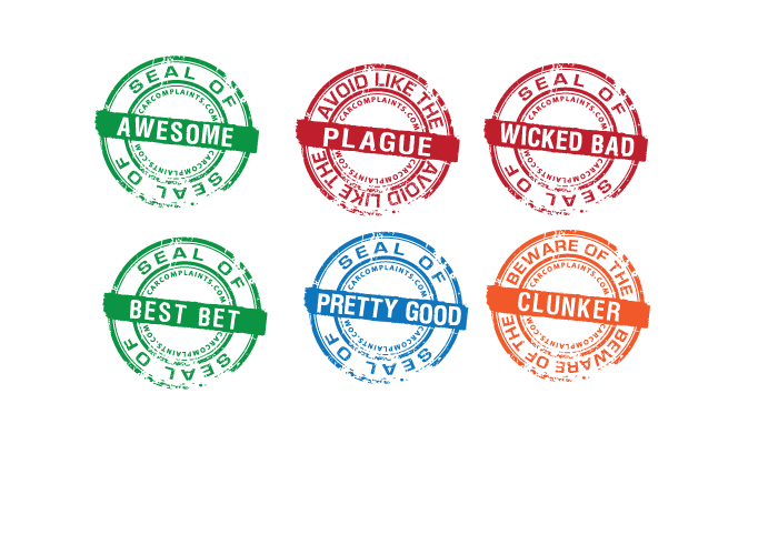
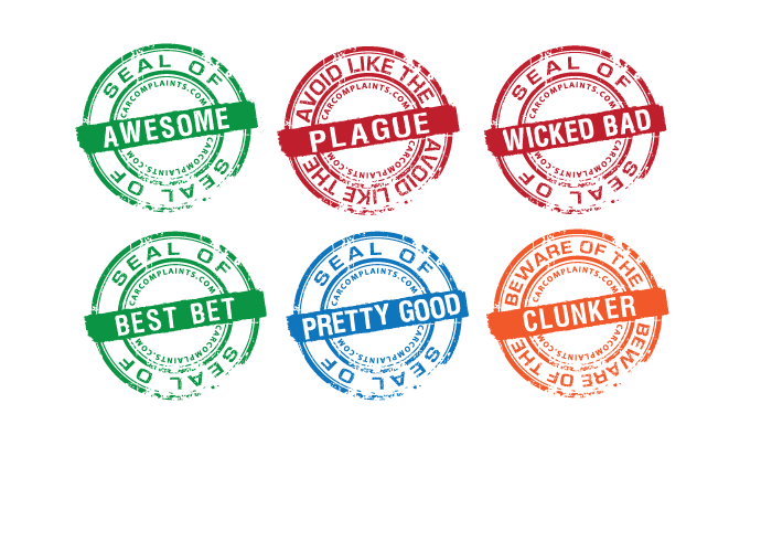
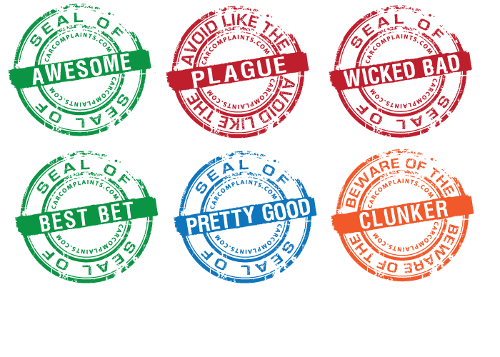
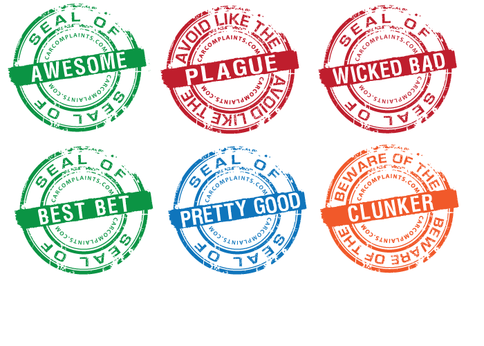
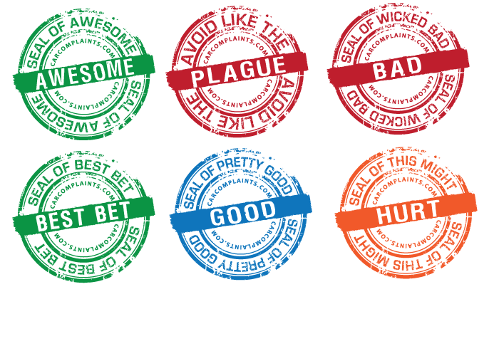
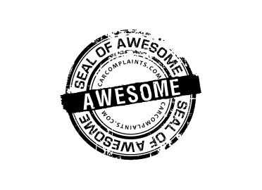
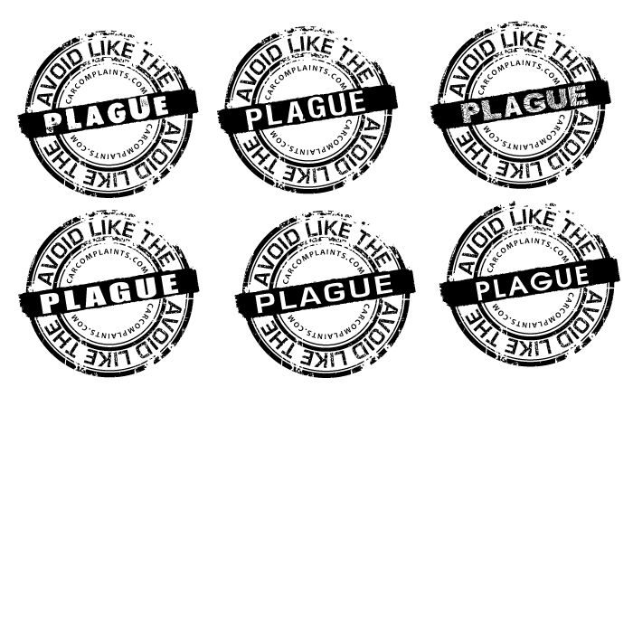
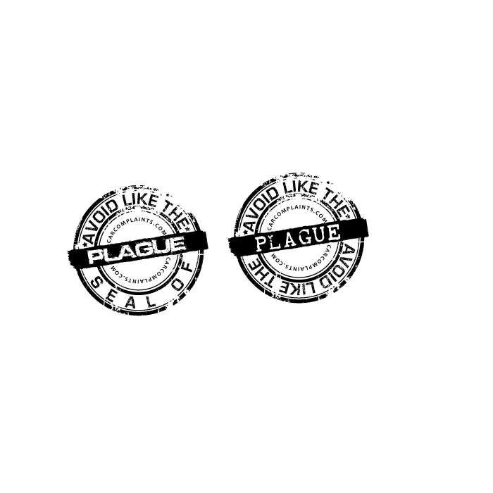
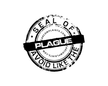
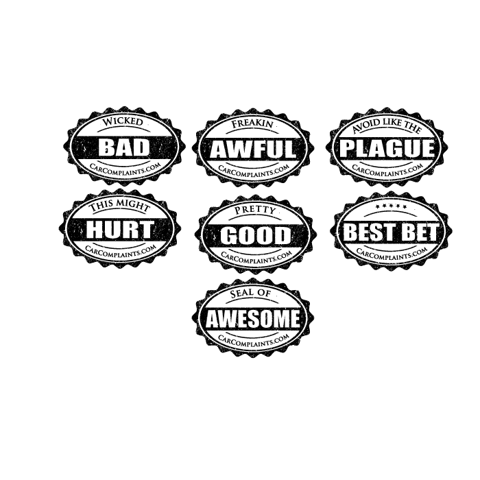
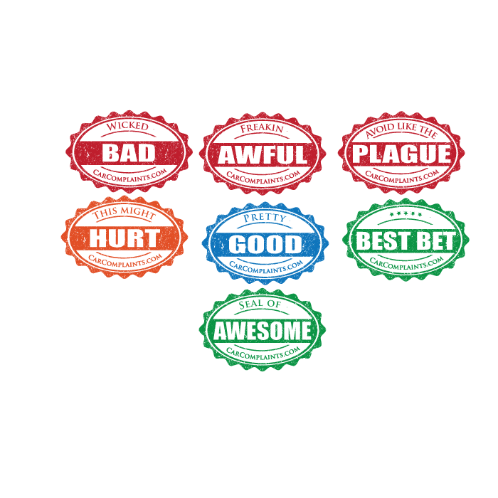
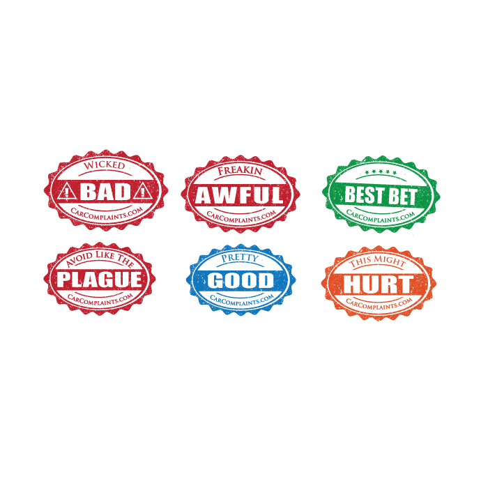
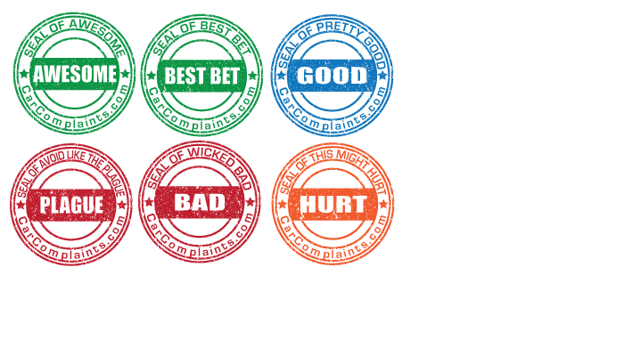
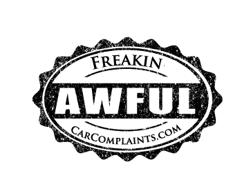
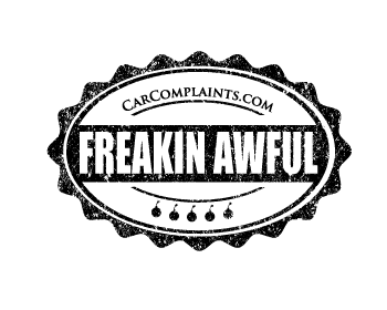
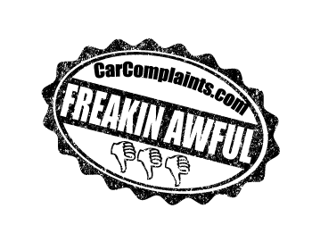
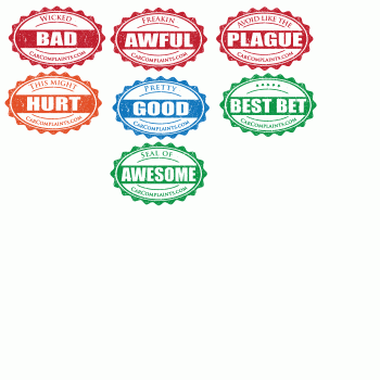
Okay, definitely like the colors. Getting very close. Here goes: "CarComplaints.com" is still bumped to the left a bit. It was perfect in your "2 bombs" version: http://www.hatchwise.com/entry/L257115-20110118154703.gif Also there are actually 4 levels: great, good, bad, awful. So "Pretty Good" is the "good" level so I think it should be blue or some color that doesn't indicate "caution" like orange/yellow & red do. I definitely like orange for the "bad" level. The text for that one is "This Might HURT" or "Beware Of The CLUNKER". I think the yellow you used is a bit too light, maybe try something around #e14e18 ? For the three red "worst" designs you did, very very close. There must be some way to make "Avoid Like The" a little clearer/larger though. Also if you could, keep that text vertically centered between the curve & the seal edge like the others... "Avoid Like The" was farther down toward the curve. "Wicked BAD" is perfect, just has the CarComplaints.com shift problem I mentioned. Not sure whether I'll want those icons on either side but if anything I'll just ask you to remove those (not yet) and keep the text unchanged as you have it.
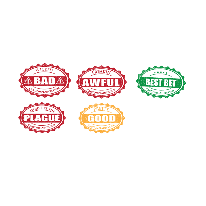
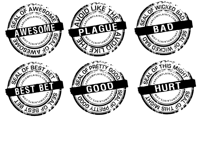
thought I would show these with a bit of colour I thought red for bad amber(orange) green for good and amber for the middle category.Also shrunk them down to more like the size you are planning to use
Browse other entries from this Graphic Design Contest


Browse other Graphic Design Contest


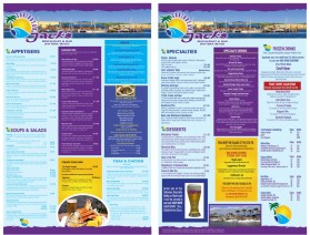
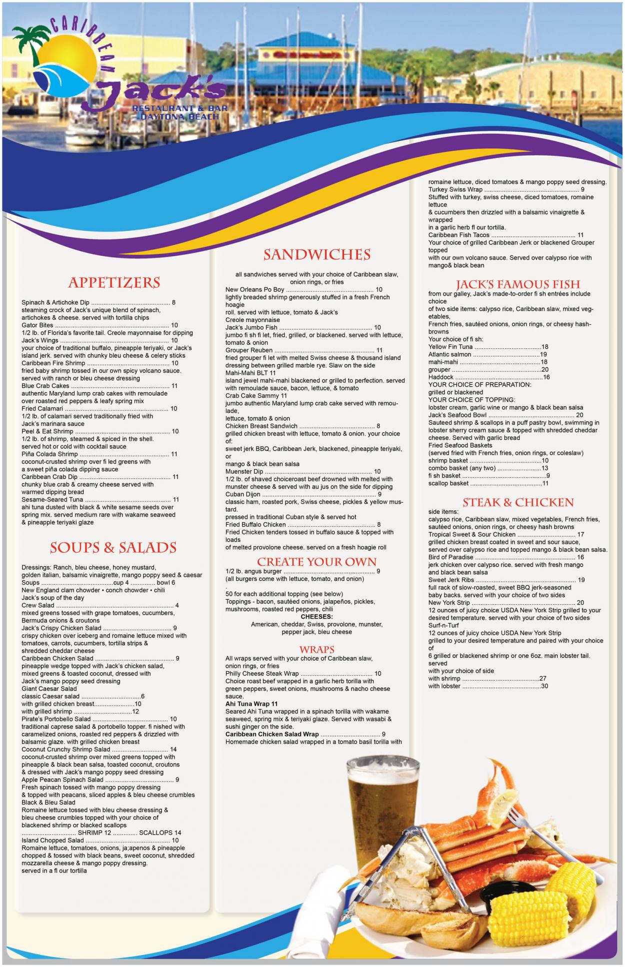
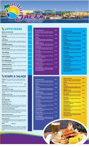
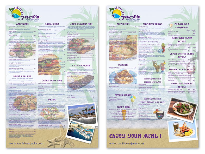
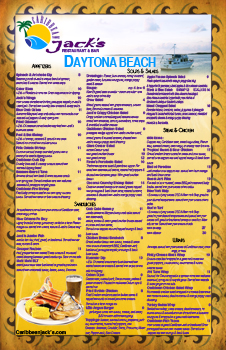
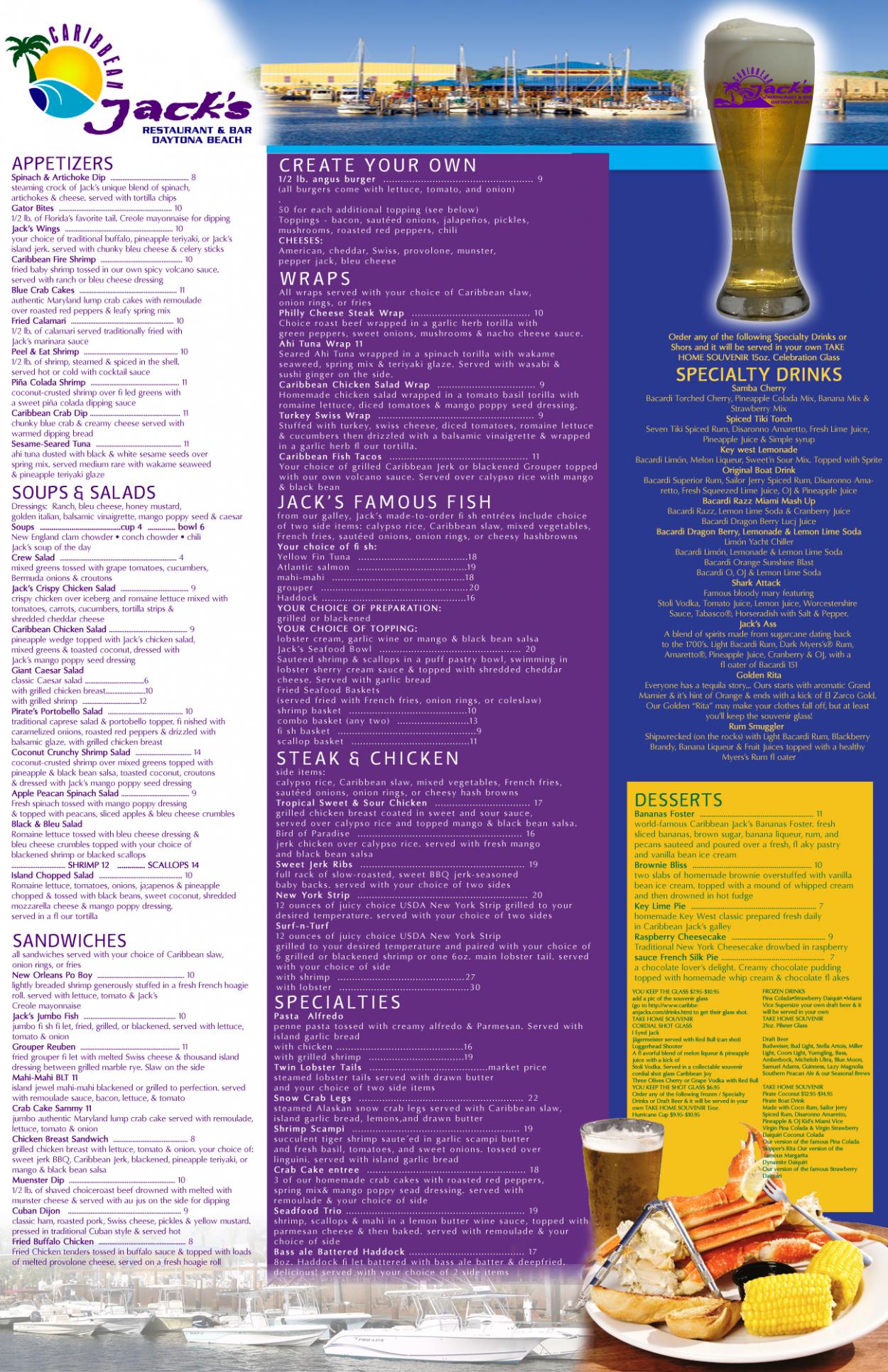
Graphic Design Contest: Caribbean Jack's Restaurant & Bar
Menu for Caribbean Jack's Restaurant
$400.00 Prize
72 ENTRIES


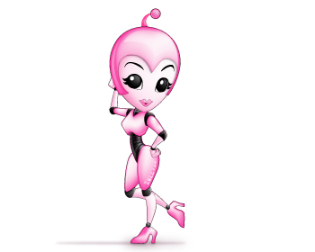
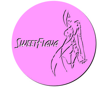
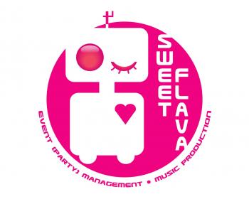
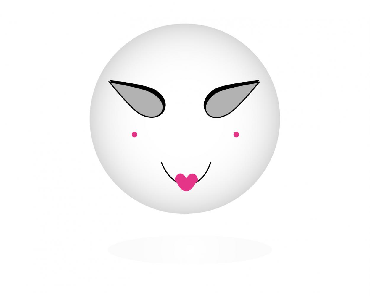
Graphic Design Contest: Sweet Flava
A white/black/pink sexy smiling robot.
$200.00 Prize
46 ENTRIES

Fast. Awesome. Affordable
About the Creative
35
36
181
Other entries by traceygl:
Similar Entries