

Graphic Design Entry # 290373
by traceygl- BACK TO CONTEST
- CREATIVE BRIEF
- ENTRY # 290373


Comments for entry # 290373
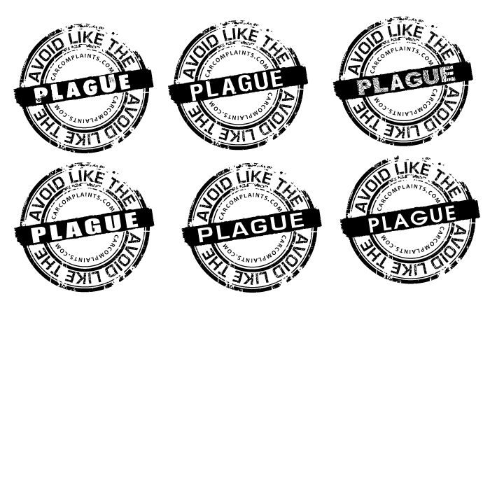
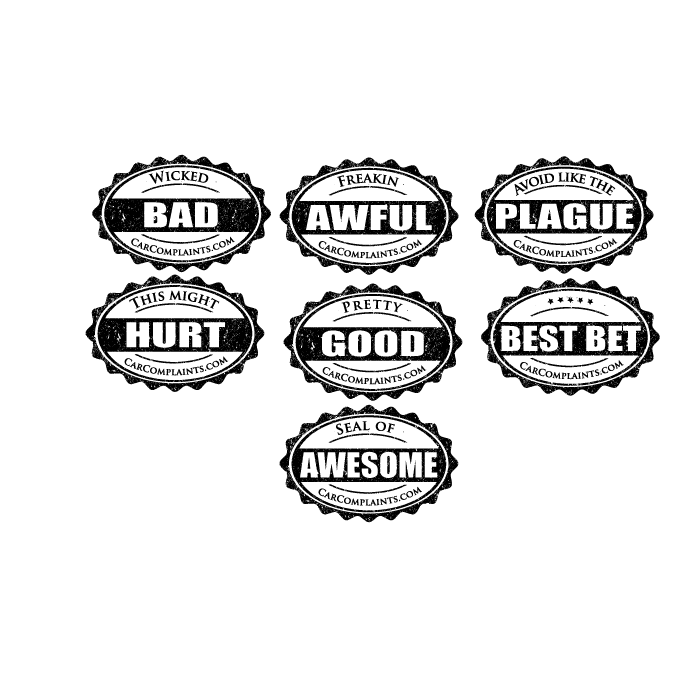
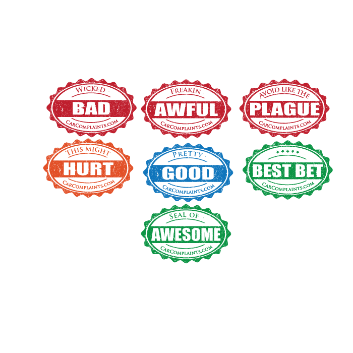
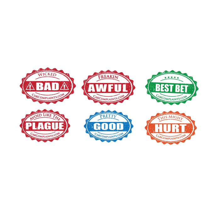
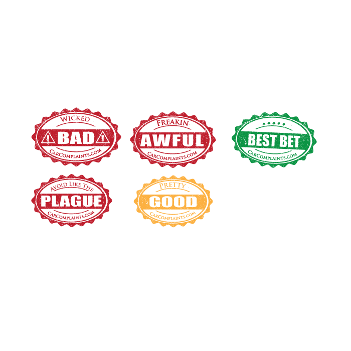
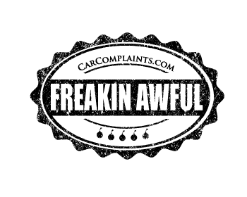
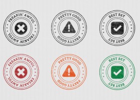
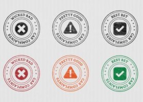
no problem will work on it some more. In respect of the font going across the middle do you like the stamped sort of decayed look or would you prefer a standard font?
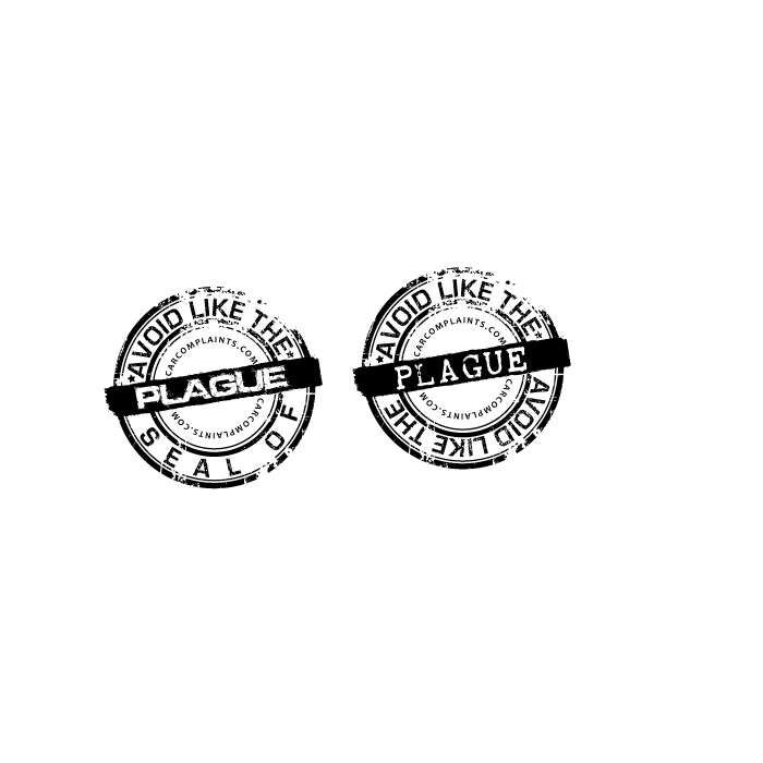
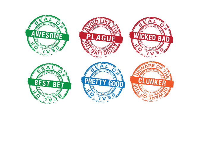
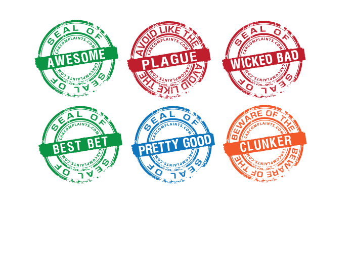
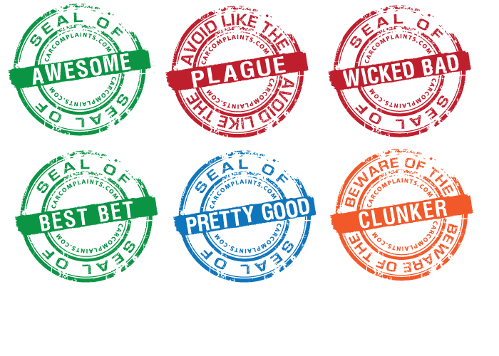
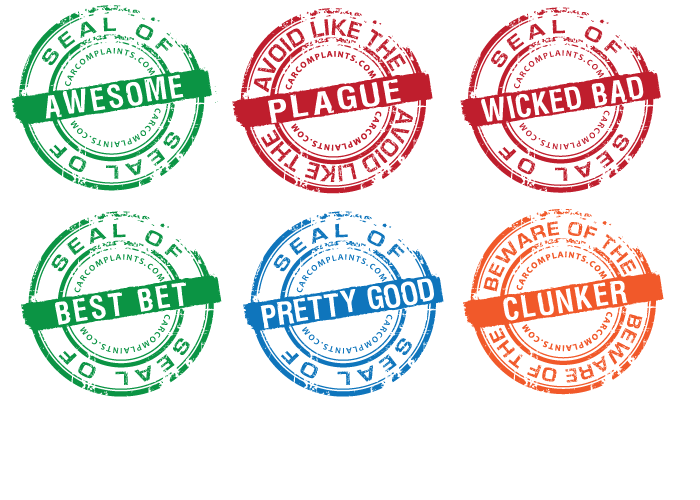
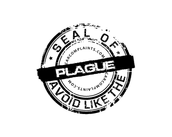
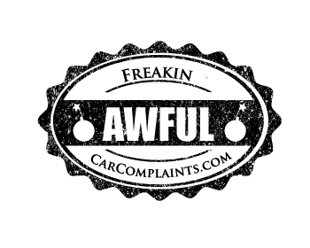
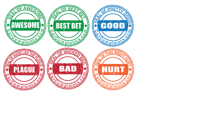
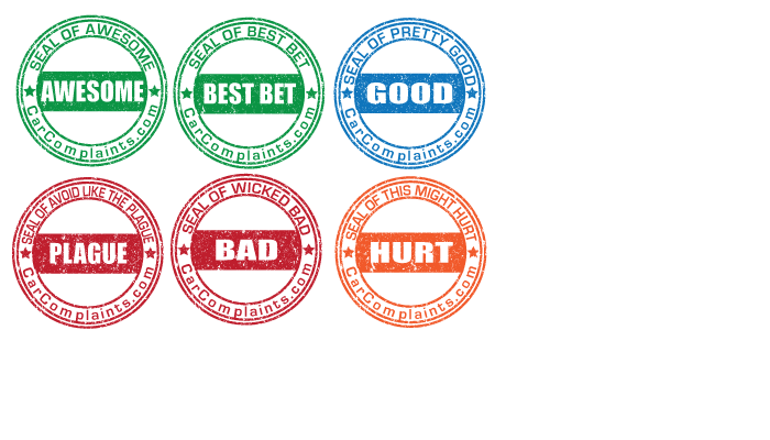
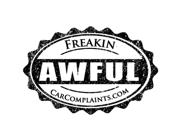
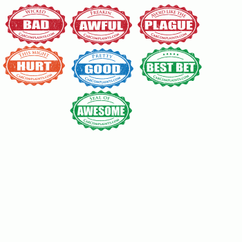
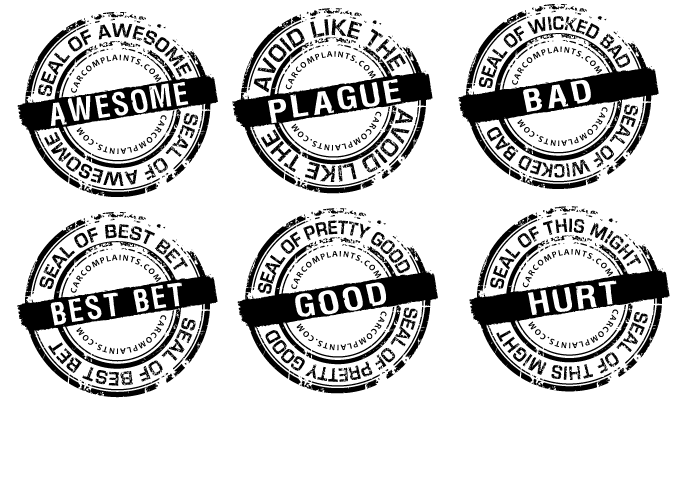
Okay, I like the text duplicated top & bottom. For this particular "Avoid Like The Plague" seal, I think the rounded text looks too tight with the stars. The bottom text looks great though. Maybe remove the stars, or a very slightly smaller font? Or whatever you think looks best. Re the middle text font, the version on the right is very close -- I think it fits especially well for "Plague", but I'm not sure it would work as well for "Seal of Awesome" etc. Any other font options for the middle text that you think look good? (and at some point please move CARCOMPLAINTS.COM a little farther out from the center, from the last set of comments) This design is really really good. Going to be tough call between this & your oval design. Thanks!!
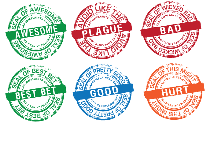
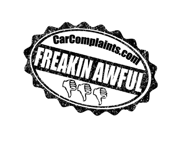
let me know which style seal and which style font u prefer if any and I will make the others up :)
Browse other entries from this Graphic Design Contest


Browse other Graphic Design Contest


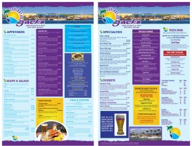
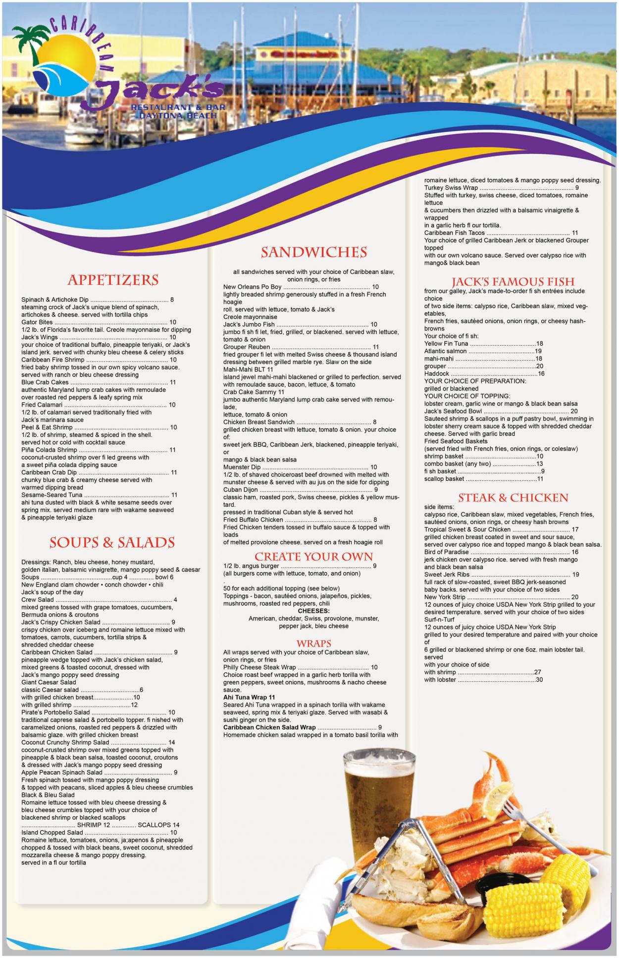
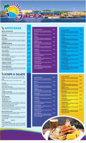
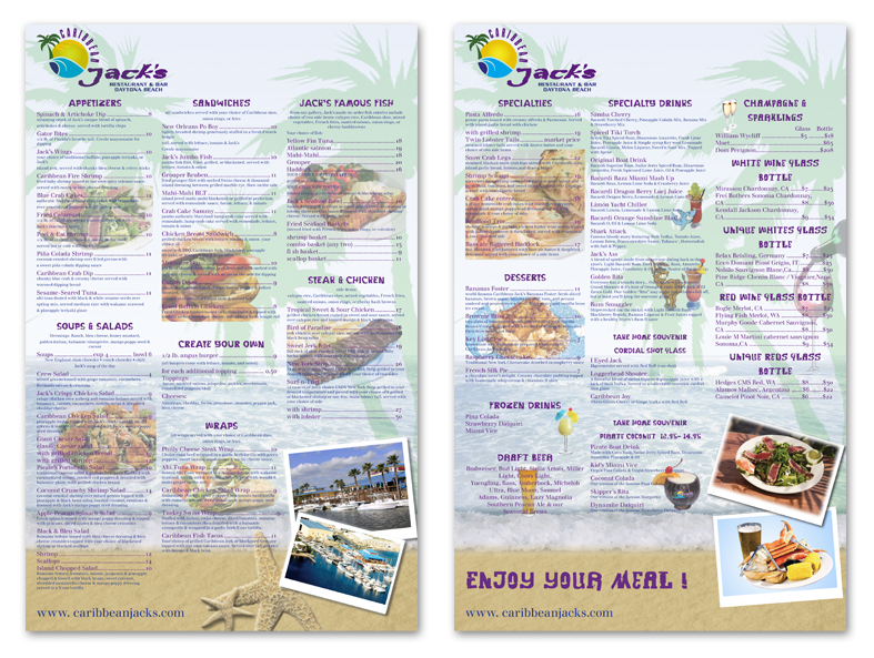
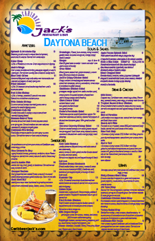
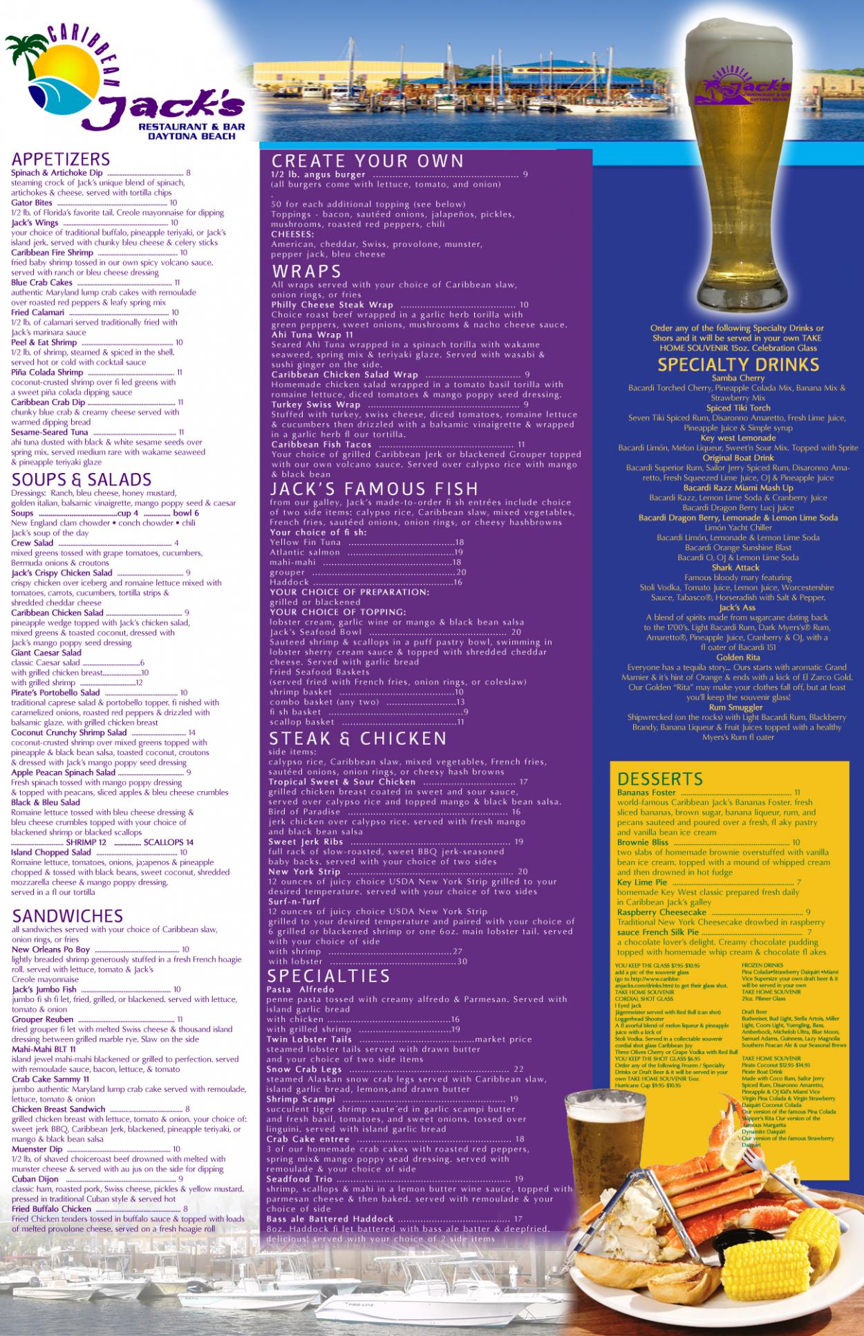
Graphic Design Contest: Caribbean Jack's Restaurant & Bar
Menu for Caribbean Jack's Restaurant
$400.00 Prize
72 ENTRIES


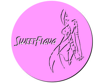
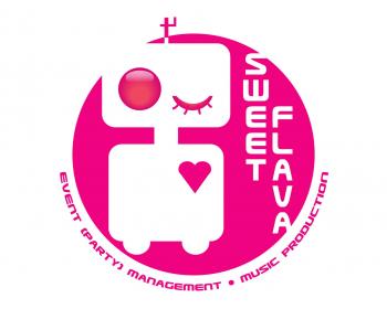
Graphic Design Contest: Sweet Flava
A white/black/pink sexy smiling robot.
$200.00 Prize
46 ENTRIES

Fast. Awesome. Affordable
About the Creative
35
36
181
Other entries by traceygl:
Similar Entries