

Graphic Design Entry # 289542
by traceygl- BACK TO CONTEST
- CREATIVE BRIEF
- ENTRY # 289542


Comments for entry # 289542
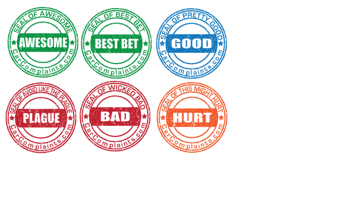
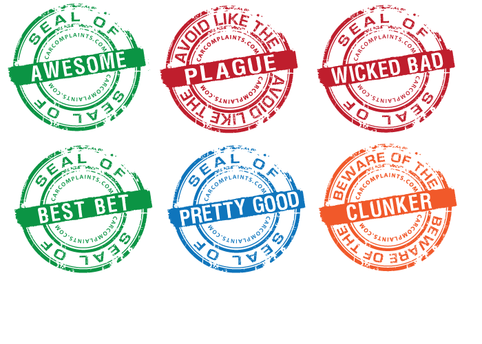
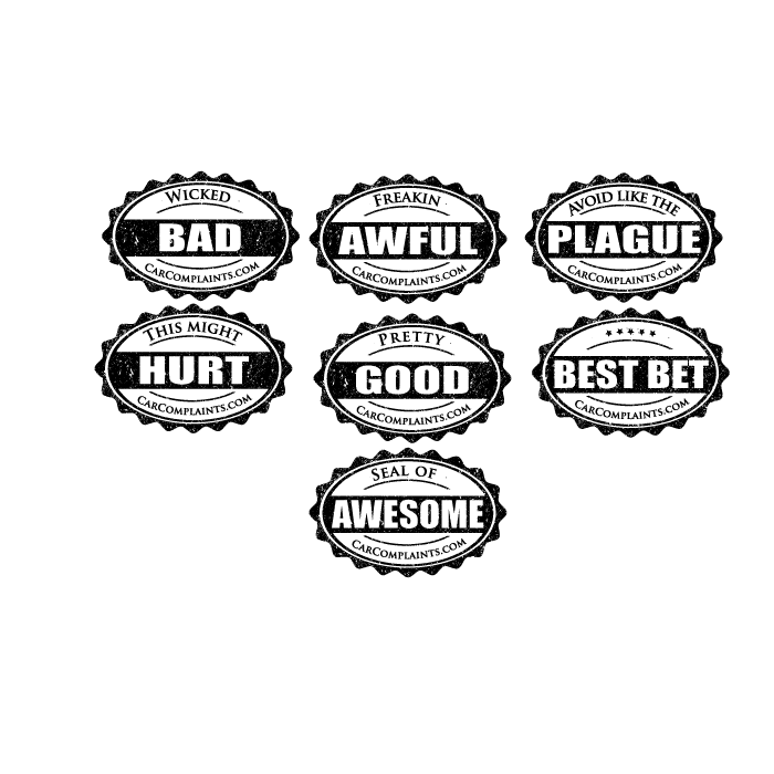
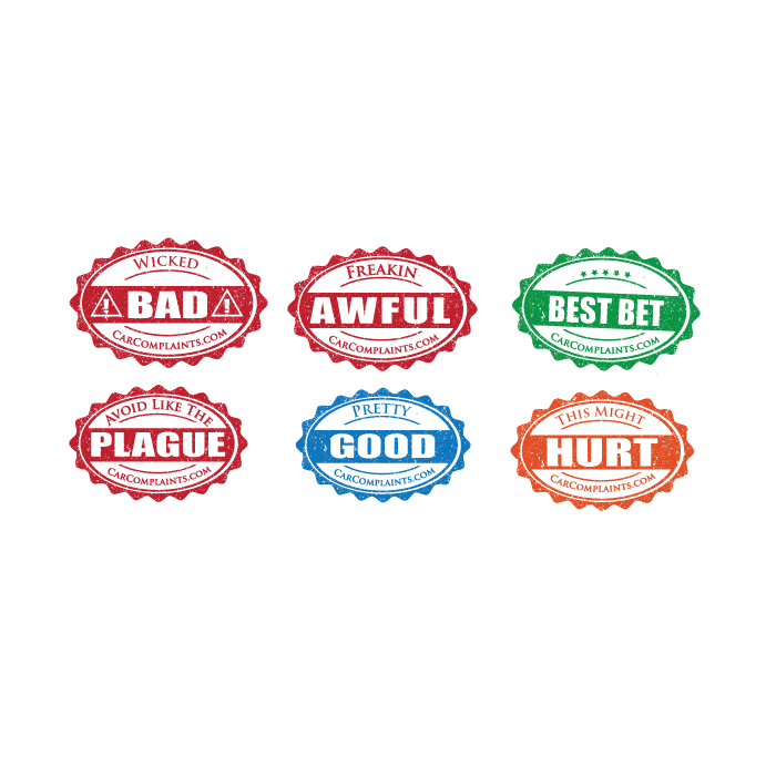
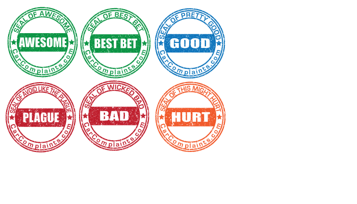
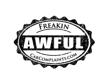
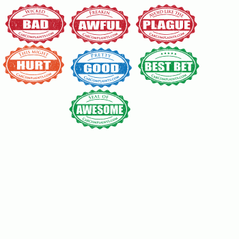
These are really good but I think this style works better for some than others... Awesome, Good, & Bad work pretty well, but Hurt & Plague not so much. If you want to continue this design idea, maybe try "Official Seal Of" around the edge & somehow fit the rating phrase into the middle area? The last word can still be huge in the bar, but I think the first word(s) need more emphasis. Basically Official Seal Of -- small Wicked - medium BAD - large CarComplaints.com - small .. I guess the solid bar with the big word could be moved farther down to make room for the first words, if you need to. Or might look weird & throw off the whole "stamp" geometry thing, I don't know. Also not sure if the medium-size first words would go inside the (taller) bar above the big word, or if the medium text would fit above the bar... Also I don't really like the "CarComplaints.com" font, doesn't seem to go with the other fonts & too stretched out, I think. I like the top text font. Thanks for the variation!
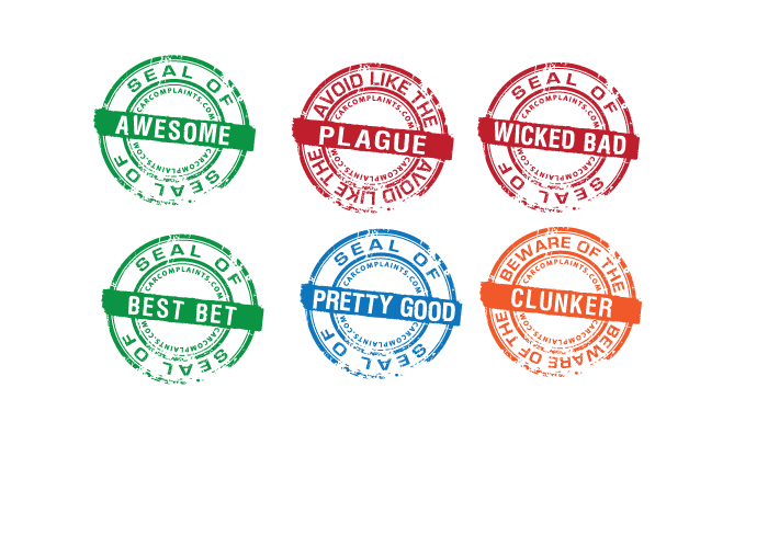
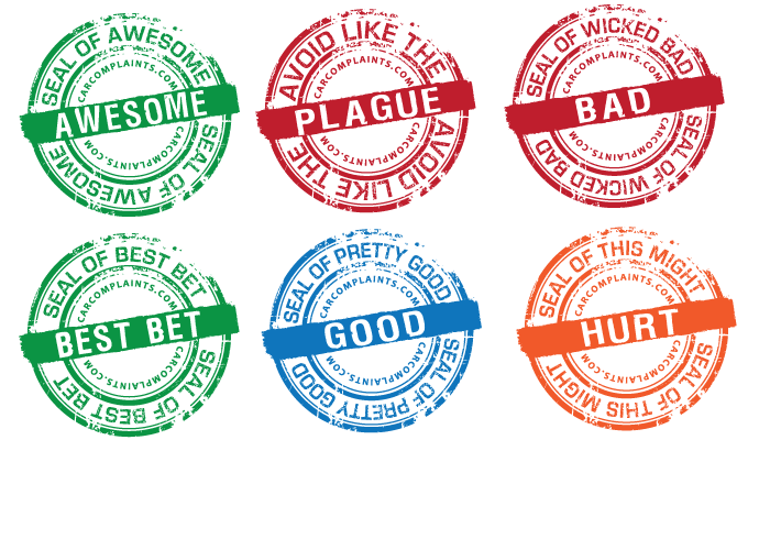
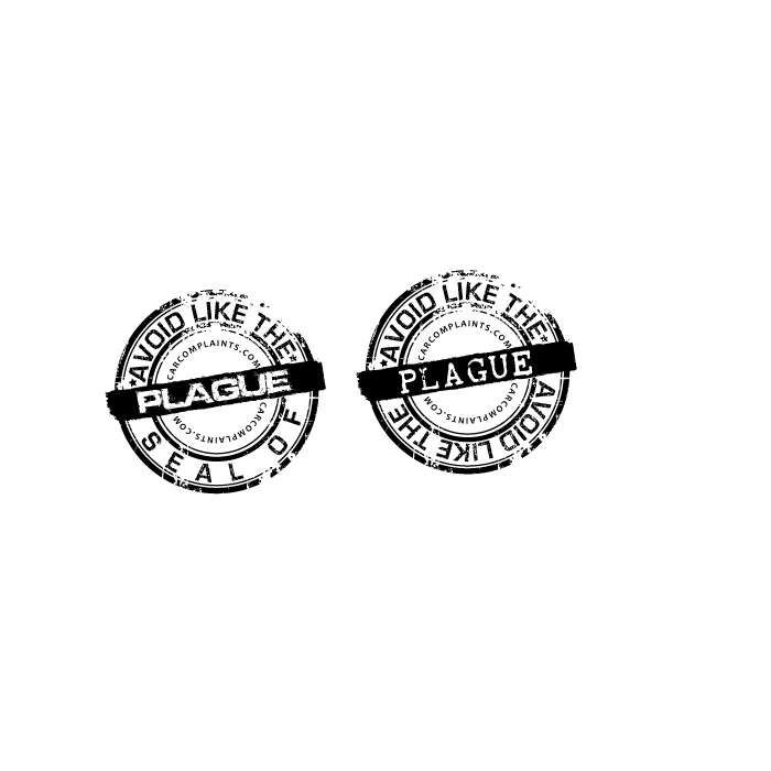
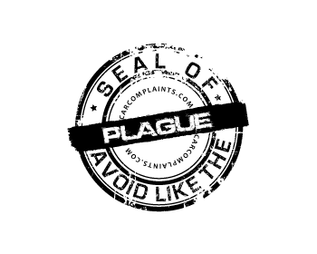
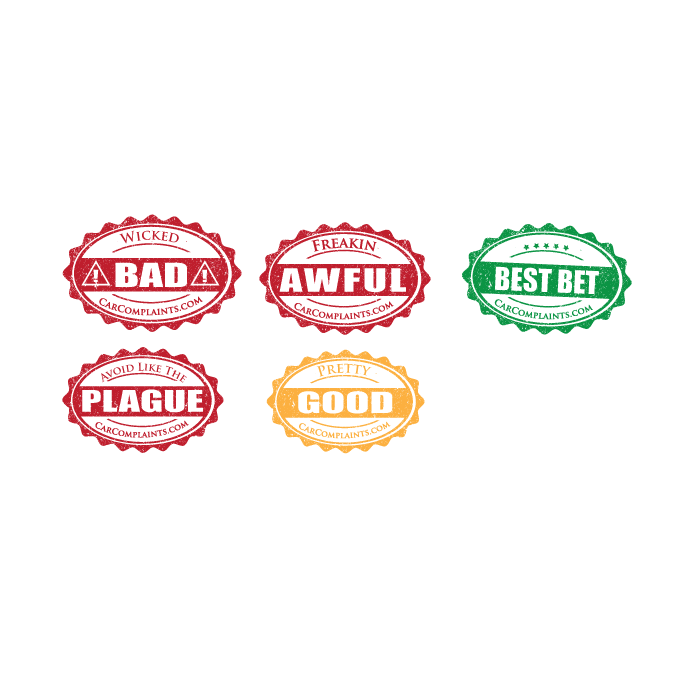
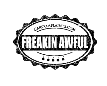
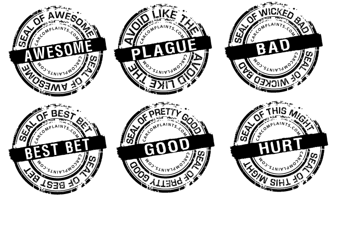
one more slight variation with the extra circle around the middle.
Browse other entries from this Graphic Design Contest


Browse other Graphic Design Contest


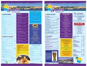
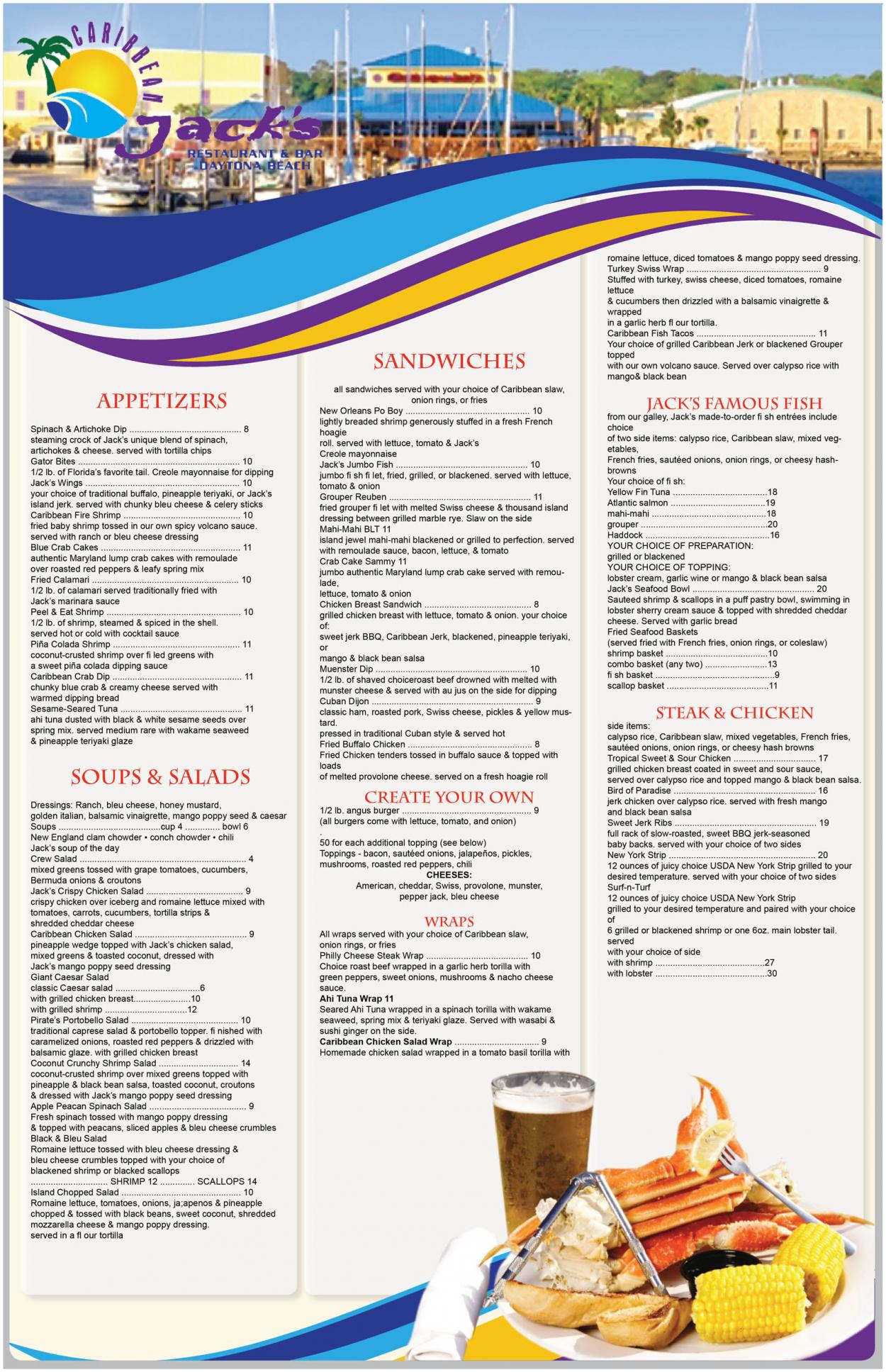
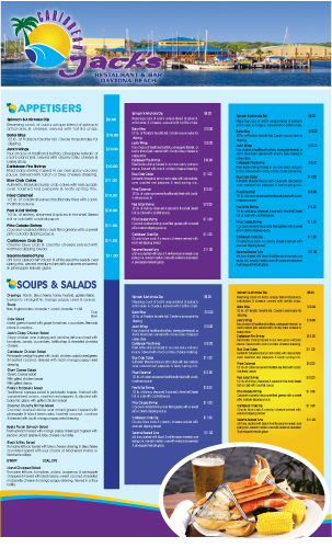
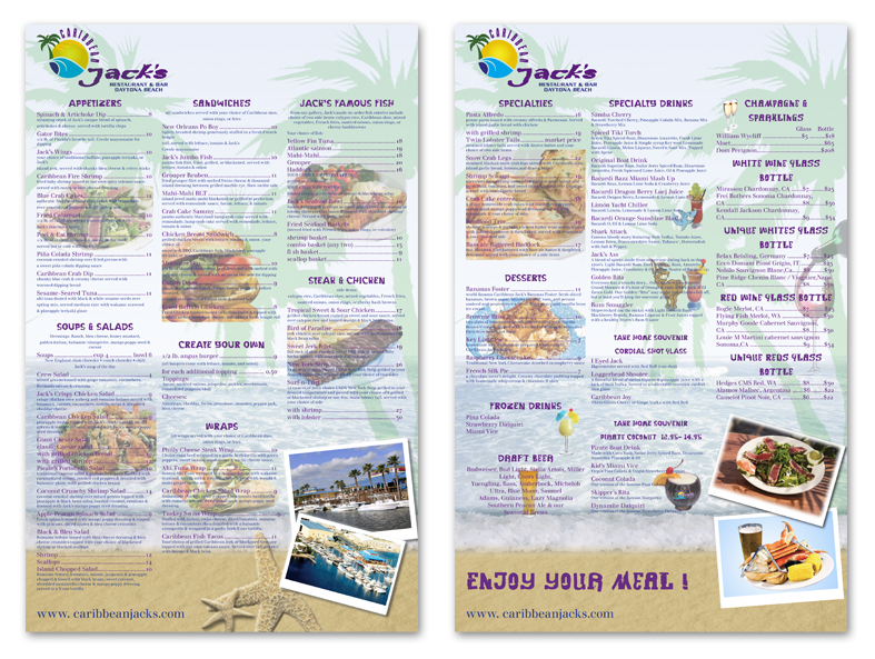
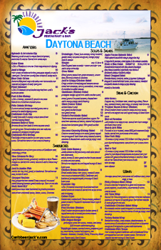
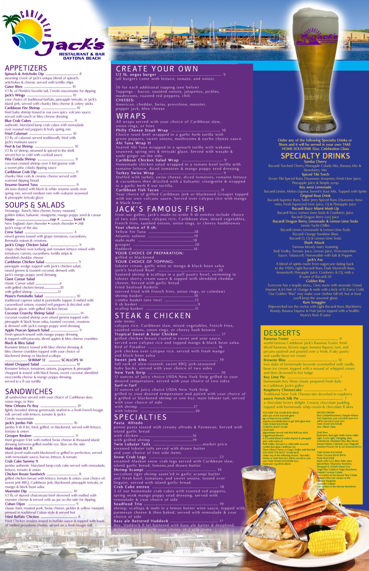
Graphic Design Contest: Caribbean Jack's Restaurant & Bar
Menu for Caribbean Jack's Restaurant
$400.00 Prize
72 ENTRIES


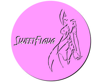
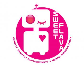
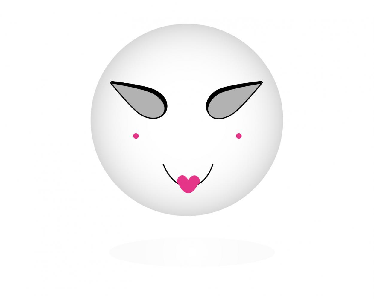
Graphic Design Contest: Sweet Flava
A white/black/pink sexy smiling robot.
$200.00 Prize
46 ENTRIES

Fast. Awesome. Affordable
About the Creative
35
36
181
Other entries by traceygl:
Similar Entries