

Graphic Design Entry # 291269
by traceygl- BACK TO CONTEST
- CREATIVE BRIEF
- ENTRY # 291269


Comments for entry # 291269
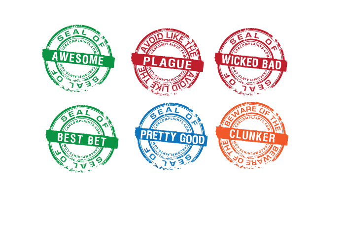
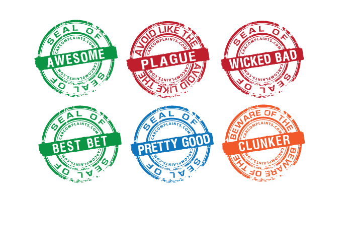
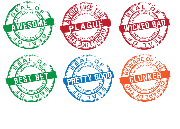
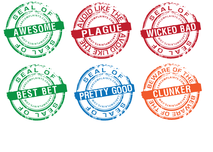
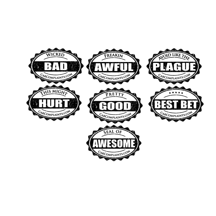
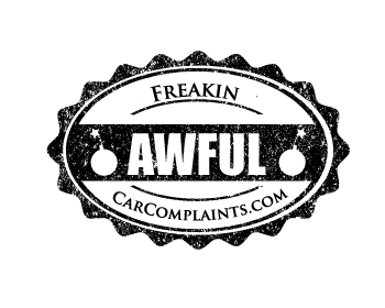
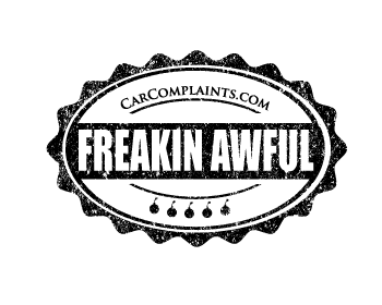
Avoid Like The Plague looks great, don't change anything there.
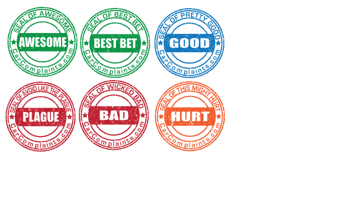
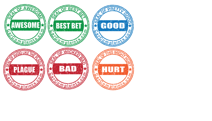
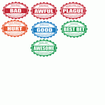
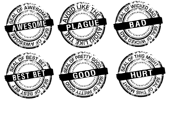
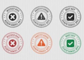
Could you try putting "OFFICIAL SEAL OF" around the outside & the text in the middle? (if it fits) ... Mainly I'd prefer to have WICKED BAD & PRETTY GOOD across the middle, if it can fit without making the font size much smaller. Also THIS MIGHT HURT probably wouldn't work like that either. I don't like that one how it is now since HURT doesn't really convey that badge well. I'd rather see "MIGHT HURT" or maybe for orange one do BEWARE OF THE around the outside & CLUNKER in the middle... Overall, these are awesome.
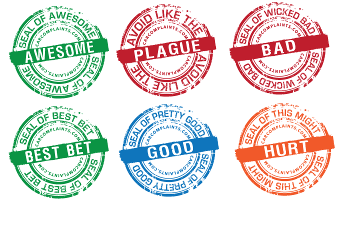
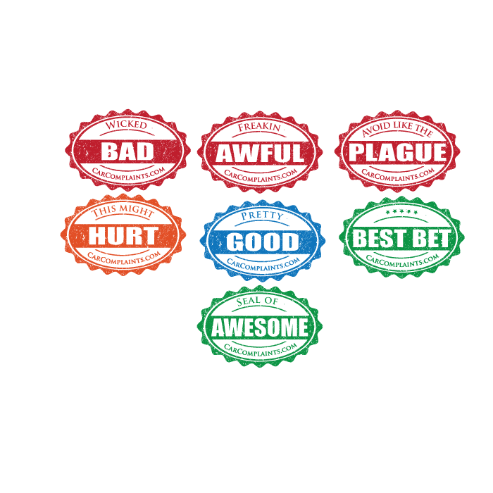
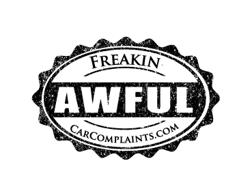
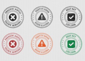
coloured version :)
Browse other entries from this Graphic Design Contest


Browse other Graphic Design Contest


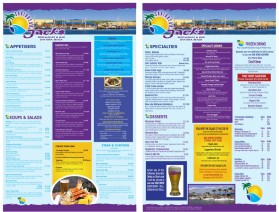
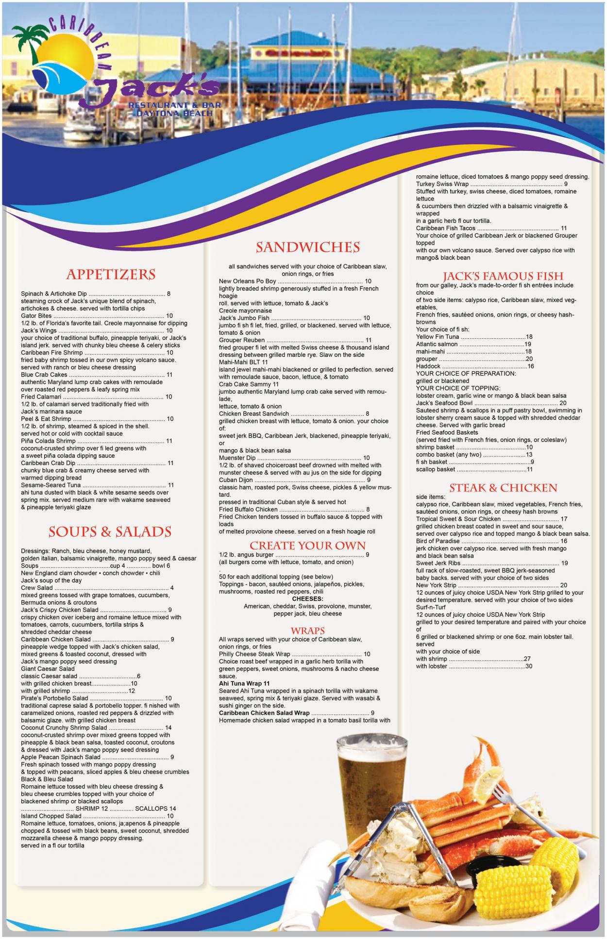
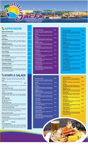
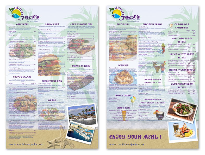
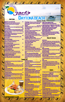
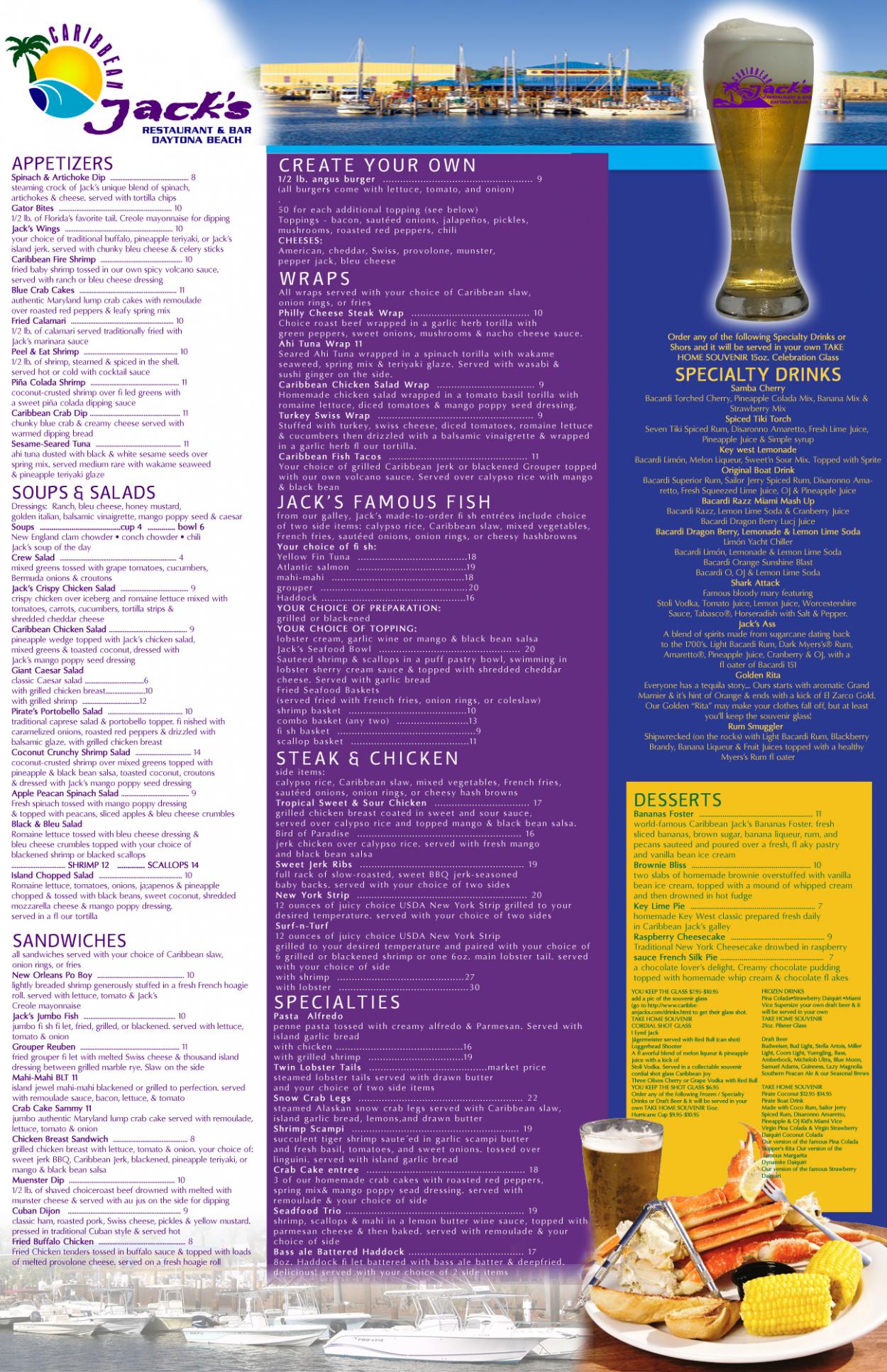
Graphic Design Contest: Caribbean Jack's Restaurant & Bar
Menu for Caribbean Jack's Restaurant
$400.00 Prize
72 ENTRIES


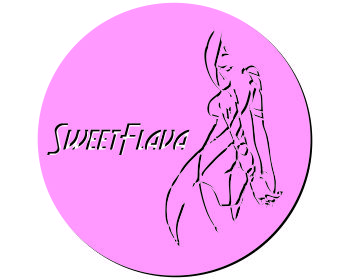
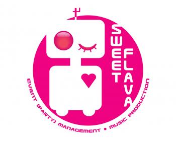
Graphic Design Contest: Sweet Flava
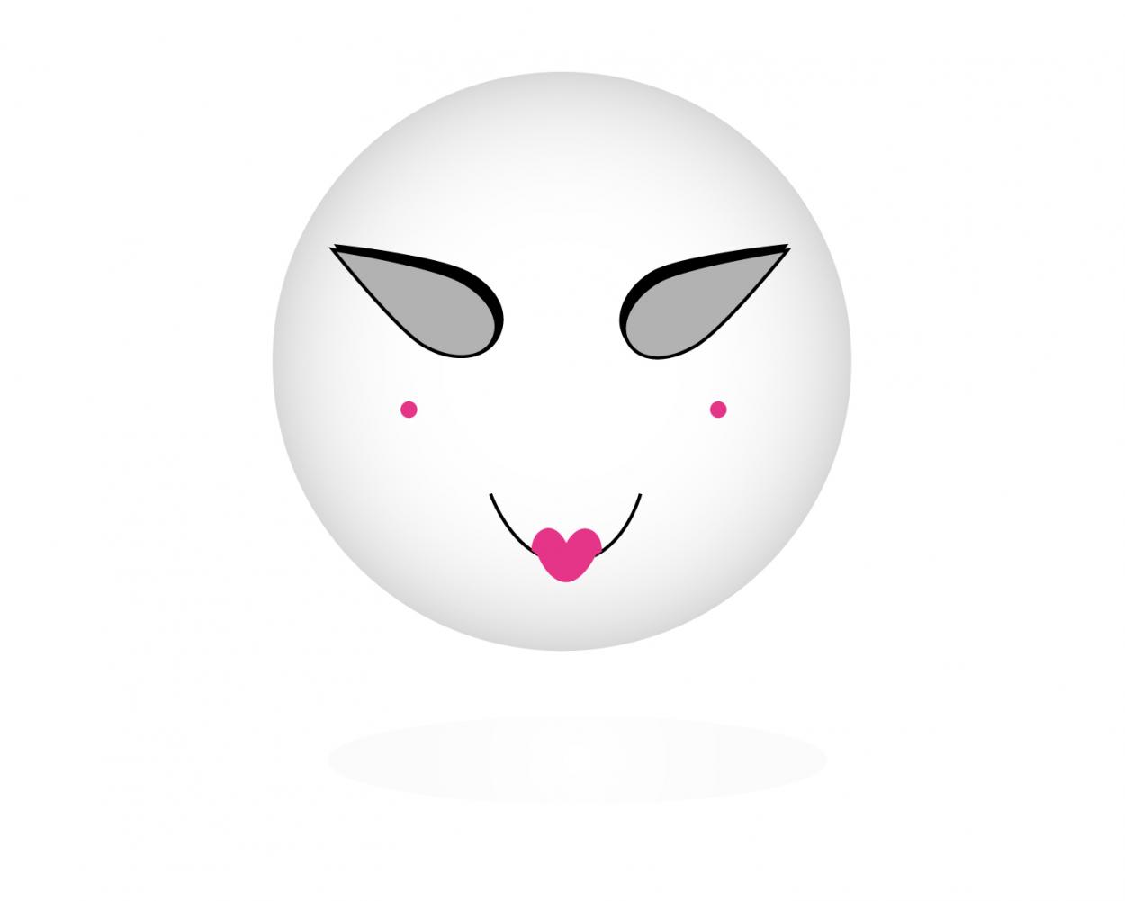
A white/black/pink sexy smiling robot.
$200.00 Prize
46 ENTRIES

Fast. Awesome. Affordable
About the Creative
35
36
181
Other entries by traceygl:
Similar Entries