

Graphic Design Entry # 288415
by traceygl- BACK TO CONTEST
- CREATIVE BRIEF
- ENTRY # 288415


Comments for entry # 288415
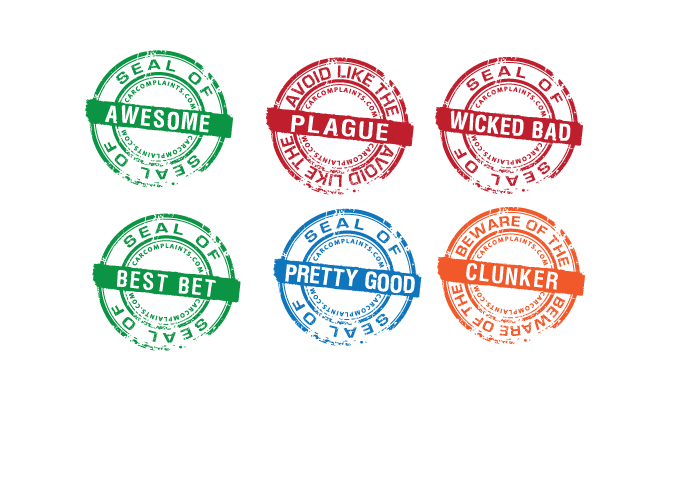
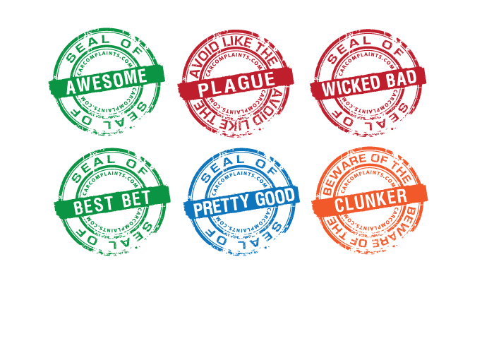
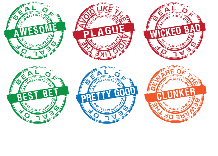
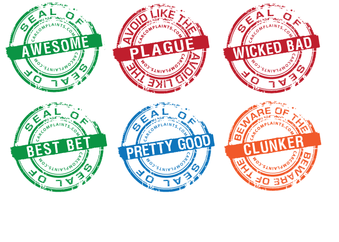
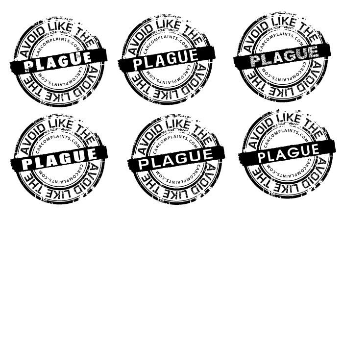
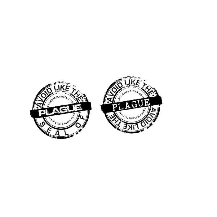
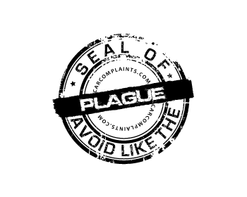
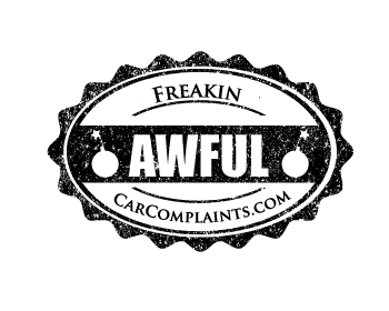
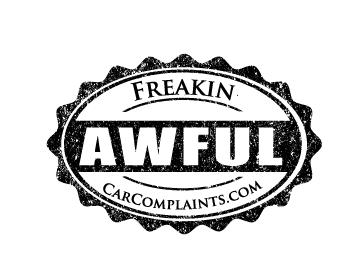
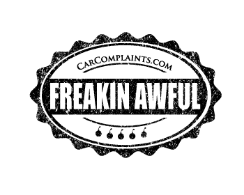
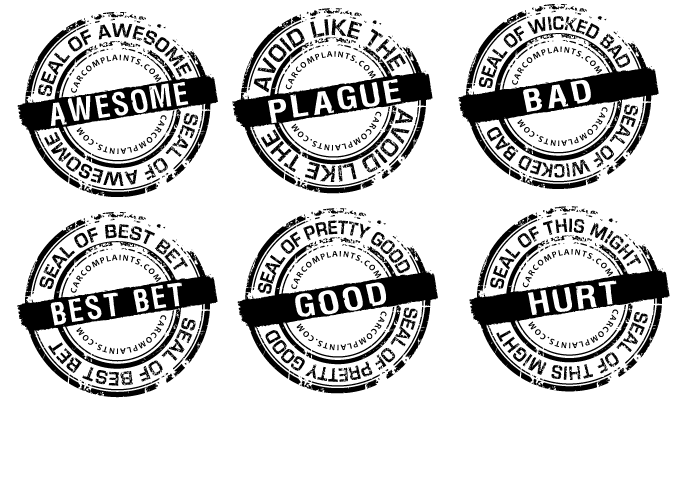
Getting there but now "CarComplaints.com" just looks quickly slapped in there -- it doesn't have the texture of the rest of the stamp & doesn't follow any of the other geometry. Also I think that font is too bold & it's borderline unreadable at the size I think it would fit on the website at (~135px wide). I realize this design is looking a lot like one of the examples: http://cdn.carcomplaints.com/img/seals/example1.jpg .. but there's a lot to like about that design. I like how on the example, the auxiliary text ("seal of approval" / "junk revolution") follows & accents the stamp geometry.
Browse other entries from this Graphic Design Contest


Browse other Graphic Design Contest


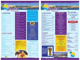
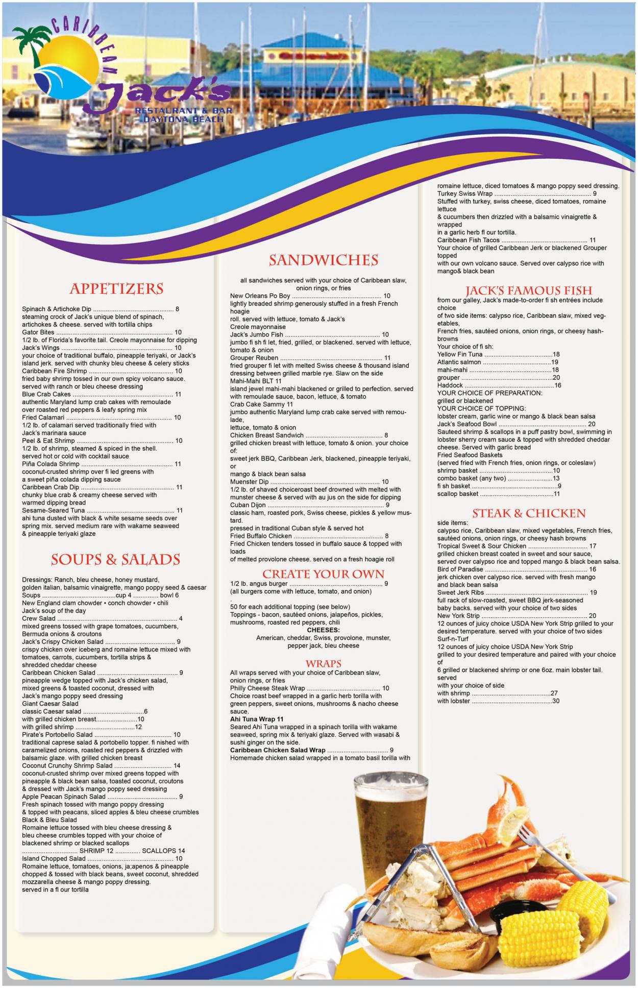
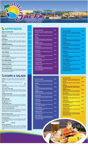
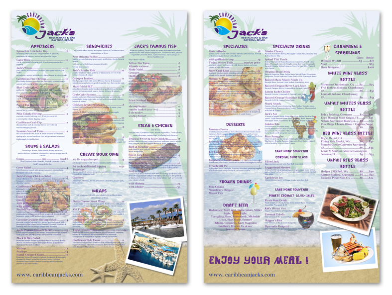
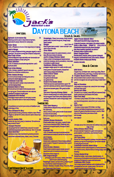
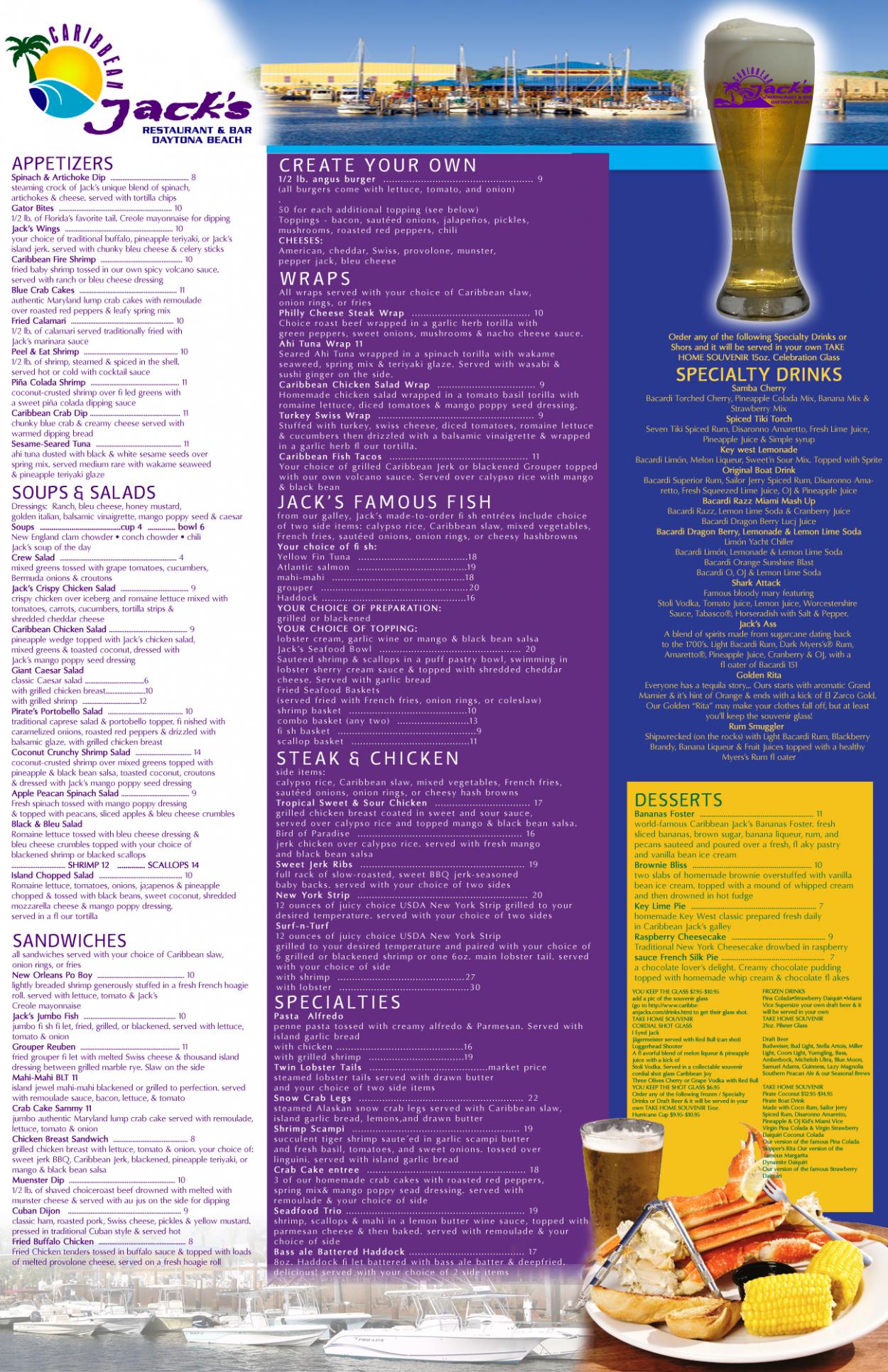
Graphic Design Contest: Caribbean Jack's Restaurant & Bar
Menu for Caribbean Jack's Restaurant
$400.00 Prize
72 ENTRIES


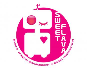

Graphic Design Contest: Sweet Flava
A white/black/pink sexy smiling robot.
$200.00 Prize
46 ENTRIES

Fast. Awesome. Affordable
About the Creative
35
36
181
Other entries by traceygl:
Similar Entries