

- BACK TO CONTEST
- CREATIVE BRIEF
- ENTRY # 22197
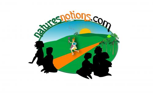
Comments for entry # 22197
As a another tip, I have finally scored two entires 5 now. Note the color tones in them. In fact one of them is going to soften it up more for me, but the gist is there. In truth, females make up 70% - 75% of the leisure reading book market, so having that accent in the shadow figures and such is a must. Like pony tail on a young girl too. Auburn hair a plus on any color figures (really just emulating my daughter). Thanks
Thanks for the in put.
I can tell you put some effort into this and I thank you for it. It doesn't work as it is. The orange, the runner, maybe too many shadow figures, the bright green in the distance. Just the general feel seems busy and loud and doesn't quite capture the "feel" yet.
Browse other entries from this Logo Design Contest


Fast. Awesome. Affordable
About the Creative
3
3
20
Other entries by Linda:
Similar Entries