

- BACK TO CONTEST
- CREATIVE BRIEF
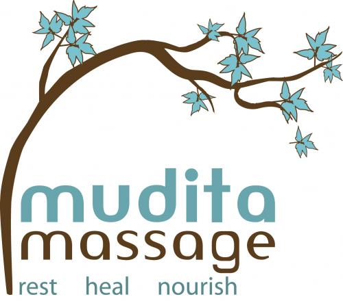
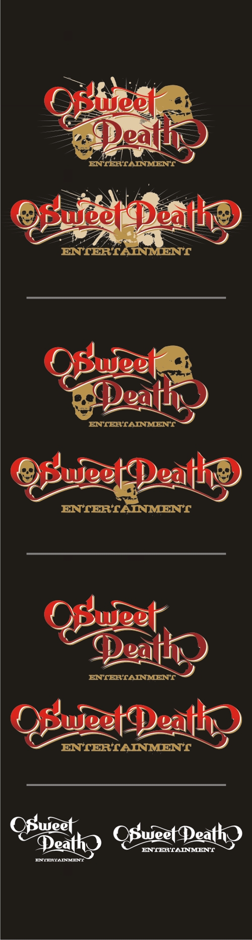
- ENTRY # 17775


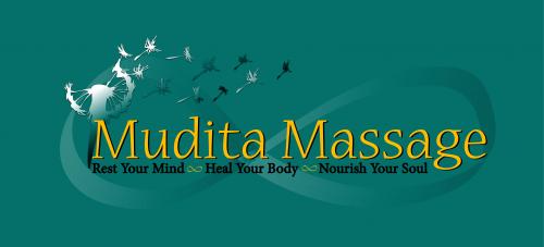


Comments for entry # 17775
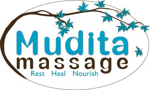
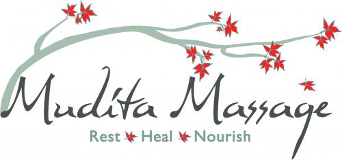
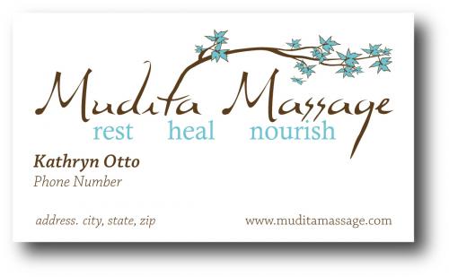
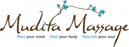
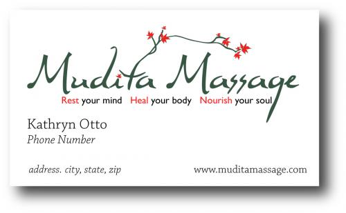
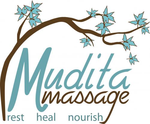
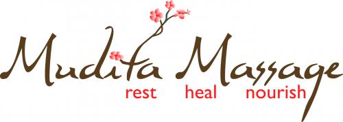
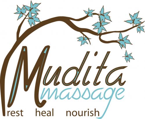
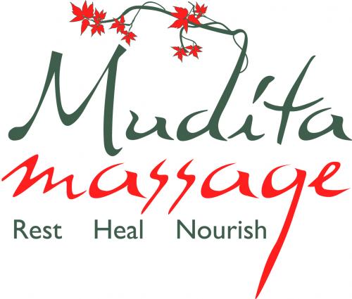
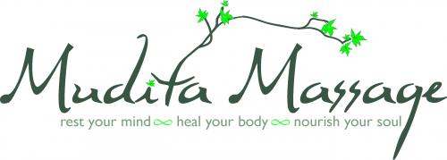
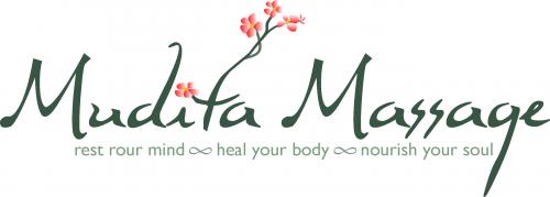
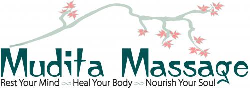
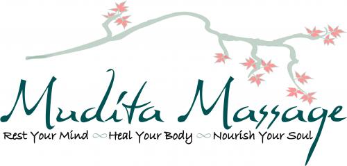
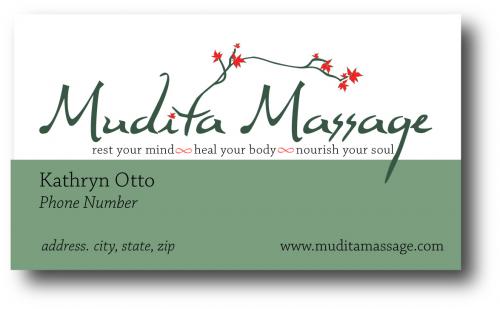
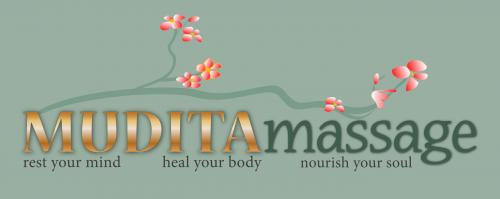
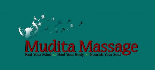
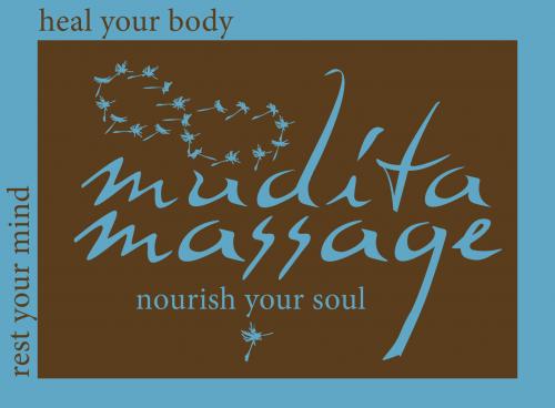
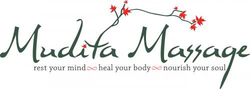
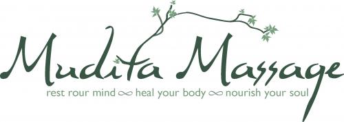
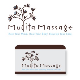
CJ from Portland said "This is my favorite but using the red color for Rest/Heal/Nourish like it shows below or use the color on the infinity symbols. The turquoise color used for Mudita Massage works well. I would also suggest adding color on the “i” like the ones with the branch out of the 't'."
Yes, I will work on this today with the shortened tag line. I was not able to find the exact font that you wanted to try last night. I have a couple that is similar.
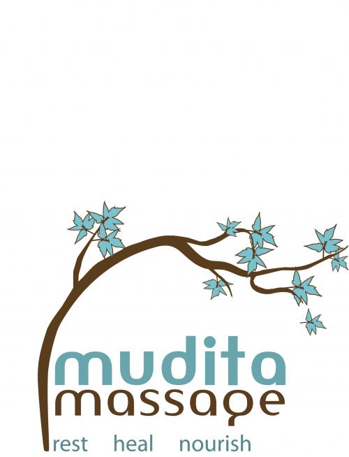
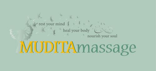
also, might there way to do this one with the shortened tag line???
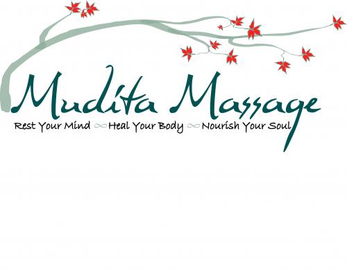
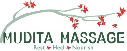
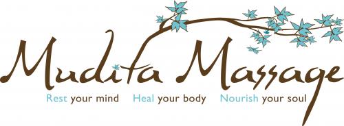
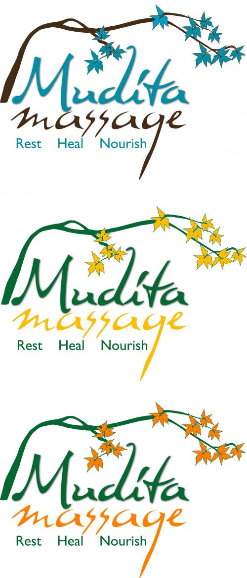
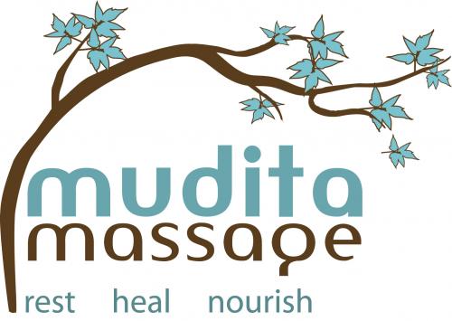
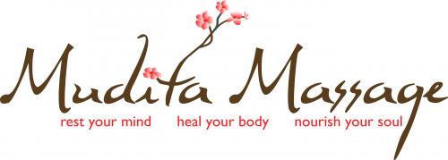
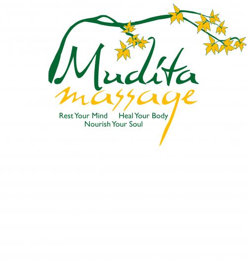
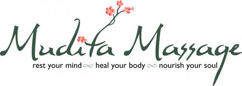
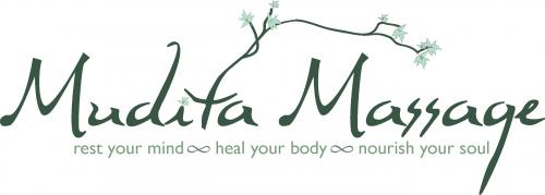
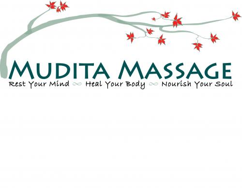
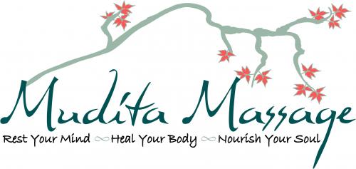
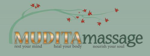
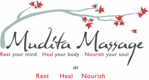
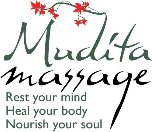
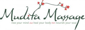
Please show the new tag line with the newer font and the highlighted words on this version. Also, please show it in the brown and blue, and the green and red. For all of the tag lines now, they should match the color of "mudita massage" instead being black. This way, we can keep the design to 2 colors. Although, I do like these original colors best. This tree is definitely everyone's hands down favorite of all of your trees. However, I have not yet shown anyone the tree with the stacked words. I will let you know how it goes.
interesting thought :) I will work it up for tomorrow.
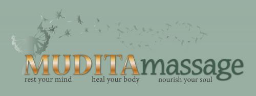
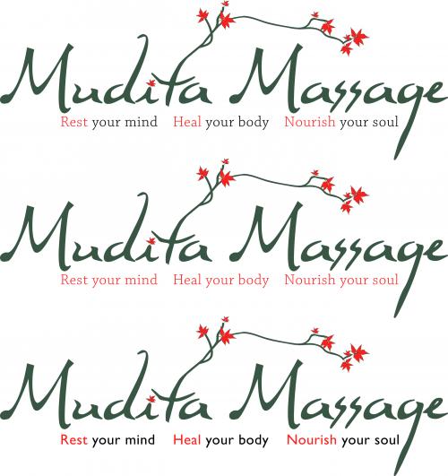
Also, just a thought--what would happen if the words were stacked and the tree wrapped almost all the way around them (possibly without the tag line, or with the tag line if you can think of something cool) ??
Yes.
Hi Kathryn, So would you like me to concentrate on this design using the tag line font used on the updated business card instead of this script font? Again I do not mind making changes for you. We want this to be perfect.
I did a survey today and this design came out the front runner. It seems that the original idea of the branch was the most emotionally provocative for people. People said it felt more "sheltering" and uncommon than the other use of the branch.Everyone likes the font of "mudita massage". There were a couple of people who pointed out that the tag line was much better in the newer, cleaner font. Sorry for all the back and forth. I am doing my best... but... Sorry.
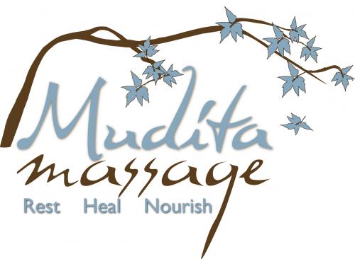
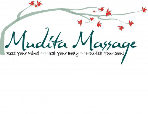
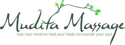
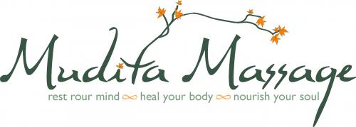
Here's some feedback from a friend: "hi kata I like the fourth one--- the branches reaching, a bit finger-like, but more fluid and stretched than the one above-- more relaxed. I like the branch a lot but the one above looks more knarled and uncomfortable. happy new year. xx wendy"
Browse other entries from this Logo Design Contest
Browse other Logo Design Contest


Logo Design Contest: EliteTacticalMartialArts.com
Elite Tactical Martial Arts
$200.00 Prize
72 ENTRIES
Logo Design Contest: Palmistry for Living
Logo Design for Palmistry for Living
$100.00 Prize
67 ENTRIES


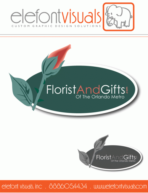
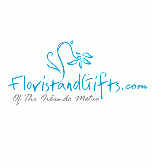
Logo Design Contest: FloristAndGifts.com
professional logo for floral industry
$200.00 Prize
270 ENTRIES
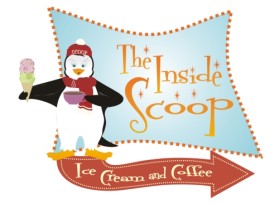
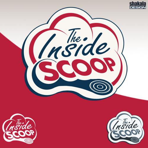

Logo Design Contest: The Inside Scoop
1950\'s Ice cream/coffee shop logo desig
$310.00 Prize
108 ENTRIES

Fast. Awesome. Affordable
About the Creative
3
3
20
Similar Entries