

- BACK TO CONTEST
- CREATIVE BRIEF
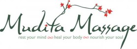
- ENTRY # 18009


Comments for entry # 18009
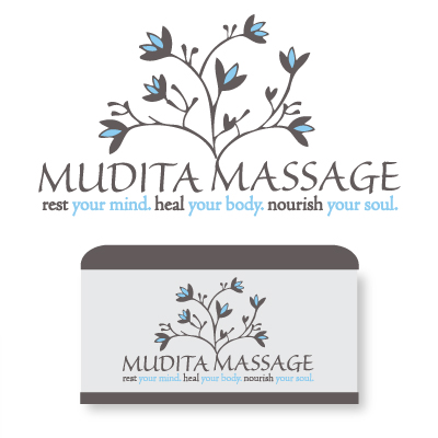
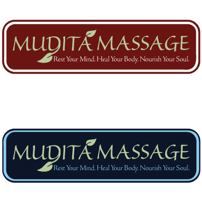
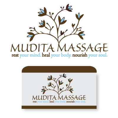
:) Wow, the feedback is certainly encouraging. Please just let me know of any changes you would like to see. Since you are preferring this font over the other one, would you like to see blue on the words Rest,Heal,Nourish...and brown on the rest? Let me know and I will do that posthaste... Thanks again, Jenny B
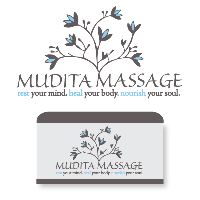
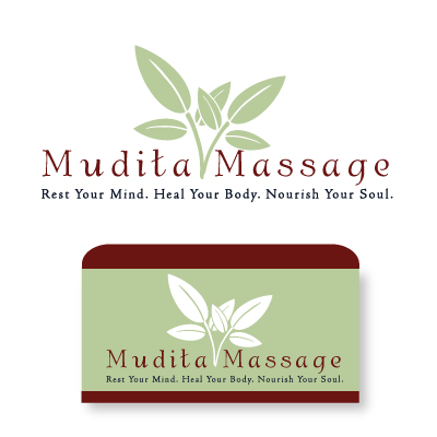
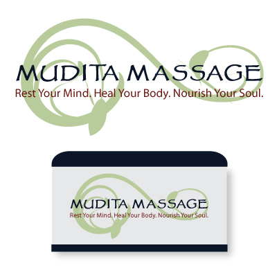
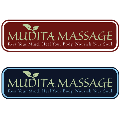
More feedback: Christi from Boulder: "aaahhh this is really nice. Blue is soothing to me." Joan, painter from Texas: "Yes, it is beautiful." Becca, Hakomi therapist from Austin: "Yes, really nice. I like the blue." Helen, graphic artist from Boulder: "Very nice! Eye catching, yet tasteful. Love the type face!" Wendy from Boulder: "I like but I am still sticking with the fingery branch. if you go w/ this one-- make the blue lettering below darker/ more bold as it is difficult to read." Kaya, business consultant from PDX: "YES my favorite too." Karen from Austin: "I agree, that one is very nice!" Bettie, artist from San Antonio: "that is gorgeous! my favorite too........and the proverb at the end would be good on it too." McKay, minimalist painter: "NICE"
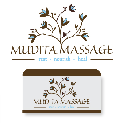
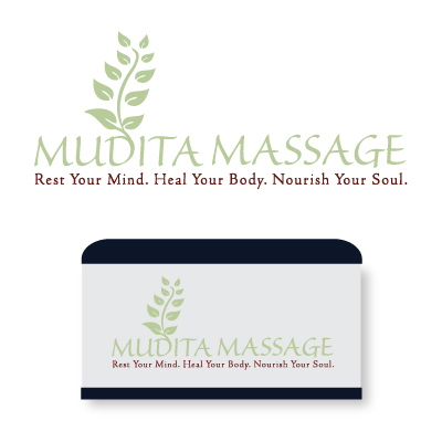
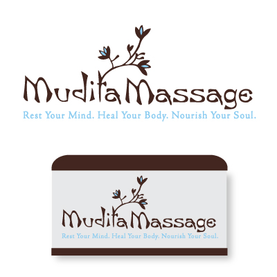
New submission coming right up per Patricia's suggestion :) Change of layout,different font too...watch for it!
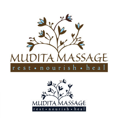
I'm not sure I agree about chocolate (I like the coolness of grey), but here's what serious art aficionado & patron of the arts Patricia had to say: "I would ask them to try combining the blue you like with a very deep dark chocolate. I think you will also have to deepen (thicken) the blue font. It gets lost on the white background. You are getting there!"
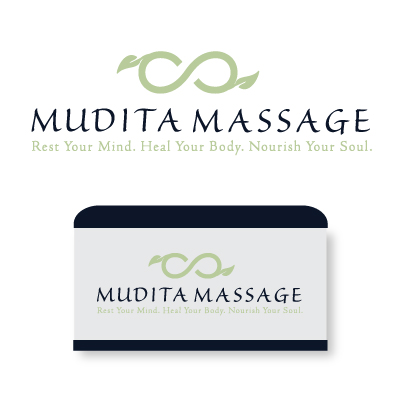
Minna, designer from PDX, said: "Oh, I do like how the flowering branches look! The join on the M seems a little inorganic somehow, though. The colors are very nice." PS. I still like the join, I think.
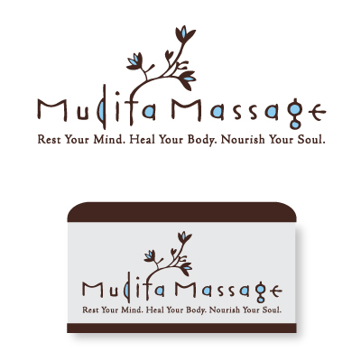
President of jam media's feedback: "Oooo... that's great!"
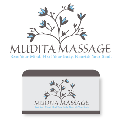
I love love love it! The blue is so soft, the vines are so open. Clean and simple.
I went back and enlarged the graphical elements to balance it a little better. These colors contrast well, if you don't like them, that's ok too.
Browse other entries from this Logo Design Contest
Browse other Logo Design Contest


Logo Design Contest: EliteTacticalMartialArts.com
Elite Tactical Martial Arts
$200.00 Prize
72 ENTRIES
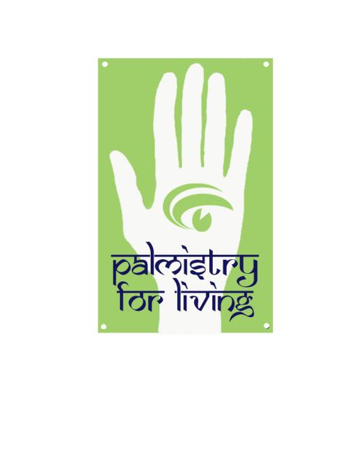
Logo Design Contest: Palmistry for Living
Logo Design for Palmistry for Living
$100.00 Prize
67 ENTRIES


Logo Design Contest: FloristAndGifts.com
professional logo for floral industry
$200.00 Prize
270 ENTRIES
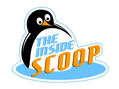
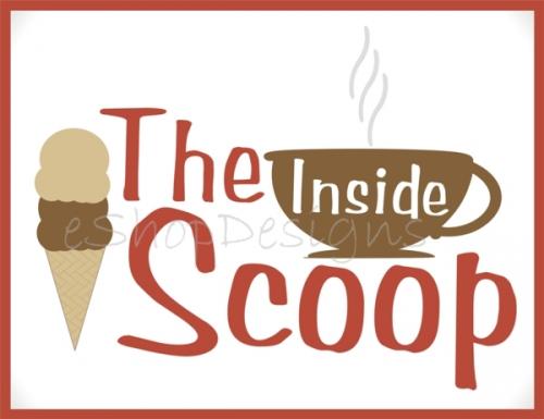

Logo Design Contest: The Inside Scoop
1950\'s Ice cream/coffee shop logo desig
$310.00 Prize
108 ENTRIES

Fast. Awesome. Affordable
About the Creative
5
7
25
Other entries by jennyb:
Similar Entries