Nintendo is one of the biggest brands in the world. It is a Japanese company that has been around since 1889 and is best known for its video game consoles and games, which have has helped the brand be at the forefront of the gaming industry for decades, creating iconic characters such as Mario, Donkey Kong, and Link and famous franchises like Pokémon, The Legend of Zelda, and Animal Crossing. Nintendo has also branched out into other forms of entertainment, such as theme parks, movies, and television shows.
The company has a long history of success and continues to innovate and create new products for its fans. Nintendo is a brand beloved by many and has become a household name, growing vastly popular and now known as one of the most famous brands ever. One of the biggest reasons the brand has grown so successful and its marketing game does not compare to others is its iconic logo. The Nintendo brand is renowned for its iconic logo, which perfectly encapsulates its adventurous, classy, and colorful image.
This logo has been through many versions since its creation in 1889, with most of them being wordmarks. These changes have been significant and have contributed to the evolution of the logo, helping it become the recognizable symbol of the brand it is today.
In this article, we will explore the entire history of the Nintendo logo and discover how it has reached its current form.

1889––1950: The First Logo
Nintendo’s first logo was created in 1889 and is rectangular with red at the top and dark blue Japanese letters. The colors chosen for the logo are significant, as red is a color that is associated with luck and joy in Japanese culture, while blue is a color of trust and reliability. The logo was created to represent the company’s commitment to producing quality products that bring joy to people’s lives. The Japanese letters in the logo spell out the company’s name, which reminds them of its roots and the importance of its heritage. The emblem symbolizes Nintendo’s commitment to creating products that bring people joy. It serves as a reminder of the company’s history and dedication to excellence.
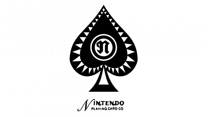
1950––1960: A Drastic Change
The 1960 Nintendo logo was the second logo created for the brand and was a black and white spades emblem. This logo was designed to represent the company’s playing card roots, as Nintendo was originally a playing card manufacturer. The choice of black and white was likely meant to reflect the simplicity and sophistication of the brand, and the spades symbol was chosen to represent the company’s heritage. The logo was also meant to convey a sense of trust and reliability, which was necessary for the company as it was transitioning from a playing card manufacturer to a video game maker. The 1960 logo was a classic and timeless design that has become an iconic symbol of the Nintendo brand.

1960––1964: Just A Wordmark
The 1960 Nintendo logo is a classic example of minimalism. It features a simple cursive font in black letters on a white background, creating an elegant and sleek look. The color choices were deliberate, symbolizing the brand’s core values: simplicity and sophistication. The logo was created to represent the brand’s commitment to quality and innovation, and its timelessness allowed it to remain relevant for over four years before the brand created a new logo.

1964––1965: Red Is Brought Into The Logo
Four years after the previous logo, the brand decided it was time to redo it. The 1964 Nintendo logo is bold and striking, with a long red rectangle and white lettering. The contrast between red and white is eye-catching, and the unique font makes the logo stand out. The logo represents the company’s commitment to innovation and creativity. Its bright colors reflect the fun and excitement that Nintendo games bring to people of all ages. The logo is a timeless classic synonymous with the Nintendo brand.

1964––1967: Black and White Returns
During the same period that the previous logo was created, this logo was also created, it was just used for a longer period of time. The black and white Nintendo logo, created in 1964, is an iconic symbol of the gaming industry. The emblem features sleek and stylish black lettering on a white background, with chunky capital letters for the design. The choice of black and white was deliberate, creating a unique look. The logo was used two years longer than the previous one, creating a symbolic look for gamers worldwide.

1965––1967: A Cleaner Font
The black and white Nintendo logo created in 1965 is an iconic symbol in the gaming industry. Compared to the logo designed in 1964, the 1965 version is sleeker and more professional looking. The font is more stylish and less scribbly, instead focusing on style and class. The logo has clear and precise black letters on a white background, making it a timeless classic. The logo was used for two years before replacing it with a second one.

1966––1970: A Circle Is Included
The red circular 1966 Nintendo logo was an iconic symbol the company used for many years. It consisted of two letters inside a red circle. The purpose of this logo was to represent the Nintendo brand and to serve as a recognizable symbol of the company. It had a classic, retro look and feels, which appeals to many people. The two letters inside the logo represented the company’s name, Nintendo, and the red circle around them symbolized the company’s commitment to quality and innovation. The logo was simple yet powerful, and it has become a symbol of Nintendo’s legacy.

1967––1975: Just The Name Shown
The 1967 Nintendo logo features the company name written in red on a white background. This simple yet effective logo is sleek and stylish, designed to draw attention and create a memorable company image. The stark contrast between the red and white colors helps to make the logo stand out, while the bold font of the company name gives it a modern and professional look. The purpose of this logo is to create a recognizable and lasting image of the company that will be associated with only the highest quality.

1968––1970: A Hexagon Shape
The 1968 Nintendo logo is very similar to the 1967 logo but with a few distinct differences. It is inside a hexagonal badge, has a distinctive red appearance, and the red appears brighter than the previous logo. The purpose of this logo is to represent the company in a positive light and to give it a unique and recognizable look. It features a bold, bright red font to stand out and grab customers’ attention. The hexagonal shape of the logo also adds a unique touch, making it more eye-catching. Overall, the 1968 Nintendo logo is a distinct and memorable design that has become synonymous with the company.
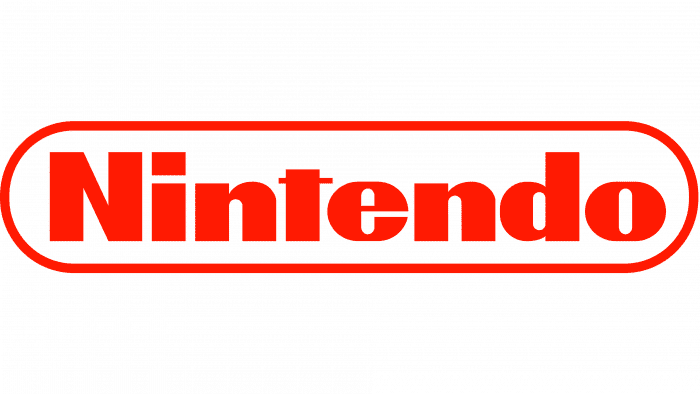
1970––1975: A Different Shape
The 1970 Nintendo logo is an elegant, straightforward design that boldly stands out. It consists of the Nintendo name written in red inside a round, narrow hexagon. The purpose of this logo is to create a memorable and recognizable brand image that can be easily associated with Nintendo. The red color stands out against the white background, while the round, narrow hexagon shape gives the logo a distinct and modern look.
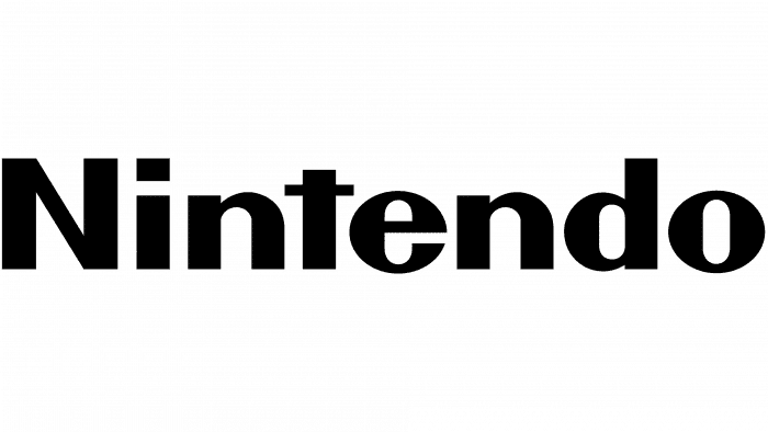
1975––Present: The Logo Today
The black and white logotype used for Nintendo today is modern and sleek. It features the company name in black on a white background, with the letter ‘N’ capitalized and the remaining letters in the name in lowercase. The font used for this logo is a modern sans serif font, which helps to give the logo a contemporary look. The purpose of this logo is to create a solid and recognizable brand identity for Nintendo. It is simple and easy to recognize, and the black-and-white color scheme gives it a timeless quality. The capital N stands out from the other letters, and the lowercase letters give the logo a sense of balance and symmetry. The overall effect is a modern, sleek, and easily recognizable logo.

2016––Today: Another Version Of The Logo
In addition to the previous logo shown, there’s a second logo that the brand often uses. The red and white Nintendo logo was created in 2016 and is still used today. It is a modern and stylish design that has become iconic in gaming. The logo consists of the company name in white with a white rounded and long circle around the letters and a red background. The red and white colors of the logo are eye-catching and memorable, making it an excellent choice for the company’s branding. The design is also timeless, as it has been used for over six years and is still relevant today. The logo perfectly represents Nintendo’s commitment to quality and innovation and symbolizes the company’s legacy. The logo is also a great way to show the company’s commitment to its customers and the gaming industry. It is a stylish, classy design that will surely be remembered for years.

The Colors Used
The Nintendo logo is instantly recognizable due to its bright and vibrant colors. The primary colors used in the logo are red, white, and black. Red symbolizes passion and energy, while white stands for purity and innocence. Black is used to represent strength and reliability. Together, these colors create an eye-catching logo that symbolizes Nintendo’s values.
The History Of Nintendo

Nintendo is a Japanese multinational consumer electronics and video game company that is one of the world’s most well-known and successful gaming companies—founded in 1889 as the world’s most prominent and successful gaming company in the gaming industry.

In the 1970s, Nintendo began to develop video game consoles and handhelds, such as the Color TV Game series and the Game & Watch. In 1983, Nintendo released the Famicom, the first console released in Japan and the predecessor to the Nintendo Entertainment System (NES). The NES was released in the United States in 1985 and was the first console released in the West. It was hugely successful, selling over 60 million units worldwide.

In 1989, Nintendo released the Game Boy, the first handheld console to use interchangeable cartridges. The Game Boy was a massive success, selling over 118 million units worldwide.
Nintendo followed up the Game Boy with the Super Nintendo Entertainment System (SNES) in 1990. The SNES was a success, selling over 50 million units worldwide. Nintendo continued to release consoles and handhelds throughout the 1990s and 2000s, such as the Nintendo 64, GameCube, Game Boy Advance, Nintendo DS, and Wii.
Today, Nintendo is still one of the most successful gaming companies in the world. The company has released the Nintendo Switch, the latest console in the Nintendo line, which has also become a massive success, selling over 55 million units worldwide. Nintendo continues to create innovative gaming experiences and is one of the most recognizable names in the gaming industry.
What Does The Name Mean
Nintendo is a Japanese word derived from the phrase “nin ten do”, which translates to “leave luck to heaven”. This phrase is used to express the idea that success and failure are ultimately determined by fate.
Nintendo is an integral part of the gaming industry and has become a household name, and its influence can be seen in the gaming industry today. Nintendo has become a symbol of quality and innovation, and its name is synonymous with fun and entertainment.
Who Designed The Logo?
The Nintendo logo is one of the world’s most recognizable and iconic, but the company has never disclosed who designed it.
As a result, despite its popularity, the public does not know who created the logo, leaving the mystery of its origin unsolved.
The Most Popular Nintendo Games

Nintendo is one of the world’s most well-known and beloved gaming companies. Over the years, they have released many popular games that have become classics.
Some of the most popular Nintendo games include Super Mario Bros., The Legend of Zelda, Animal Crossing, Pokemon, Super Smash Bros., Mario Kart, Splatoon, and Luigi’s Mansion.
These games have been enjoyed by millions of players worldwide and continue to be some of the most popular games of all time.
Why Red
The Nintendo logo has become an iconic symbol of the company and its products. The bright red color of the logo has become synonymous with the company and its products and is a recognizable symbol of the brand.
The red color of the logo is meant to evoke a sense of excitement and energy and is an integral part of the company’s branding. The color is also associated with good luck, which may be why it is so popular with gamers.
Additionally, the red color stands out against the white of the Nintendo logo, making it more visible and memorable. The color also has a long history in Japanese culture and is often used to represent joy, passion, and energy.
All of these factors make the red color of the Nintendo logo an essential part of the company’s branding and identity and help to make it a recognizable symbol of the brand.
Check out these awesome Logo Contests run on Hatchwise:


