The NASA logo has gone through a few changes, and we’ve even seen one come back after being retired. The most recognizable logos, affectionately known as the “meatball” and the “worm,” are the perfect symbols of optimism that underlie the feeling of exploration and incredible journeys NASA is known for.
If you’ve ever wondered about the NASA logo, including it’s conception and it’s progress over time, you’re in the right place. Read on to discover the history of the NASA logo.
About NASA

NASA, which stands for the National Aeronautics and Space Administration, is a forerunner in space exploration. It’s seen incredible success, and out-of-this-world achievements, and has provided the people of the world with new information that has changed the way we think about our planet and the universe.
NASA, which stands for National Aeronautics and Space Administration, is both a division of the US government and its own private agency. They are responsible for the civil space program, aeronautics research, and space research.
Descending from the National Advisory Committee for Aeronautics (NACA) in 1958, NASA’s aim was to fulfill the U.S. space development effort with a distinctly civilian orientation, with a focus on peaceful applications in space science.
NASA has long been an organization with some of the top minds in the world, from mathematicians to scientists, and more. For years, the space organization has pioneered exploration into uncharted territory. NASA is responsible for opening up a new era of human spaceflight, thanks to its brave and determined efforts to explore the vast reaches of the universe.
As NASA has grown, its logo has also changed and evolved from the first icon that symbolized the NACA to the memorable images we see today.
NASA’s Logo Over Time
As one of the most reputable and influential global organizations, NASA needs a powerful logo to be worthy of carrying its weight. As such, there haven’t been many logo redesigns during its history, and the two that are still used by the Administration are both globally recognizable and share somewhat odd nicknames — the “Meatball” and the “Worm”.
When we see NASA use a logo today, it’s typically one of three main options. The most common and the most well-known are the “official” NASA seal and the meatball. However, the “worm” logo is also frequently used for specific promotional circumstances. In addition to these chief icons, NASA has also developed new emblems for particular projects and endeavors, including the below images.


The Original Logo for NACA (1915)
The original logo, though not as famous, was also a visual identity for the National Advisory Committee for Aeronautics, the predecessor of NASA, which was established in 1915. We wouldn’t have the organization we have now without them, so it’s appropriate to pay a nod to it.
The logo for NACA had the appearance of yellow wings flying out of some sort of badge, which was outlined in black. Written in a simple, black font, the words are located in the center of the emblem.
This simple badge was well-balanced and professionally executed. It did its job reflecting the original organization and its purposes.
From there, the logos most will recognize come into play.

The Meatball NASA Logo (1958-1975)
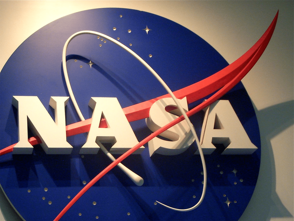
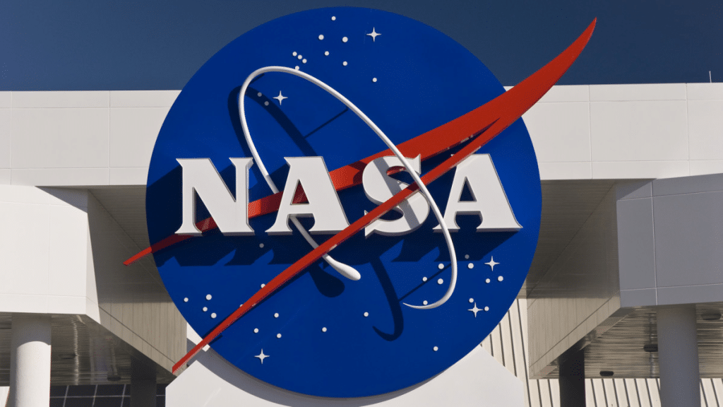
The well-known meatball logo came around about the same time that NASA started, in the late 1950s. Created by James Modarelli, who worked for NASA, the large circular design was almost immediately named the Meatball by staff members.
The logo, which circulated until 1975 and was brought back again in 1992, showcased a blue circle, which symbolized the sky, with white stars, and a red V-shaped wave or ribbon. That element was created to represent aeronautics in general.
The logo also featured a bold wordmark in serif lettering that was colored white and sat in the center of the circle. A thin white orbit trail swooshed around it.
The NASA seal was crafted after the meatball emblem. The seal, which is a blue circular badge, is used for special events and in official ceremonies and locations.

Star Trek costume designer, William Ware Theiss, created the logo for the TV show’s Starfleet Command. His design was inspired by NASA’s meatball logo. Theiss’ design emulated the stars in the sky and the red vector by giving the original Starfleet logo a golden vector and a starry blue globe.
When the crew of the Enterprise retrieved a piece of a NASA vessel, however, it was sporting the next logo.

NASA’s Worm Logo (1975-1992)
In 1975, the “Worm” logo made its way into NASA, even if it was quickly replaced by the circular emblem in 1992.
In another twist, it was brought back as a secondary badge in 2020.
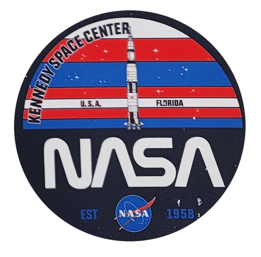
The Worm logo has the organization’s acronym in smooth, capital letters. They showcase rounded angles and distinct cuts to create a single flowing line. You can see both the letter “As” of the inscription are missing their horizontal bars in order to continue that one-line feeling.
The smooth contour of the inscription reminded people of a worm in motion, which is where the icon got its funny nickname from.
The creator of the “Worm Logo” had an interesting story.
Richard Danne spent his childhood in Oklahoma. He was born during the Great Depression, in 1934, and grew up on a farm. Richard had a love of music and artistic expression that he favored over his studies.

However, he did go to college, and after attending Oklahoma State University, his excellent work ethic and natural curiosity about graphic communication and its evolution led him to UCLA’s Graduate School of Design.
It wasn’t to last, though. New York was the hub of design at the time, so in 1963, Danne packed a few belongings and traveled across the country to pursue his dreams. It was a risky move, and he had no way back to California.
The New York design community was close and exclusive, however, it didn’t take too long for Danne to establish himself within it. During his first few years in New York, Danne threw himself into creative work. He designed film titles, branded the Harvard Business School, and spent his time making a name for himself. Soon, he met another designer named Bruce Blackburn.
The two men quickly discovered they both shared a similar design philosophy and went on to found Danne & Blackburn. Soon, they were taking on projects together and growing their agency.
What truly kicked them into the stratosphere was one of their earliest projects, redesigning the visual identity of the NASA space agency. The Mercury and Apollo space programs had recently been quite successful, and NASA felt the need for a new style and fresh face.
In fact, NASA was one of the first federal agencies to request proposals once the Federal Design Improvement program had been established. Although the designers didn’t know it at the time, Danne and Blackburn would soon take on a project that would stand as one of the most iconic and timeless creations in the history of graphic design.
That design was the red worm NASA logo.
However, not everyone was a fan of the new redesign, and older NASA staffers hated the stripped-down look. They were the ones who began calling this new red logo “the worm” and openly stated they wanted NASA to bring back the meatball.
In 1992, these somewhat disgruntled employees got their wish. The head of NASA became Daniel Goldin, as appointed by President George W. Bush. Daniel Goldin was a vocal opponent of the worm logo and had been at NASA during the time of the much-loved meatball logo.
As he embarked on his new position, Goldin toured the agency’s headquarters. While he was there, he asked what he could do to improve employee morale while he was in charge. The director of the Langley Research Center at NASA encouraged Goldin to get rid of the worm and bring back the meatball. This is exactly what new director Goldin did.
It’s remained in place ever since, with the slight addendum that would come in 2020.
The Current Logo for NASA

Ever since 1992, NASA has used the Meatball as its official logo. It hasn’t been around since the beginning, however, it has been the most popular one. You can find it on various goods, including t-shirts and keychains, and it spans the globe in recognition.
On the Meatball logo, the NASA name is still shown in those white capital letters on a round solid blue background with small white stars and a comet. You’ll also still find the red strokes in the shape of a horizontally oriented “V.” If you look carefully, you can see that those red strokes also look like a bird in flight.
However, it’s not the only logo we see used currently.
In 2020, the NASA Worm insignia of the 1970s through the early 90s returned and has been commonly used alongside the Meatball logo. This minimalistic, stylish logotype with bold red letters on a plain background and been embraced by new space fans and is seen as more modern and powerful. It complements the classic elements and lines of the meatball badge.
The Worm is also showcased on various clothing and souvenir items but is less popular than the Meatball, likely due to its simplicity and lack of design elements. It has smooth red letters, which are changed to reflect each product’s color.
The “seal” symbol

When NASA takes part in presentations and ceremonies, as a presenter or guest, the agency uses a unique, stylized version of its official emblem, known as a seal. In addition to classic elements of the meatball, stars, orbital path, and vector elements, the seal also includes two planets and a “The National Aeronautics and Space Administration U.S.A.” inscription surrounding the border.
Circling the perimeter of the frame is the “National Aeronautics And Space Administration U.S.A.” in red letters, solidifying the shape and harkening back to the official seals and insignia of national and global organizations and states. There is a yellow planet in the center, which stands out against a blue background. This is held together with a matching yellow border.
The NASA seal uses wings to wonderfully illustrate the flight and innovation of the administration. Always tied to aeronautics, here it’s even more reminiscent of a supersonic wing, which was created by Clint Brown, an aeronautical engineer.
In this logo, the wing reaches towards the “NACA” by engulfing the planet that is surrounded by stars and a moon. The shadow the wing casts on the planet gives the look a three-dimensional feel, and the tiny decorative stars add more detail.
After several officials within NASA provided their input, the seal went through even more rounds of approval with stakeholders, including a branch of the army and even the Fine Arts Commission.
In fact, Clint Brown cleverly noticed that in the original drawing, the wing design had been placed upside down, so the artwork was sent back for revisions. Once both of the agencies looked again, Dr. T. Keith Glennan, NASA Administrator, signed off and sent the design to President Eisenhower for final approval.
NASA Logo Key Elements
With just its name and a simplified version of our beautiful night sky, the NASA logos demonstrate the organization’s mission, history, and national identity. Each design has had a few key elements.

1. Red, White, & Blue
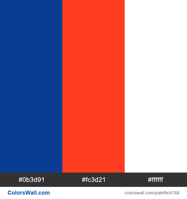
There are three colors that make up the Meatball logo. You’ll find a bright red, set at Pantone 185, a dark blue that reminds us of the night sky, set at Pantone 286, and, of course, white. The NASA logotype worm is also that trademark red and typically sits against a white background. The official seal also uses red, white, and blue, with a small addition of yellow. As our national colors, it makes sense that these are so predominant in the designs.

2. Stars & Wave
The star detailing and red wave motif are the two main focal points of both the meatball design and the official seal. Without them, the icons would be unrecognizable.

3. Bold Font
The meatball NASA logo showcases a bold serif type where each letter is capitalized.

The custom typeface of the logotype worm has thick, bold letters. You’ll also see half of the bars are extra-thick, and the triangular serifs are short and sharp, making them even more striking.
The logo’s font is between typefaces like Queskile Voyage Medium and Fiducia Serif. However, most of the contours are modified and tailored to the logo’s exact specifications.
Space Std Bold and NASAlization Bold are specialty fonts used in the logo.
Conclusion
The NASA logos haven’t changed much, which is a true testament to their staying power. And while not everyone loved the worm at first, it looks great alongside the modern logos of today. What’s more, NASA’s unique adoption of two official logos makes promoting the agency even more flexible.
They have the option to choose whichever logo feels right for the particular job. Unless, of course, it’s an official function, in which case we’ll see their traditional seal representing all that NASA stands for.
It’s unlikely the recognition and importance of NASA will change any time soon, and alongside the organization’s powerful message and work, its logo stands as a reminder to set your sights to the stars. Perhaps if we do find intelligent life in space, they’ll also be very familiar with NASA’s red wave, blue sky, and white stars.


