

- BACK TO CONTEST
- CREATIVE BRIEF
- ENTRY # 22971


Comments for entry # 22971
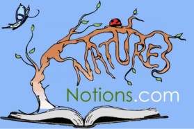
Yes, a wee wee little. And get the twig tip colored like the other ones. Thanks.
add more to the tip of the green swoosh under the Ns?
Actually, lets tweak it in two places. 1. Add just a tad more of tip under the "N"'s. 2. See the tip of the rightmost twig at the top. Notice how its fads out. It should show a bit more brown.
It's works. Colors are coordinated well enough. I think this graphic is done.
Here is the design with the additions you asked for. Good call on the pencil tip. Before, I had the pencil tip green, it didn't seem to work. But that was also with the previous color palette. I actually think it works much better than before. I guess thats up to you :)
Browse other entries from this Logo Design Contest


Fast. Awesome. Affordable
About the Creative
2
Similar Entries