

- BACK TO CONTEST
- CREATIVE BRIEF
- ENTRY # 22965


Comments for entry # 22965
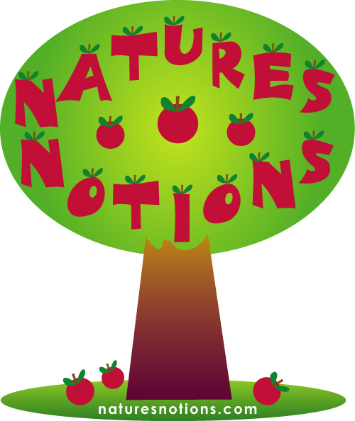
Shortened should say narrowed. The green at the bottom stretches to much. It can be cropped a bit. Also, the name can be laddered a bit more closely giving a bit more to crop.
I am not sure what you mean by shortened, can you please elaborate?
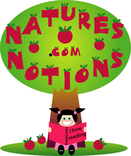
Yes, this is a cleaner look. 1. I'm not sure the butter works near the words, but maybe below them. 2. The .com looks pretty squeezed. 3. It's a bit wide for the content that there so it could be shortened. 4. I'm still debating on the apple sitting there by itself.
A different cleaner look, let me know what you think!
Browse other entries from this Logo Design Contest


Fast. Awesome. Affordable
About the Creative
8
8
17
Other entries by jojomarie:
Similar Entries