

- BACK TO CONTEST
- CREATIVE BRIEF
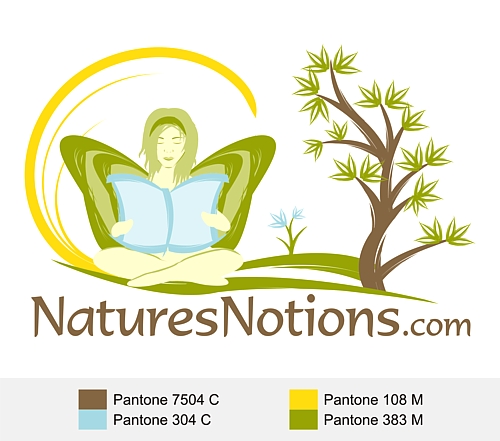
- ENTRY # 22907


Comments for entry # 22907
You can increase the height of what's left of the tree to get the letters to work, but don't make it too tall. I like tight graphics and few colors.
This is different. 1. I don't think that tucked are on the right quite works. It should be holding the book, though I know she's holding the tree. 2. If you knocked for the left limb with a Y and then stacked "N" on top with "atures" and "notions" stacked vertically from top to bottom below the "N" and then ".com" across the bottom below the letters this would tighten the graphic up and possible make it look "cool." Never know till you see it.

Here's one more. Thank you.
Browse other entries from this Logo Design Contest


Fast. Awesome. Affordable
About the Creative
45
45
125
Other entries by eShopDesigns:
Similar Entries