

- BACK TO CONTEST
- CREATIVE BRIEF
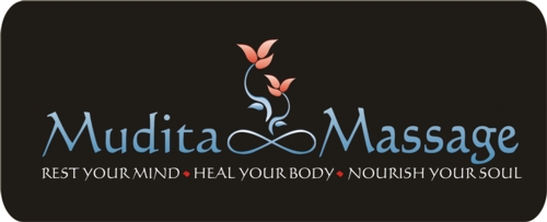
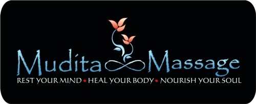
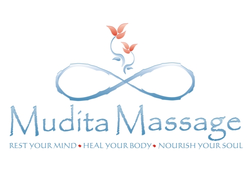
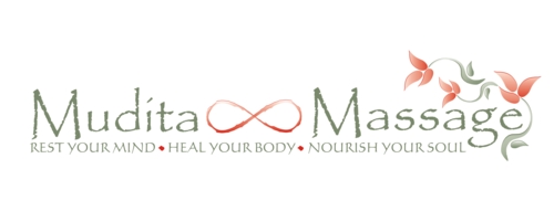
- ENTRY # 17782


Comments for entry # 17782
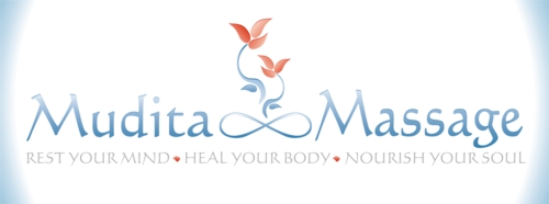
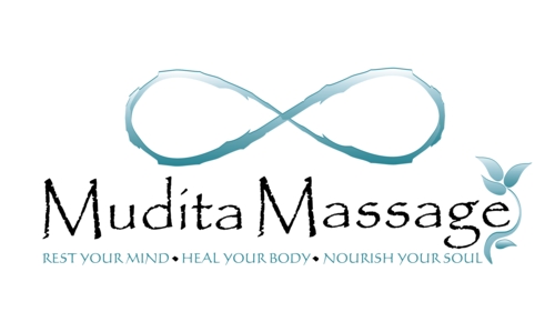
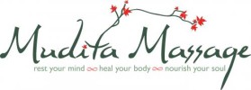
Here's some feedback from my German friend: "take the infinity symbol size from 17794 and this is my favorite (infinity and flowers resemble buddha with folded legs; maybe scale up the whole image part a bit afterwards); I would play with fore- and background colors though, maybe the "warmth" can be enhanced + it looks to soft to be taken seriously: take the risk of some more contrast" (I'm not sure if I agree, but it would be interesting to see...)
My friend Lynn Read says... "nice"
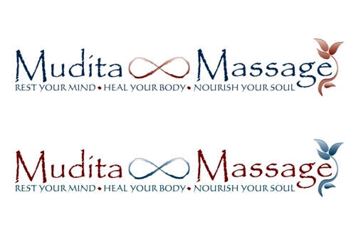
My Mom & my friend Karen are both voting for this logo, saying "I like this one best, because it is very centered and calming, and I really like the design. ..."
The impact of this one is staying with me. I really like the changes you made by softening the symbol and changing the font.
I like the softening of the infinity symbol. I really liked the original font. However, the new font works with the softening of the design. Is there a way to keep more of the brush stroke in the infinity symbol? The first big one was a little too choppy, but I don't want to entirely lose the hand painted feel. I like both layouts. My favorite of your submissions are this one, the very first one you submitted and the one with the green/more vines. I need to sit with this a little longer to let you know what I think will make the design both the most fitting for my purpose and the strongest (design wise). For me, it's about impact... not just the particulars. So if you get a wild idea, please feel free to throw it my way. You are definitely on the right track and up on the top of my list.

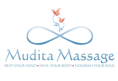
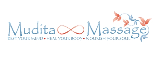
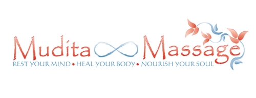
Hi...We softened the infinity symbol and also changed the top font to see how this looks...which layout have you preferred? Was the first font ok? How about the first entries with more vines?
Browse other entries from this Logo Design Contest
Browse other Logo Design Contest
Logo Design Contest: EliteTacticalMartialArts.com
Elite Tactical Martial Arts
$200.00 Prize
72 ENTRIES
Logo Design Contest: Palmistry for Living
Logo Design for Palmistry for Living
$100.00 Prize
67 ENTRIES


Logo Design Contest: FloristAndGifts.com
professional logo for floral industry
$200.00 Prize
270 ENTRIES
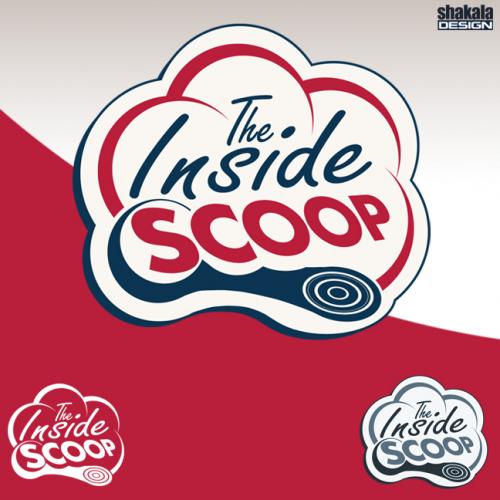
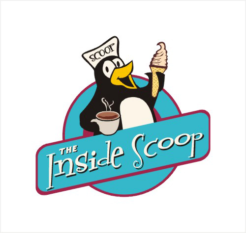
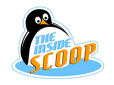
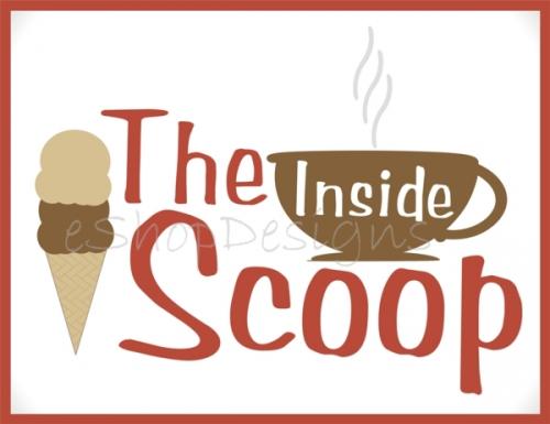
Logo Design Contest: The Inside Scoop
1950\'s Ice cream/coffee shop logo desig
$310.00 Prize
108 ENTRIES

Fast. Awesome. Affordable
About the Creative
45
45
125
Other entries by eShopDesigns:
Similar Entries