The DreamWorks logo is one of the most recognizable brand marks in the entertainment industry, appearing at the beginning of some of the biggest animated films of the past two decades.
The logo’s iconic image of a boy sitting on a crescent moon, fishing for stars with a pole, has been etched in the minds of audiences across the globe. But how did this logo come to be? In this article, we will dive into the history of the DreamWorks logo and explore its evolution over the years.
Who is Dreamworks?
DreamWorks Animation is an American animation studio that is a subsidiary of NBCUniversal, a division of Comcast. It is based in Glendale, California and produces animated feature films, television programs, and online virtual games.
The studio has currently released a total of 30 feature films, including Shrek, Madagascar, Kung Fu Panda, and How to Train Your Dragon. DreamWorks Animation was formed in 1994 as Feature Films for Families Inc., a joint venture between Pacific Data Images (PDI), the then-newly merged DreamWorks SKG (the live-action company co-founded by Steven Spielberg, Jeffrey Katzenberg, and David Geffen.
The DreamWorks logo is a multi-colored abstract design that features a black circle in its center. Founded by Steven Spielberg, Jeffrey Katzenberg, and David Geffen in 1994, DreamWorks SKG became one of the most successful film studios in history.
The company achieved this success due to its ability to combine high-quality films with innovative marketing strategies, with the logo being a core part of its marketing. The studio’s logo has changed over time but has always retained its circular shape.
DreamWorks’ first logo was simple, consisting of the company’s name written in white capital letters in a black box. This logo was used until 1997 when DreamWorks began creating animated films such as Shrek and Antz.
The History of Dreamworks Logo
The DreamWorks logo has undergone some changes over the years.
Read ahead to find out more about how it has evolved from 1998 to date.

Dreamworks Logo Between 1998-2004
The history of the DreamWorks logo between 1998 and 2004 is a fascinating tale of creativity, innovation, and evolution. In the mid-1990s, Steven Spielberg, Jeffrey Katzenberg, and David Geffen founded the studio to create a new kind of entertainment company driven by innovation and creativity.
The company’s name was first used on August 13th, 1994, when it was incorporated as DreamWorks SKG; however, it didn’t use this particular logo until 1996, when it began releasing movies under its label.
The first logo was text-only, consisting of the words “DreamWorks Animation” in two lines. The top line has the word “DreamWorks”, and the bottom line has “Animation.” Both words are elongated and separated by a solid black stripe. The font used for both words is corporate, which is usually the studio’s name.
However, in 1998, the studio began experimenting with new logo designs as they prepared to release their first animated feature film, “The Prince of Egypt.” They wanted a logo that would be dynamic, innovative, and reflective of their creative vision as a studio.

Dreamworks Logo Between 2004-2006
Between 2004 and 2006, DreamWorks Animation released several films, each of which featured a new and updated version of the studio’s iconic logo. While the basic design and concept of the logo remained the same, each new iteration featured unique elements that reflected the studio’s continued growth and evolution.
In 2004, DreamWorks released “Shark Tale,” which featured an updated version of the logo designed by Steve Frankfurt. However, the story of the DreamWorks logo during this period began much earlier, in 1998, when the studio first began experimenting with new designs and concepts.
Ultimately, the final version of the logo was developed by Industrial Light and Magic, a visual effects company that had worked with DreamWorks on several films. The Industrial Light and Magic team worked closely with Dave Carson and Clint Goldman of Kaleidoscope Films to refine the logo and ensure that it accurately reflected the studio’s identity and vision.
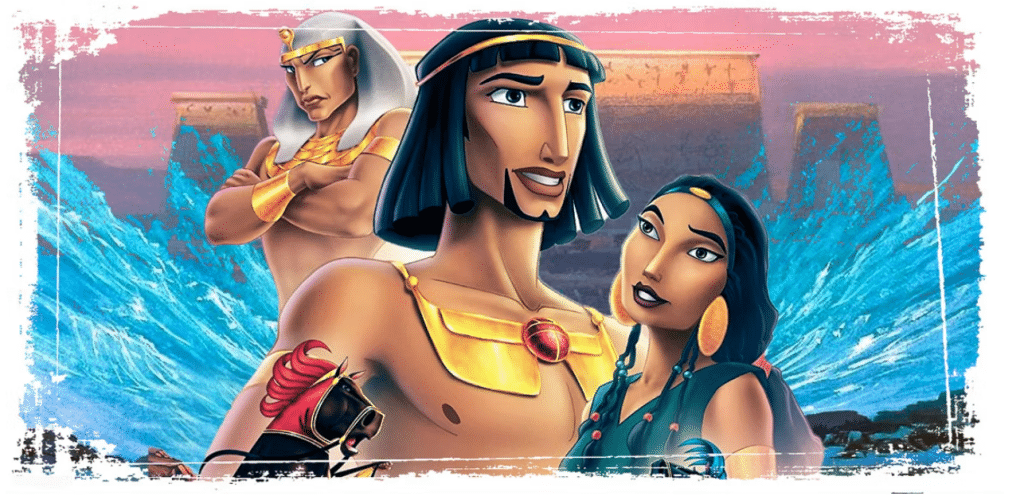
The new logo debuted in 1999 with the release of DreamWorks’ first animated feature, “The Prince of Egypt.” The film was a critical and commercial success, and the logo quickly symbolized the studio’s commitment to innovation and creativity.

At the time, Dennis Murren, a visual effects supervisor and filmmaker, suggested that the DreamWorks logo be recreated in painted form. Artist Robert Hunt was brought on board to create the new design, and he ultimately drew a boy sitting on a crescent moon fishing. The boy was chosen as the centerpiece of the logo because he represented innocence and the limitless potential of children, which aligned with DreamWorks’ vision as a studio.
The new logo was a significant departure from the previous design, which featured only text in a corporate font. However, the new logo was not without its challenges. The studio struggled to balance the painted aesthetic and the clean, modern look they were trying to achieve.
Over the next several years, the DreamWorks logo continued to evolve, with each new film featuring a unique interpretation of the original design. The logo for “Shark Tale,” which was released in 2004, featured a more stylized and playful version of the boy on the moon and a new tagline, “Catch the Wave,” which reflected the film’s oceanic setting and adventurous spirit.
The logo for “Over the Hedge,” which was released in 2006, was designed in-house by DreamWorks’ design team. The new logo featured a more dynamic and colorful look, with a more stylized depiction of the boy on the moon and a playful font for the DreamWorks name.
Overall, the history of the DreamWorks logo between 2004 and 2006 reflects the studio’s continued commitment to innovation and experimentation. While the basic design and concept of the logo remained the same, each new iteration featured unique elements that reflected the studio’s growth and evolution over time.
Dreamworks Logo 2007-2018
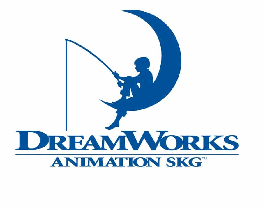
DreamWorks Animation’s logo underwent several changes between 2007 and 2018. In 2007, the studio unveiled a new logo with a more polished and refined look than its previous versions. The contours were cleaned up, resulting in a smoother and more modern appearance.
The 2007 logo also featured a change in the color palette, with the monochrome scheme being replaced by a calm, intense shade of blue. The blue was placed on a white background, adding a touch of calmness to the overall design.
In 2010, the logo was updated again to include a more prominent and animated version of the iconic boy fishing on the moon. The boy was given a more detailed appearance and was seen casting his fishing line into the clouds, adding a sense of whimsy and playfulness to the logo.
In 2013, the logo was updated once more to coincide with the studio’s 20th anniversary. This version featured a more streamlined and simplified design, with a larger and more prominent moon and boy fishing. The blue color was retained, but the shade was lightened slightly to give the logo a more open and airy feel.
Overall, DreamWorks Animation’s logo underwent massive changes over the 11 years, with each update adding a sense of refinement, playfulness, and modernity to the design. The 2007 logo, in particular, marked a significant departure from the studio’s previous designs, with its cleaner lines, brighter colors, and more polished appearance.
Dreamworks Logo Update From 2016 To Date
In 2016, the animators decided to change the boy in their emblem – he had previously looked like Tom Sawyer, but now he looks more like Woody from Toy Story. The artists also changed the color scheme: everything that was sky blue became white and vice versa.
The boy was corrected by removing the bend on his trousers and changing his face, which now has no protruding chin and a strand of hair sticking out at the top of his head. His forelock is also tousled, just like Tom Sawyer’s. They also removed two lines from the title and enlarged “DreamWorks”.
In 2019, DreamWorks Animation celebrated its 25th anniversary, which led to another logo redesign. This new logo features the same boy and crescent moon but has a more stylized design. The boy is now more detailed, and the moon has a gradient effect that gives it a more dynamic look. The words “DreamWorks Animation” are written in a new font, similar to the previous one but with some minor changes.
The new logo was also accompanied by a new opening animation sequence, which features the boy fishing in the moonlit waters. This new sequence replaces the previous one, which featured a series of characters from DreamWorks Animation’s films.
In 2021, DreamWorks Animation released a new logo to coincide with the launch of its new streaming service, Peacock. The new logo features the boy and crescent moon but with a simpler and more streamlined design.
The boy is now a silhouette, and the moon is a solid white circle with a blue gradient effect. The words “DreamWorks” are written in the same font as the previous logo but with a more minimalist design.
The new logo was also accompanied by a new opening animation sequence, which features the boy fishing in the waters as in the previous version. However, this new sequence has a more cinematic feel, with more detailed animation and an orchestral score.
DreamWorks logo has undergone several changes over the years, reflecting the studio’s evolution and commitment to innovation. The latest version of the logo and the new opening animation sequence is a testament to the studio’s ability to keep reinventing itself while staying true to its roots. With this new logo, DreamWorks Animation continues to captivate audiences with its bold characters, heartwarming stories and unparalleled storytelling techniques.
Why Dreamworks hasn’t changed its logo in 20 years

The DreamWorks logo, which dates back to 1994, is a classic. It’s simple, it’s memorable and it works. The company has been using the same logo of a boy sitting on a crescent moon fishing for 20 years, and it hasn’t changed in all that time.
The studio behind How to Train Your Dragon, Kung Fu Panda and Shrek has an iconic brand identity that people recognize instantly. Why haven’t they updated their logo? It turns out there are several reasons why the studio doesn’t change its logo:
It’s memorable
A memorable logo helps build a brand’s identity and makes it easy for people to recognize your business. When people see the DreamWorks logo, they know what kind of movies the company produces.
It’s timeless
A timeless logo can be used across different mediums over a long period of time without becoming outdated or irrelevant. The DreamWorks logo looks just as good on its website as it does on movie posters or DVD covers and has had the same effect ever since.
It’s consistent
A consistent design helps build trust with customers because they know what to expect from your business every time they see your logo or branding materials. When you consistently use the same color scheme and typeface in your marketing materials, customers start forming opinions about how trustworthy you are based on those elements alone. That’s what the DreamWorks logo has achieved over the years.
It’s simple
The company wanted to keep the design simple so it could be easily replicated on merchandise like t-shirts and toys. This helps them sell more products, which means more money for DreamWorks!
Conclusion
We have seen the evolution of the Dreamworks logo from a startup to one of the largest film production companies in the world. The original logo was designed by the founder, Steven Spielberg, and his friends Jeffrey Katzenberg and David Geffen. The logo was a hand-drawn image that looked like a little boy holding a huge pencil.
This image was used in all their films and became very popular among children and adults alike. However, the logo has undergone some changes as time passed to make it more modern. This new logo is still being used today. We hope you enjoyed reading about its history!
Check out these awesome Logo Contests run on Hatchwise:


