


When you think of athletic wear what brands come to mind? For some, it may be Nike, for others it may be New Balance, and for others it may be Adidas. Adidas’ three stripes have grown to be just as recognizable as Nike’s swoosh.
While most people know the Adidas brand when they see it, they don’t know how why the Adidas logo looks the way it does.
What was first developed in 1949 has evolved into the logo you see today. It has been through many modifications in an effort to be the foundation of a top sporting goods brand. To learn where it started, how it progressed, and why it looks like it does today, read on.
Are you ready? If so, keep reading below to learn more about how Adidas evolved and how its logo grew to be so iconic.
History Complete History of the Adidas Logo and the Brand
About Adidas
What many don’t know is that Adidas actually started in a washroom – that’s a true story, we promise! With humble beginnings, the brand has grown to be a multinational corporation. Today, Adidas is still headquartered in the town where the company was founded, in Bavaria, Germany. It is at this headquarters where Adidas directly produces and designs its athletic lines, including the well-known Adidas sneaker. What Adidas has done works and today the brand is the second largest athletic brand across the globe, only falling short of Nike.

Along with shoes, the company makes various accessories and clothes.
So, how did Adidas go from a washroom to global domination? The answer is all thanks to Adolf “Adi” Dassler. After World War I, in the 1920’s, Adi and his brother, Rudolf, created the Dassler Brothers Shoe Factory. Close in age, Rudolf Dassler was born in Germany in 1898, and Adolf was born in 1900.
Adidas’ first introduction to fame was during the 1936 summer Olympics. It was then that Jesse Owens, a sprinter from the United States, decided to wear athletic sneakers that Adi designed. His performance was phenomenal, winning the Olympian a gold medal four times and earning him an Olympic sponsorship, the first African-American in history. After that, Dassler’s shoes hit it big.
At first, the Dassler brothers the two brothers worked together well. But it wasn’t to last.
The War began, and during heavy drafts, the German government deemed Adolf a useful shoemaker, allowing him to avoid service and continue to make shoes. The same courtesy wasn’t given to Rudolf. According to citizens of the time, Rudolf was extremely upset about this, and Rudolf believed that his brother was more than happy to continue making money from their business while his life was on the line.
The brothers became disconnected with one another. The war caused part of their rift, as did the negative relationship of their wives. It came to the point where they couldn’t even be in the same room with one another.
In fact, the Dassler brothers’ rivalry would divide a whole town.
When the Dassler brothers were separating, nearly everyone in the small town of Herzogenaurach was employed by the two companies. Negotiations between the brothers split earnings, equipment, and employees, causing rifts among the townsfolk.
In 1947, the brothers officially split up, with Rudolf forming Ruda (that would later become Puma) and Adolf registering the brand as we know it today, which came from an acronym of his first and last names, as Adi was a nickname for Adolf. Thus, he adopted the “Adidas” signature name fans recognized.
Adi held on to the company that he founded up until 1987. It was during this year that Adi decided to part ways with his company, selling it to Bernard Tapie, a French investor. With Adi removed from the everyday operations, Bernard decided to increase the production of the Adidas shoe line. As production ramped up, Bernard struggled to keep up with the added costs and the interest on his purchase loan. So, as a result, Tapie sold Adidas to Robert Louis -Dreyfus.
After Adi first sold the company, Adidas shifted ownership many times until it was under an owner that could strategically help its growth. Today, Adidas belongs to the Adidas AG holding company is led by Bjorn Gulden, the current CEO. In the current market, the company works with the NFL, the NBA, and other sports leagues, providing them with apparel, as well as fashion collaborations, such as Gucci. On March 31, 2023, Adidas AG reported generating a one-year revenue of $23.43B.
Along the way, the company has used its clever marketing tactics and the popularity of its designs among top athletes and celebrities to achieve even more success.
Only falling short of Nike, Adidas has grown to be highly recognizable across the globe in the athletic wear space. The company has recently challenged the industry giant footwear and sportswear brand Nike. Adidas has been able to attract new customers while many of its competitors have struggled. What has kept Adidas going all these years is its response to marketing, its applicable brand messaging to the everyday person, its commitment to sustainability, and its cutting-edge designs.
Adidas’s Logo Over Time
While Adidas’ logo revisions have been sporadic, the brand’s logo has gone through some occasional updates.
However, an interesting note about the brand is that they never retire a logo but instead use all four in different product lines and collections.
The Original Logo for Adidas (1949)

When the company first began with the brand and logo of the Dassler Brothers, it just sold sports’ shoes. Over time, their sales grew until they reached 200,000 pairs sold in 1924. The logo that was used for their
original brand was the shape of a shield. On the shield, a Dassler Brothers shoe was being carried by a flying bird.
The original 1949 logo for Adidas featured the only thing he sold at the time, a shoe. A track and field spiked shoe with the signature Three-Stripes sat between the two extended tails of the letter Ds in Adidas. “Sportschuhe,” which is a “sports shoe” in German, was written under the name Adidas, and the logo frequently appeared in a shade of blue that’s considered a classic color for the brand.
They also chose to use lower-case letters for the name of their company, making a brand statement that the company was laid back. This became a hallmark of Adidas, and in fact, across the content on their site, their name is never capitalized.
This logo, along with the Three-Stripe trademark design that started to show up on every shoe, and eventually on apparel, was and is the foundation of the brand.

Those signature stripes weren’t an accident or chosen because of their meaning. Dassler ended up choosing them to go on the first pair of Adidas shoes when he tested several versions and found that the three showed up the best in photography.
For an up-and-coming sports gear brand hoping to gain attention and brand recognition, that’s essential. While these three stripes was a new design element, it was one that caught the attention of consumers and is an element we still see today.
With the launch of Adidas, it was discovered that shoe company Karhu Sports already had a logo that resembled the Three-Stripe design used by Dassler. To resolve the dispute, Dassler purchased the trademark from Karhu Sport for just 1,600 euros at today’s rate and two bottles of whiskey because the owner was hard up for cash.

Adidas’s Logo from 1980-81
A new logo was added in 1972 when Adidas branched out from selling shoes to manufacturing sporting apparel for the first time. This is when the company first established the Trefoil. The three-leaf-shaped foil design was crafted by German designers and leaders in the Adidas company. This design remained consistent with Adidas’s notoriety as the brand with the three stripes, and that image itself was present as the Three- Stripes design runs through the leaves.
During this time, Adidas were sold in Asia, Europe, and North America. These continents were honored on the logo, each one represented by a leaf. Thus, the logo was a representation of the growth of Adidas; three leaves for three continents.
Adidas wasn’t just for athletes at this point, either. Other celebrities, particularly in the music space became supporters of this brand. It was common to see musicians like The Doors, The Sex Pistols, Bob Marley, and David Bowie wearing an Adidas sneaker.
This Adidas logo was on clothing from 1972 and shoes from 1976 onward. Since 2000, it became reserved for all Originals products, and the company states that it’s designed to “pay homage to the heritage of the brand.”

The 1990s Adidas Logo
In 1989, a visionary designer and creative consultant worked with Adidas to create a new logo for the new era in pop culture and fashion. The brand created the unique Adidas Equipment logo inspired by Adidas’ commitment to equipping athletes with the best gear. The designers created this mark when they sketched how the famous three stripes looked when seen from the inside of an Adidas shoe. The new Equipment logo, publicized in 1991, showcased the Three-Stripes design in a three-bar arrangement, with the words “Adidas EQUIPMENT” just below the icon in an Adidas sporting green color.
This logo is one of the most familiar to consumers because it has since been adapted for use as part of several logo marks for the brand, such as the Badge of Sport, they launched in 1996. In this logo, the Three- Bars design was combined with the Adidas wordmark. With this update, the three stripes and the Adidas name became interchangeable.
The stripes shifted to this new slight angle and created a bold mountain-like icon, which was frequently associated with obstacles to overcome during your work to achieve your athletic goals.
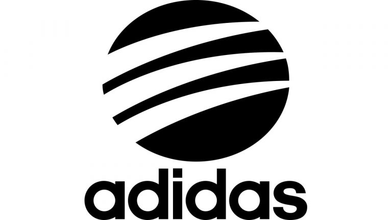
The 2002 (Current) Adidas Logo
In 2002, the brand contained the stripes in a circle. It was made to resemble a mark made by an animal. The tell-tale three marks of Adidas run over the surface of the circle, arching and reducing in size as they move up and reach the right side. The logo remains two-dimensional and on a single plane. Known as the logotype, this is the common logo still used today for Adidas products and brand.
While the logo has gone through various iterations, the logo hasn’t ever drastically changed. You’ll still see many of its classic logos in use on various lines. Whatever logo you’re looking at, you’ll always see the traditional Three-Stripes design in one form or another.
Adidas Logo Key Elements

1. Three Stripes
- Three Stripes
The three stripes are the common element that is found across all of their product lines. These three stripes have become synonymous with the Adidas brand.
2. Trefoil
Adidas uses the trefoil shape in conjunction with the three-stripes design for their line of more laid-back shoes and apparel, known as the Originals. It still features the three stripes from the classic design, but this more artistic logo holds a special place among the logo interpretations.
3. Bar
The Adidas line, Performance, uses the Bar emblem. It resembles a mountain and is the foundation of this athletic line because it almost evokes the progress bar on a treadmill and connects to the uphill journey toward athletic achievement.
4. Circle
Adidas’ Style line features a unique collaboration between the company and designers. This line uses the Circle logo, which is a stylized version of the classic logo and lends itself to the fashionable, trendy feel the collection is about.
A Note About Colors
Like many fashion and apparel brands, Adidas’ choice to maintain a monochromatic color pallet for its official logo allowed the company to recreate the symbol in a range of shades for whatever unique situation they use it in.
Throughout the years, Adidas shoes and apparel have shown off several multi-colored versions of the logo. In fact, for a decent chunk of time, the color blue was often associated with Adidas.
Today, for the sake of branding, a black logo image with a black font on a white background is the official brand coloring.
Lesson from the Adidas Logo

- Simplicity: Adidas focuses on making a memorable punch with no fanfare. Minimalist designs, combined with an easy-to-read brand name, create a clear and instantly recognizable logo.
- Flexibility: Most of the time the Adidas brand is seen in black and white, but that’s not to say that is the only color the brand has used. The simplicity of the logo allows for it to also be flexible with its color scheme. Sometimes the logo is depicted in black or white, and other times it is depicted in red, green, or another color. However, it never loses its simplicity because the logo is typically always monochromatic.
- Impactful messaging: Adidas is smartly using its logo to communicate its values. Each logo evokes the brand’s quality, strength, and perseverance.
- Visibility: Many accomplished athletes and even celebrities trust the Adidas brand. You’ll see the clothing and shoes on various famous individuals, from Muhammad Ali to Beyonce. Their use of the brand’s products acts as incredible word-of-mouth promotion, bringing awareness of the products and brand to current and future customers.


