

- BACK TO CONTEST
- CREATIVE BRIEF
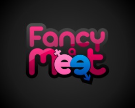
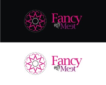
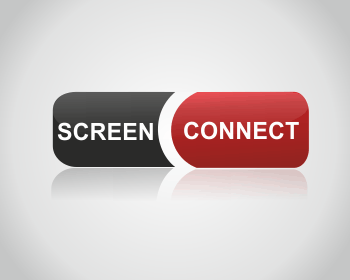
- ENTRY # 329178


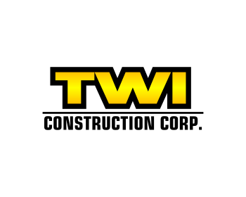


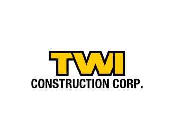

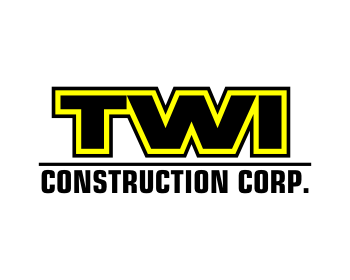
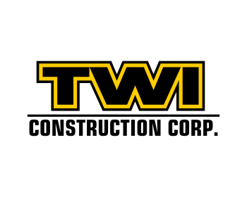
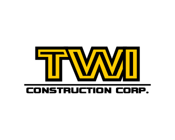


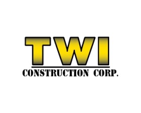
Comments for entry # 329178

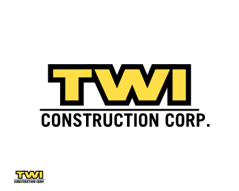
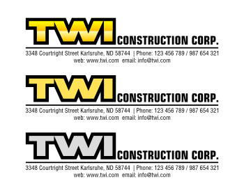
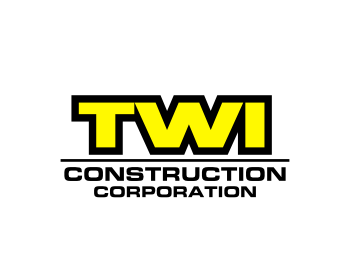
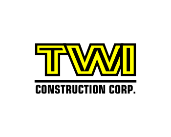
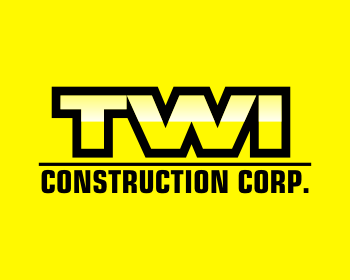
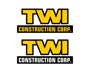
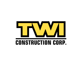
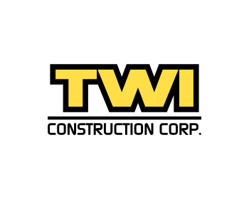
touching letters are the best thing here
CAN YOU TELL ME WHY?
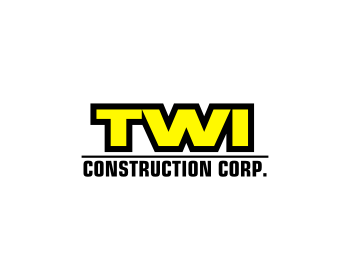
TWI should not touch
*it makes logo more logo not just a text
and why not letters should not touch eachothers? it makes logo more log nut just a text
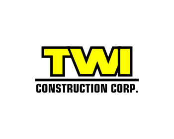
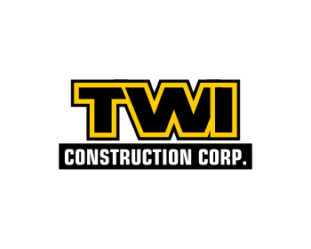
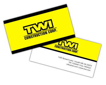
oh and check this out: http://dl.dropbox.com/u/9093791/twilogousage.png
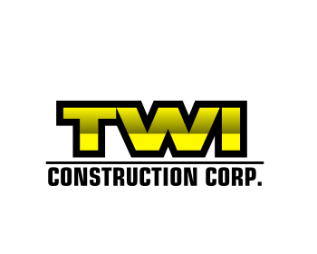
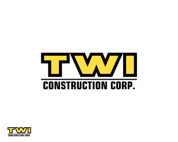
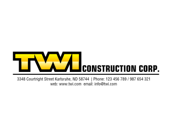
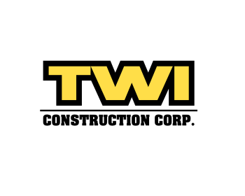
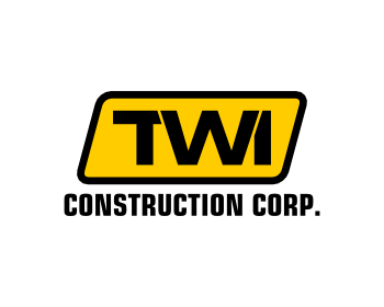
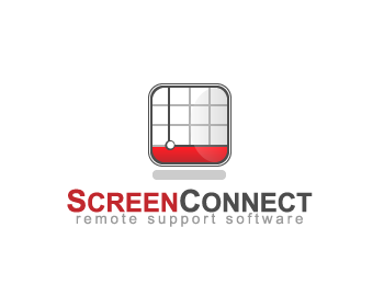
it is allways good when logo works well in small size too . the logo you see bottom left corner is about 5 mm in height thats the reason i havent used small details in logo
Browse other entries from this Logo Design Contest

Browse other Logo Design Contest


Logo Design Contest: Fancy a Meet
Logo Design for Swingers Website
$100.00 Prize
57 ENTRIES


Logo Design Contest: www.screenconnect.com
Logo Design for remote support software
$250.00 Prize
308 ENTRIES

Fast. Awesome. Affordable
About the Creative
61
61
489
plasticity Bio
...
Other entries by plasticity:
Similar Entries