

- BACK TO CONTEST
- CREATIVE BRIEF
- ENTRY # 328943


Comments for entry # 328943

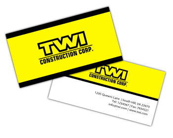
separation? you mean more space between the letters?
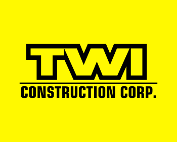
winning designer should provide logo in shade colors and in plain colors so you can use both of them. depends where you use them.
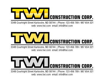
Ok. If i can see it with a separation between the TWI.
and yes printcost is cheaper too if only plain colors are used
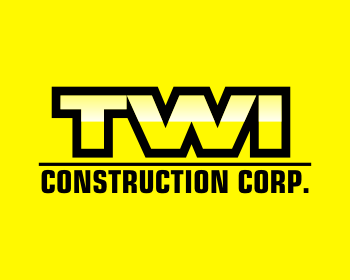
without shading shadin can be good if you use it on web. but when you start to use it in print media or example car decals its better to use plain color. but for web it is ok to use more colors and shadings. but shading should look good i tried the black shading but it made the design not clean very muddy feeling IMO thats why i used different shades of yellow for my shadings. I am not sure what yellow color you like maybe you have a color example that you think is the right one for plain color version?
Browse other entries from this Logo Design Contest


Browse other Logo Design Contest


Logo Design Contest: Fancy a Meet
Logo Design for Swingers Website
$100.00 Prize
57 ENTRIES


Logo Design Contest: www.screenconnect.com
Logo Design for remote support software
$250.00 Prize
308 ENTRIES

Fast. Awesome. Affordable
About the Creative
61
61
489
plasticity Bio
...
Other entries by plasticity:
Similar Entries