

- BACK TO CONTEST
- CREATIVE BRIEF
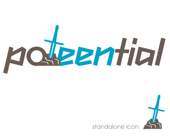
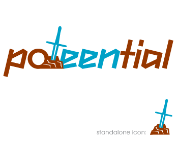
- ENTRY # 856601
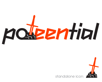
Comments for entry # 856601
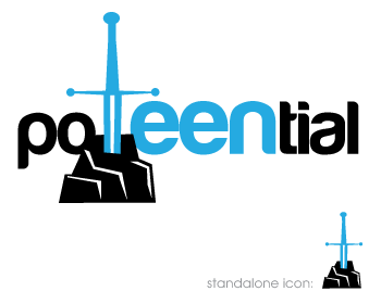
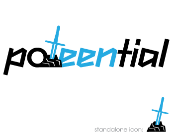
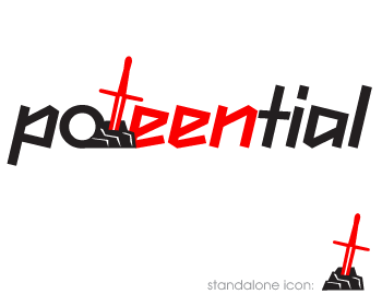
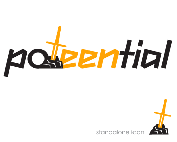
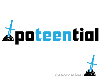
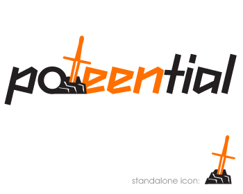
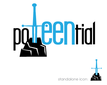
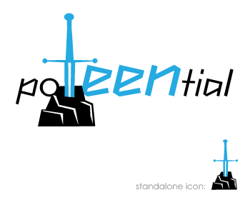
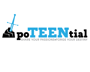
These are the ones that I liked the best. I still need to consult with the team about more feedback, but for now i'd like to see the sword and the stone blend in with the font as much as possible. Making all the letters the same size, and the sword/stone much smaller so that the letters are level with the bottom of the rock, so the sword and the stone can stand out. Angling the sword is cool, I'd like to see if that works in the text as the 't' also would like to see a couple variations of the sword, without the circles. I really like this concept, but it's only going to work if it is as slick and subtle as possible. Thank you for all your submissions!
Browse other entries from this Logo Design Contest
Browse other Logo Design Contest
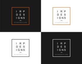
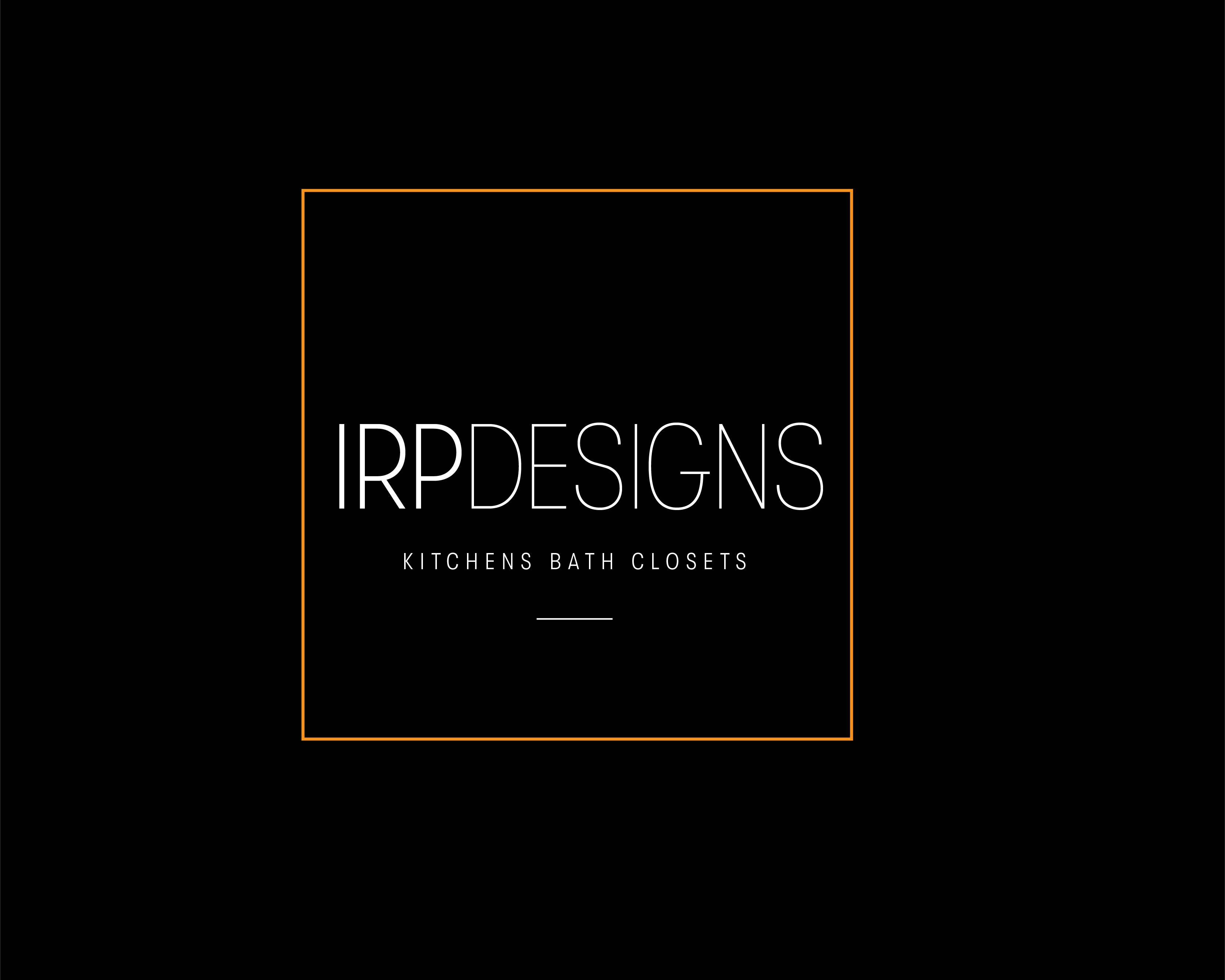


Logo Design Contest: IRP DESIGNS
re doing and modernize the current logo we have.
$150.00 Prize
439 ENTRIES
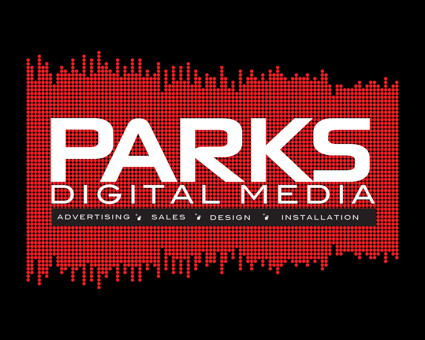
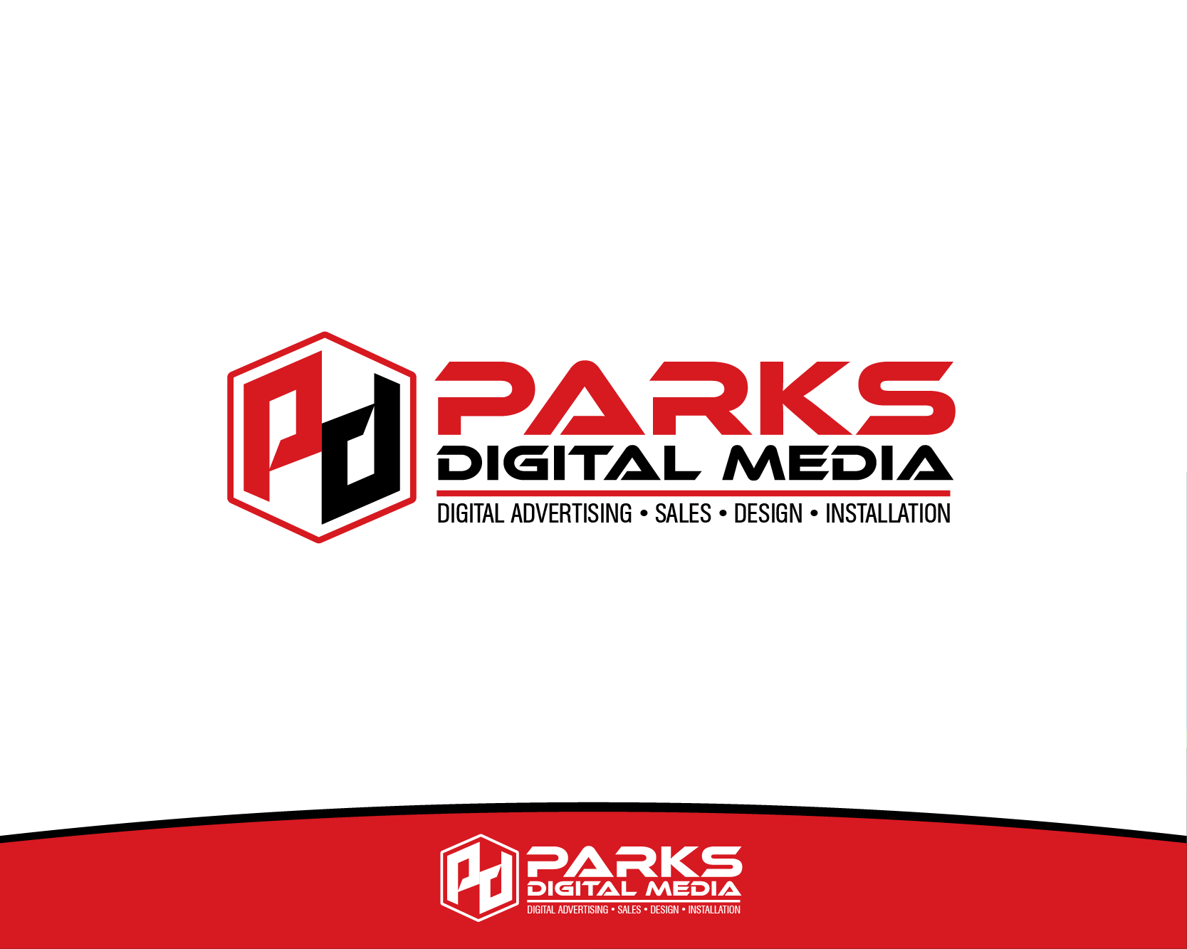
Logo Design Contest: Parks Digital Media
Fresh New Ideas for Digital Advertising
$210.00 Prize
318 ENTRIES


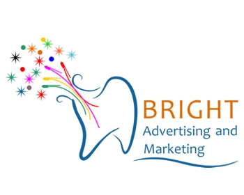

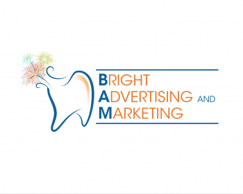
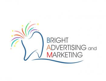
Logo Design Contest: Bright Advertising and Marketing
Logo for a dental marketing agency
$200.00 Prize
98 ENTRIES


Fast. Awesome. Affordable
About the Creative
142
144
605
john12343 Bio
I am an Illustrator and Designer living in Los Angeles. I work for a nonprofit org full time.
Other entries by john12343:
Similar Entries