

- BACK TO CONTEST
- CREATIVE BRIEF
- ENTRY # 856393
Comments for entry # 856393
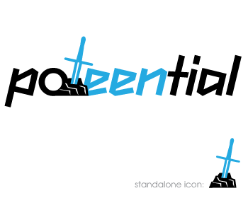
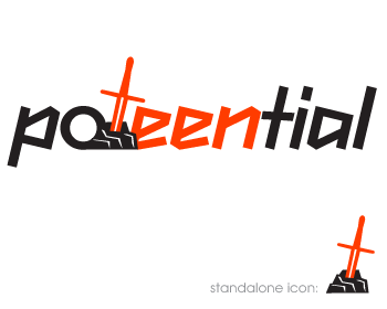
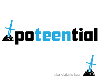
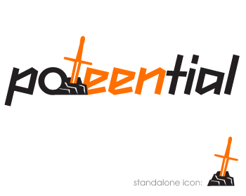
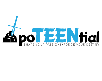
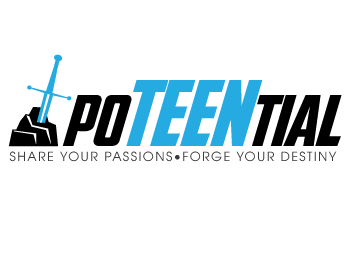
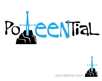
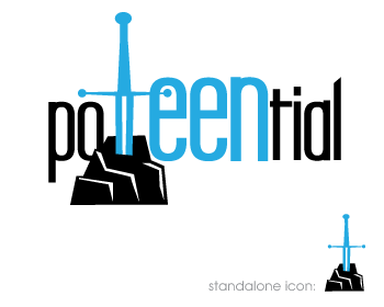
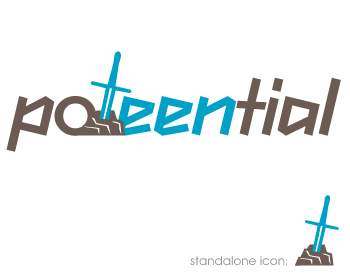
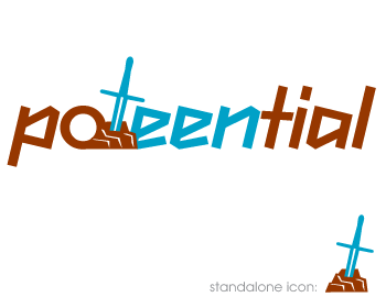
Cool concept! Love the symbolism. Your tagline is absolutley congruent with our organization, but it seems that the font and the symbol don't allign,especially if we didn't use that tagline. If there was a more "rockstar" or "edgy" font to go with the symbol, or if a sword and stone could be incorporated into the font, that would be awesome. Thank you!
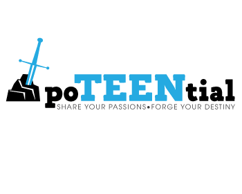
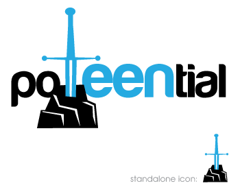
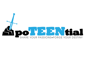
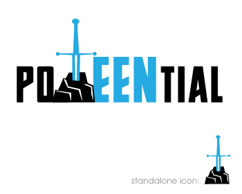
Hi. Here is my first attempt at a logo design for you. Arthur was 15 or so, when he pulled the sword from the stone, depending on which account you look at. So this seemed like a potential powerful symbol what your site is meant to achieve. Let me know your thoughts. Best regards, Matthew
Browse other entries from this Logo Design Contest
Browse other Logo Design Contest


Logo Design Contest: IRP DESIGNS
re doing and modernize the current logo we have.
$150.00 Prize
439 ENTRIES
Logo Design Contest: Parks Digital Media
Fresh New Ideas for Digital Advertising
$210.00 Prize
318 ENTRIES


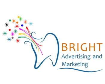

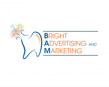
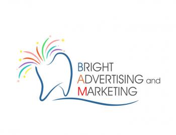
Logo Design Contest: Bright Advertising and Marketing
Logo for a dental marketing agency
$200.00 Prize
98 ENTRIES


Fast. Awesome. Affordable
About the Creative
142
144
605
john12343 Bio
I am an Illustrator and Designer living in Los Angeles. I work for a nonprofit org full time.
Other entries by john12343:
Similar Entries