

- BACK TO CONTEST
- CREATIVE BRIEF
- ENTRY # 144483


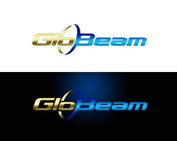
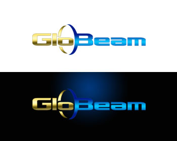


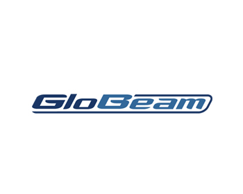


Comments for entry # 144483
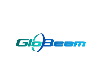
I like this one a lot but would ask if you think it still works if you start from a light blue on the G that gets darker as it moves towards the right to the m. I see that you're starting from the darker blue on the right side of the circle next to B so maybe it doesn't work as I described. Please try using a slightly darker blue to start and make it so it gets darker to become a royal blue.The only current concern is that the blues are a bit too light, please try some variations of different blues, light, dark, marine, navy, turquoise. Great work!
Browse other entries from this Logo Design Contest

Browse other Logo Design Contest


Logo Design Contest: AdultTurnkeySuperstore.com
Looking for unique, cutting edge design
$450.00 Prize
122 ENTRIES


Logo Design Contest: Accelerated Claims Inc.
Accelerated Claims Inc. Logo upgrade!
$300.00 Prize
50 ENTRIES

Fast. Awesome. Affordable
About the Creative
6
6
27
Other entries by boss88:
Similar Entries