

- BACK TO CONTEST
- CREATIVE BRIEF
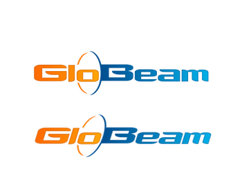
- ENTRY # 144343
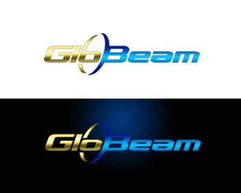
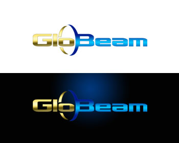
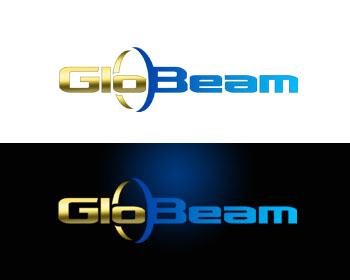


Comments for entry # 144343

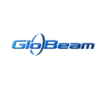
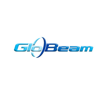
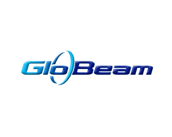
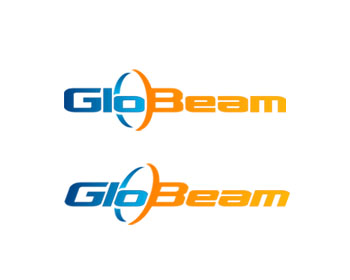
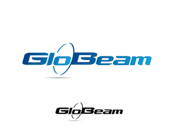
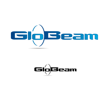
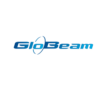
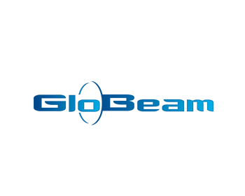
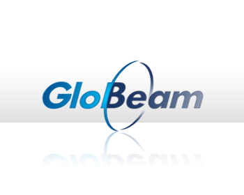
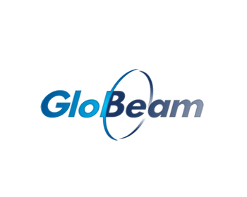
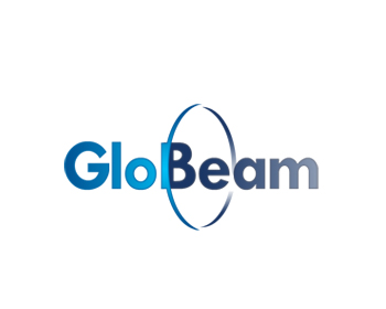
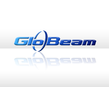
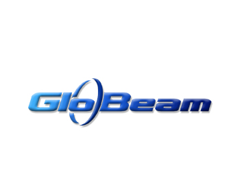
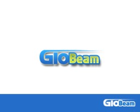
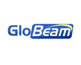
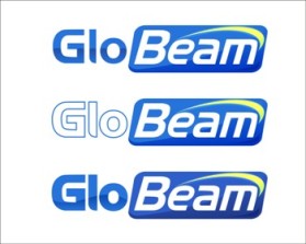
i am sorry .my english is bad. 1. G similar with G in (g)oogle , Yes?., only G with in embossed (3d) or Glo, maybe , GLO 2. sorry, i think, space between The B and ring, is not good :), sorry, i think,
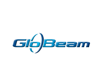
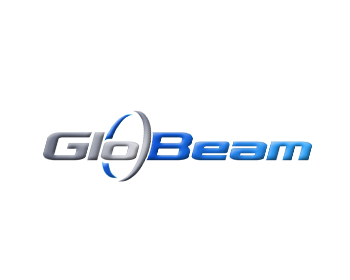
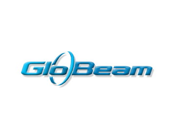
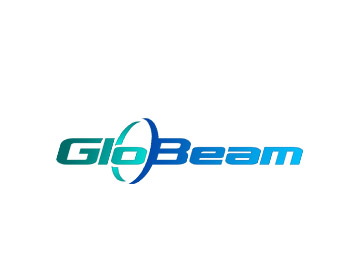
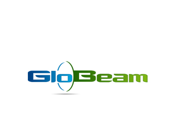
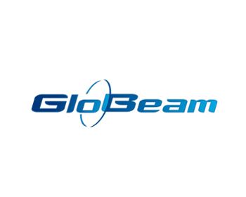
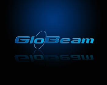
Please try starting with the lighter blue you're showing on the m with the G and try to apply the color and 3d gradient effect that is used on the G in Google's logo. Please also create a little more space between the B and the ring so that they're not touching. I really appreciate your efforts to show the various color combinations but I'm still struggling to pick one that I like. Let's try using different shades of blue as I previous mentioned. Thanks for your patience.
Browse other entries from this Logo Design Contest
Browse other Logo Design Contest


Logo Design Contest: AdultTurnkeySuperstore.com
Looking for unique, cutting edge design
$450.00 Prize
122 ENTRIES


Logo Design Contest: Accelerated Claims Inc.
Accelerated Claims Inc. Logo upgrade!
$300.00 Prize
50 ENTRIES

Fast. Awesome. Affordable
About the Creative
6
6
27
Other entries by boss88:
Similar Entries