

- BACK TO CONTEST
- CREATIVE BRIEF
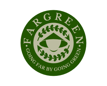
- ENTRY # 794047


Comments for entry # 794047
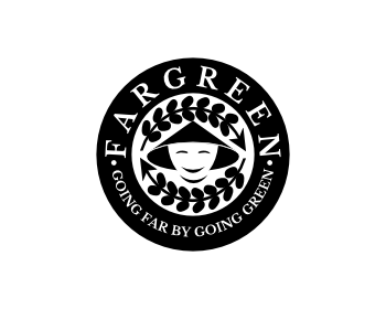
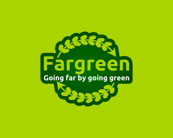
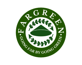
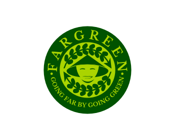
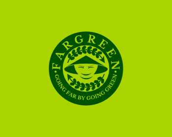
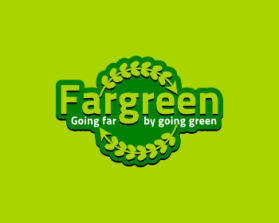
Also, one important comment is that the logo some how looks "locked" or crowded. Maybe you want to reduce the ratio of the rice plant or the circle so it's more pleasant to the eyes as well. Thanks.
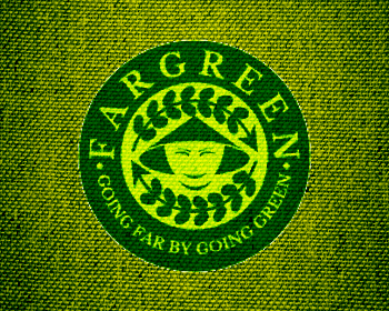
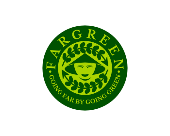
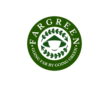
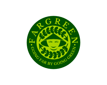
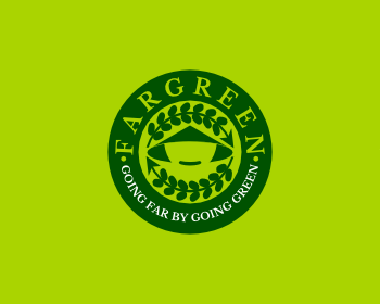
Hi Friend. A lot of my friend like the round one (#993870, but think the colors should contrast more (lighter yellow and darker green) and lose the facial features, just have the silhouette of the traditional Vietnamese hat. Can you make that one separate entry? thanks.

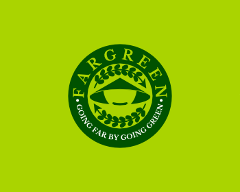
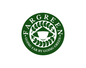
black and white version
Browse other entries from this Logo Design Contest


Browse other Logo Design Contest
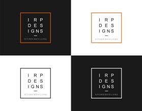
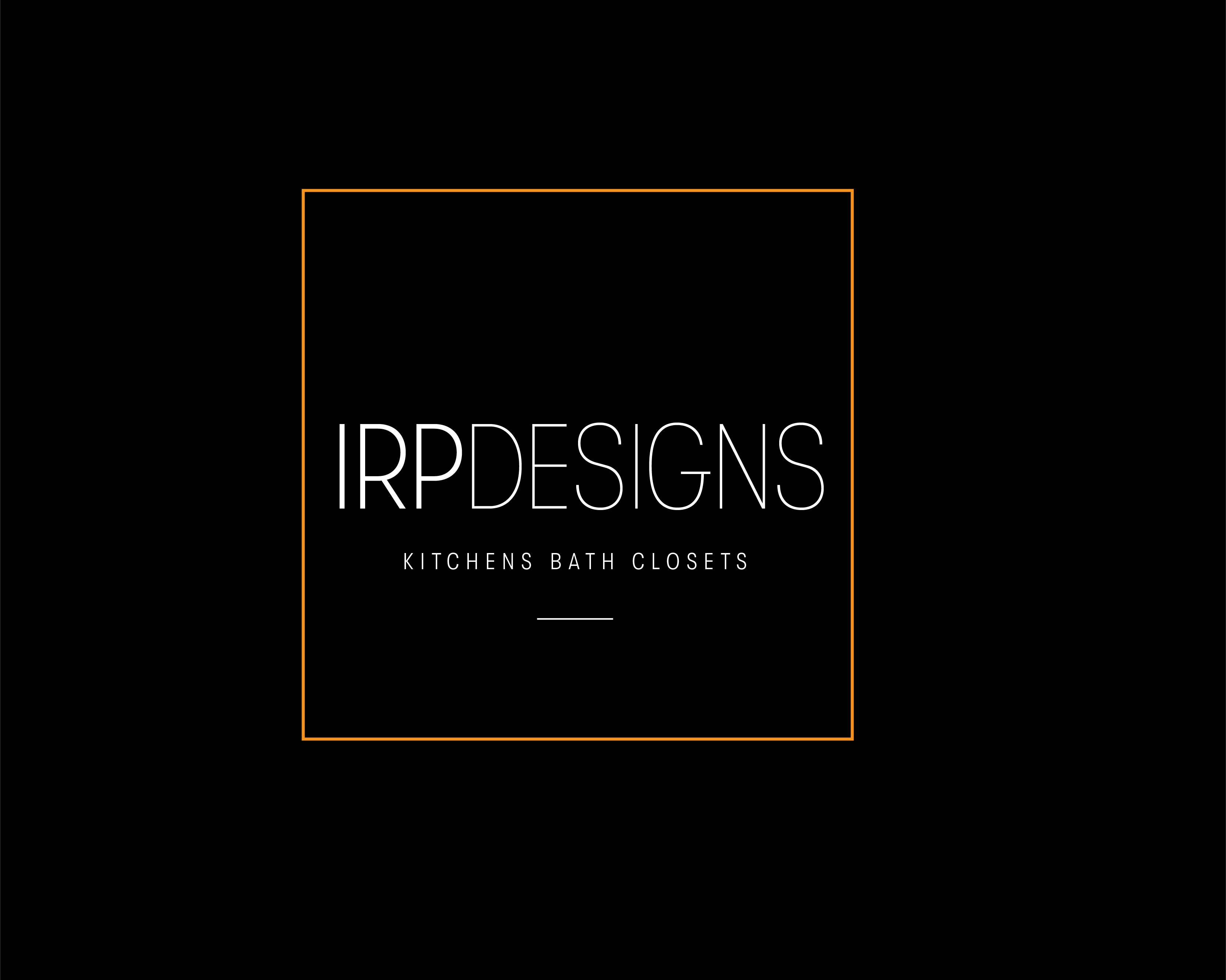


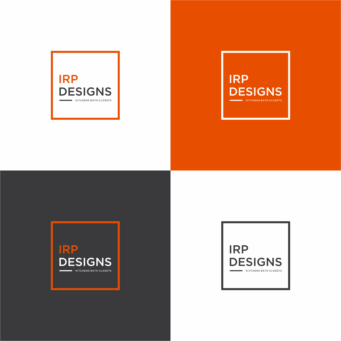
Logo Design Contest: IRP DESIGNS
re doing and modernize the current logo we have.
$150.00 Prize
439 ENTRIES

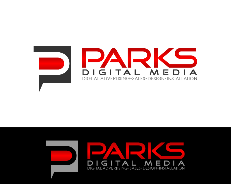
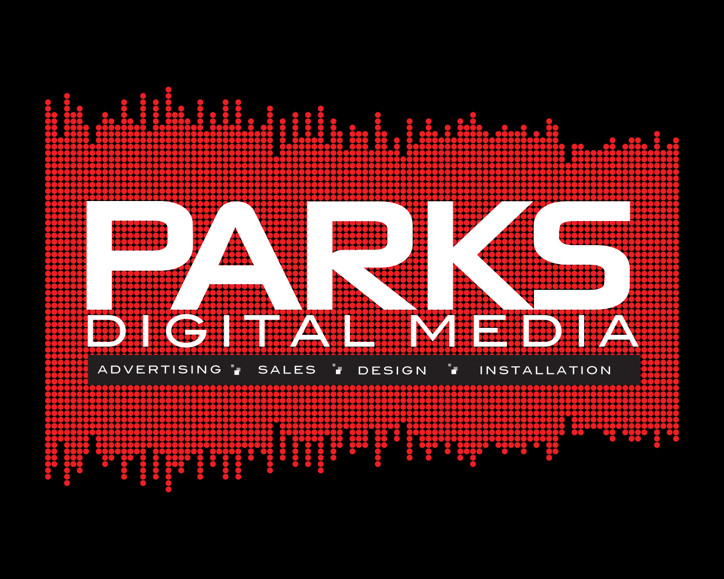

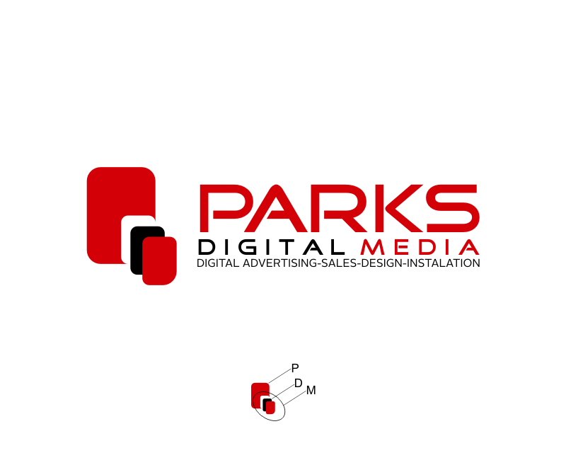
Logo Design Contest: Parks Digital Media
Fresh New Ideas for Digital Advertising
$210.00 Prize
318 ENTRIES


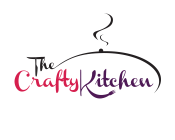
Logo Design Contest: The Crafty Kitchen
Elegant Logo for The Crafty Kitchen
$110.00 Prize
126 ENTRIES

Fast. Awesome. Affordable
About the Creative
61
61
489
plasticity Bio
...
Other entries by plasticity:
Similar Entries