

- BACK TO CONTEST
- CREATIVE BRIEF
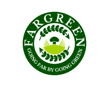
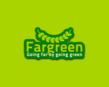
- ENTRY # 792664


Comments for entry # 792664

font is different from #792465 difference between the #792665, #792664 , #792562 is that #792562 has ike a black shadow under the text and the emblem itself. #792664 dont have that and #792665 has darker and bit gradiented drk green emblem. it looks very good I think.
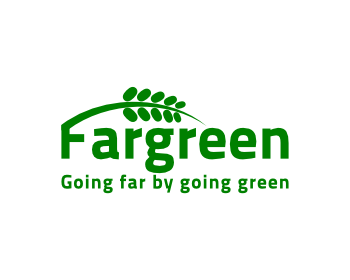
what's the difference between this and the other similar one you posted earlier?
Browse other entries from this Logo Design Contest


Browse other Logo Design Contest
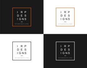


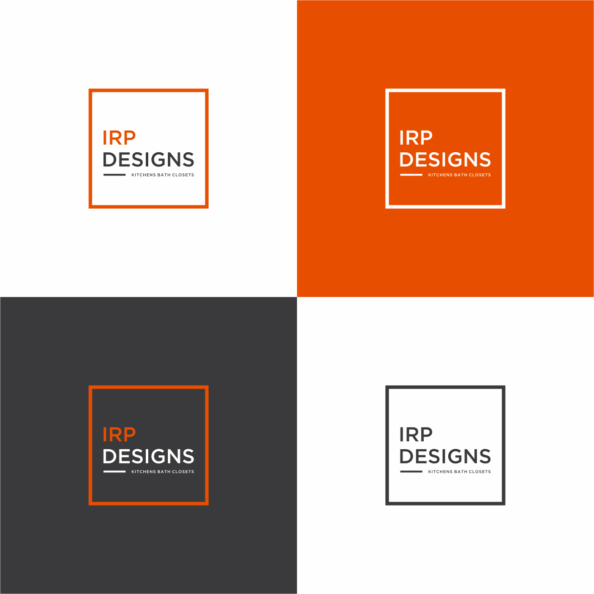
Logo Design Contest: IRP DESIGNS
re doing and modernize the current logo we have.
$150.00 Prize
439 ENTRIES


Logo Design Contest: Parks Digital Media
Fresh New Ideas for Digital Advertising
$210.00 Prize
318 ENTRIES


Logo Design Contest: The Crafty Kitchen
Elegant Logo for The Crafty Kitchen
$110.00 Prize
126 ENTRIES


Fast. Awesome. Affordable
About the Creative
61
61
489
plasticity Bio
...
Other entries by plasticity:
Similar Entries