

- BACK TO CONTEST
- CREATIVE BRIEF
- ENTRY # 24968


Other entries by eShopDesigns (12)
Comments for entry # 24968
timechime
Mar 18, 2009 03:03 AM
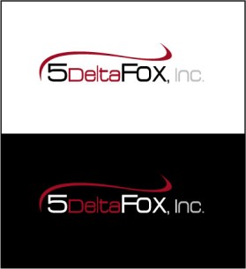
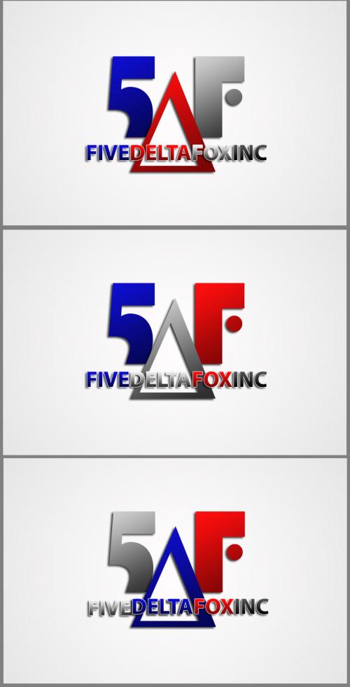
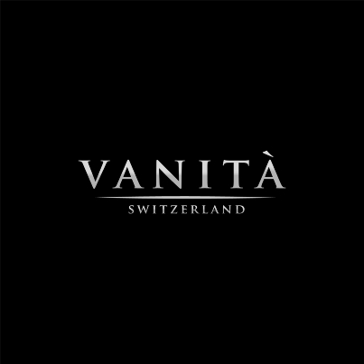
The rounded works. I'd like to see the vertical gray line between the icon and the name disappear and the icon brought closer to the name. I'm assuming the lower large icon is simply for me to see the detail and it isn't part of the logo.

eShopDesigns
Mar 17, 2009 03:03 PM
Hi, we rounded the edges a bit more and went with the third font from entry #24833. Let us know if you want to see any other changes. Thanks!
Browse other entries from this Logo Design Contest


Fast. Awesome. Affordable
About the Creative
45
45
125
Other entries by eShopDesigns:
Similar Entries