

- BACK TO CONTEST
- CREATIVE BRIEF
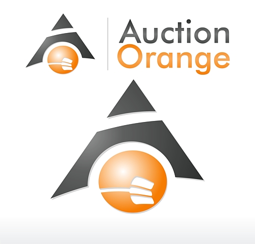
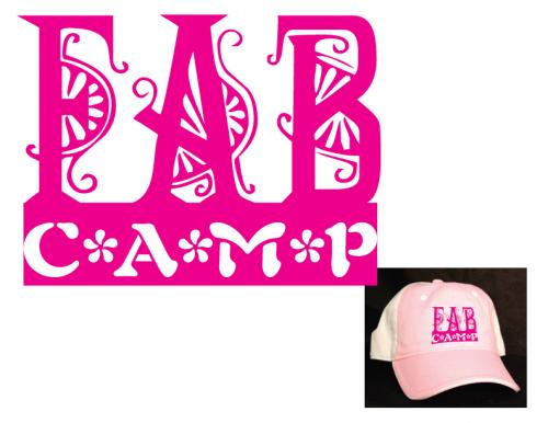
- ENTRY # 24712
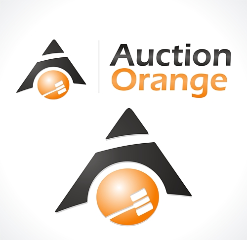
Comments for entry # 24712
Nice. I like the other font better. Because it is sort of distorted and oriented horizontally, I initially didn't catch the gavel. Maybe take some of the distortion out of it and orient it more diagonally.

Hi, thanks for the rating and feedback. We have added a auction gavel with the illusion that it's slamming down, to give a bit of action to the design without making it look too busy. Let us know what you think.
Browse other entries from this Logo Design Contest


Fast. Awesome. Affordable
About the Creative
45
45
125
Other entries by eShopDesigns:
Similar Entries