

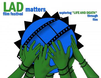
Logo Design Entry # 340381
by nrj-design- BACK TO CONTEST
- CREATIVE BRIEF
- ENTRY # 340381


Comments for entry # 340381
Really nice, thanks for making it clearer, this design rocks!... My only comment on this would be that using the grey for "security" makes that word disappear slightly in the globe... I like the matching to the tag line colors, but maybe all text in the globe needs to be green? maybe a gradient across the green?
Browse other entries from this Logo Design Contest


Browse other Logo Design Contest
Logo Design Contest: Nova Flavors & Ingredients
Flavor & Fragance Company Logo Design
$300.00 Prize
290 ENTRIES
Logo Design Contest: LADmatters film festival
LADmatters film festival logo
$100.00 Prize
48 ENTRIES


Logo Design Contest: Durango Wealth Management, LLC
Logo, business card design
$125.00 Prize
54 ENTRIES

Fast. Awesome. Affordable
About the Creative
4
5
37
Other entries by nrj-design:
Similar Entries