


The first fast food chains that changed the future of what “quick-service” food could consist of were hamburger chains. What started as McDonald’s, grew to Burger King and Wendy’s. These hamburger chains revolutionized the way Americans could purchase meals on the go.
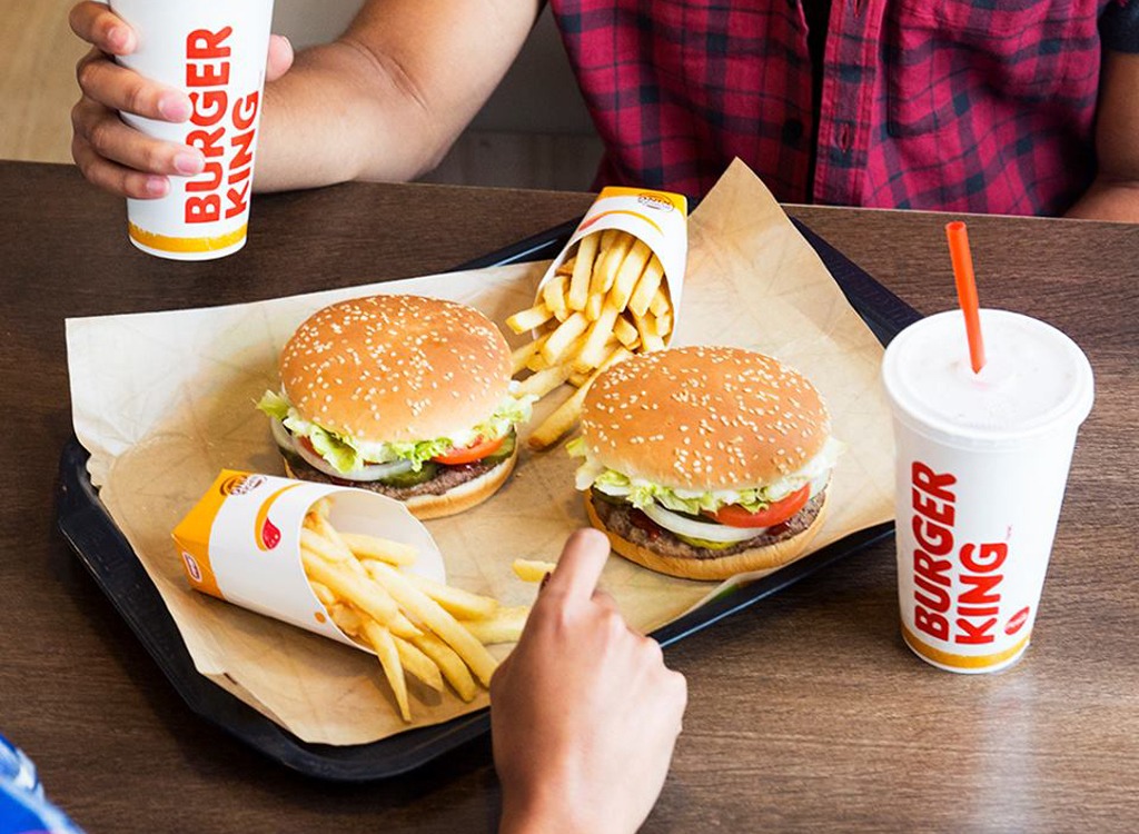
For this article, we’re going to focus on one of those three chains – Burger King. Burger King’s menu spans from cheeseburgers (aka their iconic “Whooper”) to onion rings, to even chicken fries. Whatever your Burger King menu preference is, it’s worth looking at the brand behind those offerings.
To learn more about this staple fast food chain’s evolution and how its logo came to be, keep reading below.
Meet Burger King
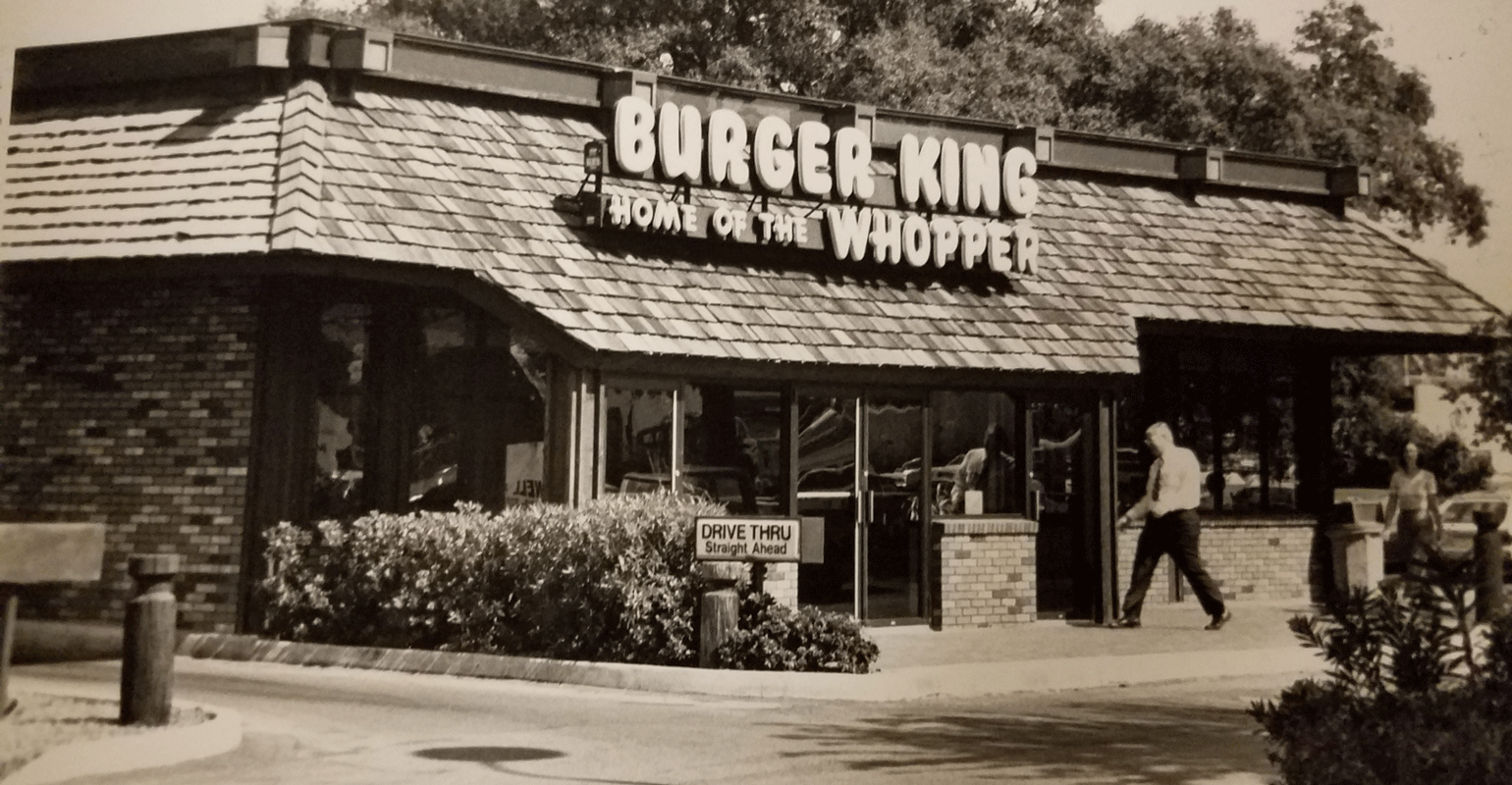
Founded in Jacksonville, Florida, Burger King’s first location was called “Insta-Burger King.” What drove this name was the shop’s use of the Insta-Broiler, which could cook up burgers fast – and these burgers would be the same burgers that Americans adored. To launch the Burger King brand, two business partners, David Edgerton and James McLamore, purchased Insta-Burger King in 1953. From there, the duo expanded the brand under this new name, and it wasn’t long before the company’s first signature menu item was introduced, the Whopper.


Today, you can still find the Whopper on Burger King’s menu (or the Whopper Jr. if you’re looking for a smaller size version), but their menu covers so many more items. To stay competitive with competitors like McDonald’s, In-N-Out, Chick-Fil-A, Wendy’s, and other chains, Burger King’s menu is constantly evolving.
Burger King’s Evolution
1953 – 1954: The early years of Burger King

Before looking at Burger King’s evolution, you first need to look at what the company was before “Burger King” was purchased. And if you look back to 1953, you’ll find that that was Insta-Burger King. This burger joint was founded by Keith Kramer and Matthew Burns (the uncle of Keith’s wife). Both men were born and raised in Jacksonville, Florida, so this felt like a natural town to set up their first location.

What provided the duo with this idea was a trip to San Bernardino, California where they visited a McDonald’s. The two men knew that this was a huge market and there was room for a competitor to rival McDonald’s. After getting rights to the Insta-Broiler, Insta-Burger King was born. Within the next year, several other locations were opened across Florida.
Kramer and Burns operated this company on their own until 1954. It was that year that two Cornell University students and friends, James McLamore and David Edgerton, purchased the Miami, Florida location. After this acquisition, this new duo implemented a flame broiler and ditched the Insta-Broiler to give the burgers a “flame-grilled” finish that Americans immediately fell in love with.

1959-1967: Edgerton and McLamore purchase the Burger King franchise
The founders, Kramer and Burns, were hit with financial trouble during the first 10 years of the franchise’s life. To help them come out of this trouble, Edgerton and McLamore purchased the entire franchise After the duo purchased the franchise, their first order of business was restructuring the brand’s operations. One of the first operation-focused updates the duo made was related to the menu offerings. The new owners added their signature burger we know today, the Whopper, to the menu officially in 1959 and that menu item has been a staple ever since.
1967-1988: Burger King goes through several leadership changes
Nearly one year after Edgerton and McLamore purchased the franchise, the company was sold to a larger corporation, Pillsbury Company. Burger King was purchased for $18 million in 1967. With this new leadership, Burger King was able to grow (and grow fast). It wasn’t long before Burger King became the second-largest burger chain, with McDonald’s being the first.
Ten years after Pillsbury purchased Burger King, a new executive was brought on board to lead the franchise. This leadership choice was Donald Smith who came from McDonald’s. While it’s not clear if the franchise hoped that Smith would bring over some of McDonald’s strategies, it didn’t matter. Smith’s plans centered on restructuring the current franchise agreement. This new agreement only allowed one Burger King to belong to each franchise owner (and that the franchise could be no longer than an hour’s drive). This was an intentional choice to ensure that each owner was directly integrated into their location, and ultimately helped locations perform better.

Another strategy that Smith introduced during this time was a marketing strategy focused on children. He worked with Burger King’s design team to create kid-friendly animated characters, the Burger King, the Wizard of Fries, and the Sir Shake-a-Lot. One last strategy Smith implemented before leaving the chain in 1980, was introducing a chicken sandwich and fish sandwich to the menu.
When Smith left to go to PepsiCo, sales were up by 15%. After his departure, around 1980, the new CEO was Norman Brinker. Brinker was also the founder of another fast-food chain owned by Pillsbury, Steak & Ale. One of the first things he did when joining Burger King was release commercials that felt like a “burger battle” between the chain and McDonald’s. While this did boost sales, Brinker left the chain around 1988 to help launch Chilie’s.
1988-2012: Burger King goes through a series of acquisitions
After Smith left Burger King, the brand began to decline once again. Around this same time, Pillsbury Company (who owned Burger King) was purchased by Grand Metropolitan PLC. This British company purchased Pillsbury for a whopping $5.79 billion and as a result, Grand Metropolitan PLC was the new owner of Burger King. With his acquisition, Grand Metropolitan PLC ordered for the company’s distribution methods to be updated, switched their partnership to PepsiCo., and partnered with the Walt Disney Company.

While this partnership tried to keep Burger King on the path of growth, the company experienced another round of declines in 2002. To turn this around, Texas Pacific Group (TPG), Bain Capital, and Goldman Sachs purchased Burger King together for $1.5 billion. This joint acquisition positioned Burger King for an IPO. The IPO was filed in 2006 and with this, $425 million was generated. The momentum from this public IPO helped gain momentum and the brand introduced a new concept referred to as the “Whopper Bar.” This was a customer-focused experience where customers were directly involved with the making of their Whooper burgers.
Two final acquisitions during this period were with 3G Capital in 2010 and with Justice Holdings LTD in 2012. With 3G Capital’s acquisitions, new menu items were introduced and stores across the world were remodeled. When 3G Capital decided to sell the brand, the firm sold a 29% stake of Burger King to Justice Holdings LTD.
2014 – Today: Burger King evolves

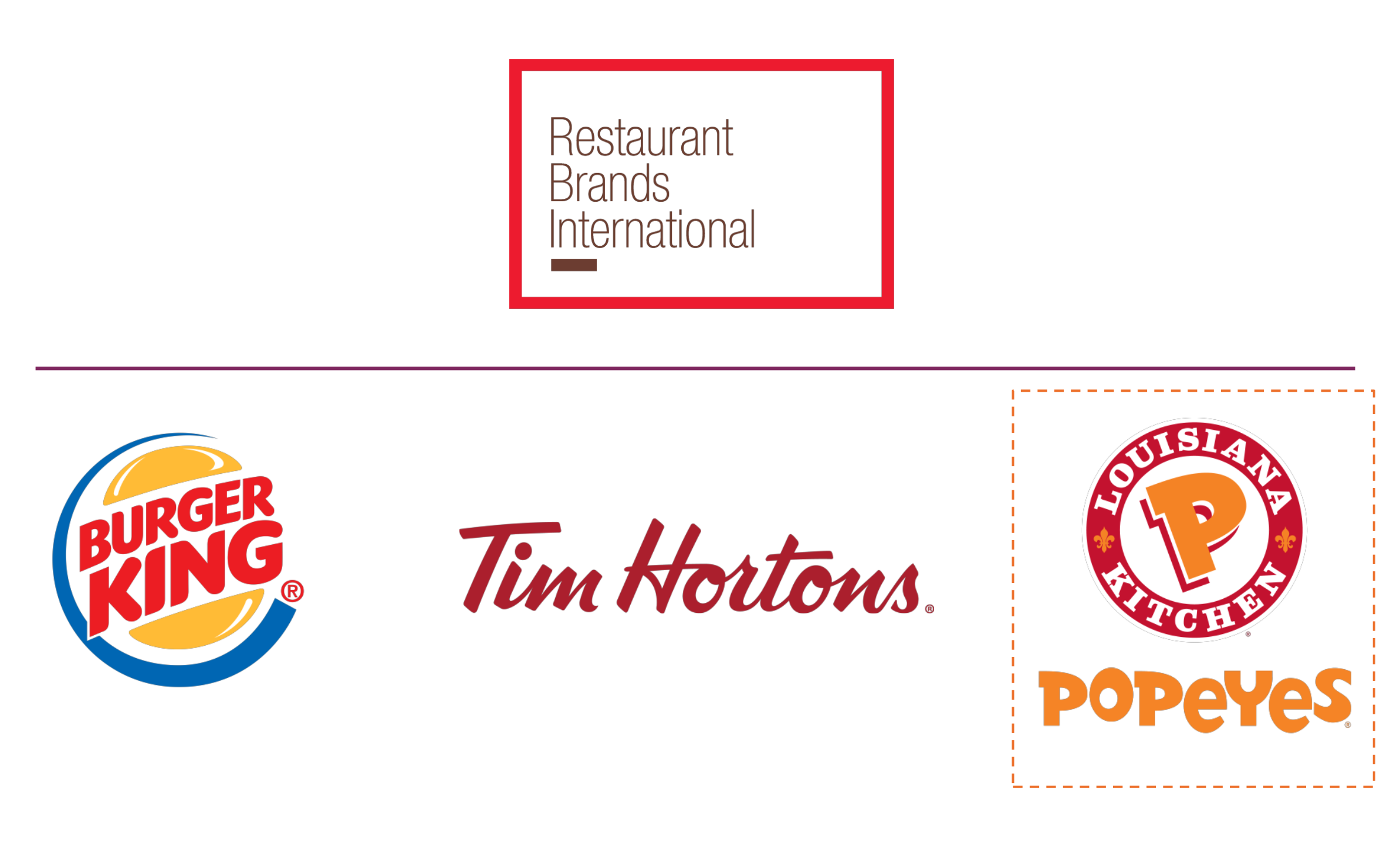
The Burger King we know today is a result of a company taking the steps to remain competitive in an already competitive space. In 2014, the company took its first step toward this by merging with Tim Hortons and forming the Restaurant Brands International. While Tim Hortons locations are few and far between in the United States, this coffee shop chain and restaurant are prominent across the border in Canada. This merger showed the public that Burger King has no plans to slow down.
Roadblocks Along the Way
You could probably guess what the biggest roadblock Burger King has had to navigate is. And if you guessed, McDonald’s, you would be correct. McDonald’s’ double arches are everywhere, and many consumers would choose McDonald’s over Burger King when presented with the two options. So, with a roadblock so challenging, how can Burger King stay in business?
What Burger King has done is offer new menu options that are exclusive to Burger King (i.e., chicken fries and onion rings) and has tried to use its partnership with the Walt Disney Company to propel the brand. While Burger King may still struggle to become the top hamburger chain, being second place means the brand is still doing something right (and that the strategies they do have, make a difference).
The Meaning of Burger King’s Logo and Burger King’s Logo History

1953: The first (and only) version of the Insta-Burger King logo
As you know now from this article, Burger King started as Insta-Burger King. This logo had classic ’50s designs and was warm, inviting, and friendly.

1954: The first Burger King logo
Once Insta-Burger King was renamed Burger King, a new logo was unveiled. This logo kept many of the same classic features of Insta-Burger King’s logo, such as a similar, bold, sans-serif font, but it also included a sunburst image placed at the top of the logo design. Shortly after the sunburst was included, it was omitted to just display the company name (in a similar font), only reading “Burger-King.”


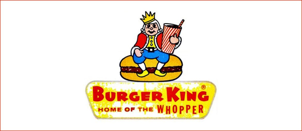
1957: The second Burger King logo
Three years after Burger King’s first logo was unveiled, the logo went through its first major redesign. This version incorporated a king sitting on top of the company name, on top of a hamburger. This version also included the brand’s tagline “Home of the Whopper.” The addition of this king highlights not only the brand’s name but also showcases what the company sells. With the “king’ sitting on top of a burger, and with a soda in his hand, there is no confusion that Burger King is a fast-food hamburger spot.

1969: The third Burger King logo
In this updated logo design, Burger King’s design team omitted the king image and instead made the logo much simpler. The result, as you can see, is the company name placed between each half of a hamburger bun. Like the prior logo, this version depicts what the brand sells.

1994: The fourth Burger King logo
At first glance, it may be hard to spot a difference between this logo and the prior one. At a closer glance, you’ll notice that this version is more refined, brighter, and bolder though.

1999: The fifth Burger King logo
For this logo design, the brand outsourced design support to Sterling Brands agency. While this logo kept the name placed between two hamburger buns, this one had the lettering placed diagonally and included a blue border.

2021: The current Burger King logo
Just like with the prior design, this version was outsourced to Jones Knowles Richie. This version was an attempt to bring back some of the retro, classic design elements veteran Burger King fans know and love. Unlike the early versions of the logo, this updated “retro” design included a cream outline around the burger bun.
Burger King’s logo font:
Like many other companies, Burger King used a font that was exclusive to the brand. This “Burger King” font was called “Insaniburger,” and was designed by Adam Nerland. Key characteristics of this font choice are that it is bold, has a sans-serif variation, and had friendly features. Even when the font was updated in 2020, the new typeface still incorporated those characteristics.
Burger King’s logo color:
Over the years, Burger King has tested out several possible colors. The first color combination was black and white and then later the combinations included red and orange. It wasn’t until 1999 that a new color was introduced ~45 years after it was founded – blue. This addition made the logo more modern without comprising the friendliness of the logo.
Burger King’s logo symbols:
If you looked at all of Burger King’s logos back-to-back, you’ll see that one symbol was prominent over the years – a hamburger bun. While the brand tested out other symbols like a king or sunburst, the hamburger bun got the company’s message across the best. Having a simple logo symbol that perfectly describes what the brand sells is key in building customer loyalty and brand recognition, especially when your business is a franchise.
Burger King Today
What has helped shaped Burger King into the brand it is today, which is a competitive brand, was its merger with Tim Hortons. This merger in 2014 formed a larger company, Restaurant Brands. When partnering with other companies, brands can get their sales back on track and help with growth.

After this initial merger, the group acquired Popeye’s in 2018 for $1.8 billion. With this acquisition, the group’s areas of expertise and market coverage continued to grow. Now with coffee, sandwiches, hamburger, fries, and chicken sandwiches, Restaurant Brands was able to diversify its portfolio of offerings.
If you are looking for Burger King on the stock market, you can find them under Restaurant Brands. In 2018, after the group acquired Popeye’s, Restaurant Group’s stock rose to $55 a share. This was $20 more than what their shares previously were. This same year, Burger King solidified their spot as the second-ranked hamburger chain across the United States. This was after the chain generated about $9.6 billion in sales and overtook Wendy’s (which previously had the second-place spot).
Lessons Learned from Burger King
Even if Burger King hasn’t achieved market dominance, there are still lessons we all can learn from Burger King. The first (and probably the key) lesson you can take away from Burger King is that going through a rebranding is not a kiss of death.
Burger King went through several rebrands which helped to reengage customers, and that strategy worked for them (and it can work for your brand too).
Another lesson you can take from Burger King is to choose a symbol that directly ties into your brand’s purpose. For Burger King that was a simple hamburger bun. And that simple hamburger bun leads us to the last lesson learned. Keep your logo simple and don’t overcomplicate it. With a franchise, you want your logo to be easily identifiable no matter where that is, and this is also true for smaller-scale companies.


