

Logo Design Entry # 381184
by john12343- BACK TO CONTEST
- CREATIVE BRIEF
- ENTRY # 381184


Comments for entry # 381184
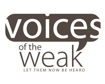
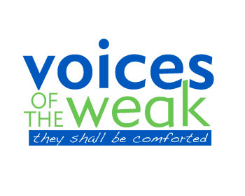
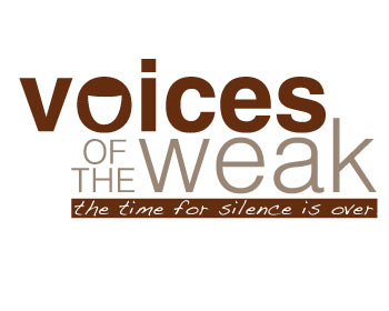
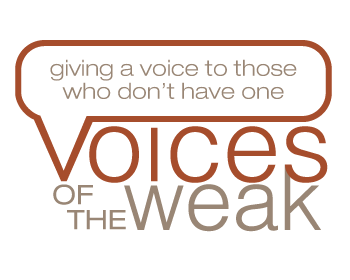
MatthewW, I apologize if my feedback seems a bit harsh. It is not intended as such; I am simply attempting to be as honest as possible so as to communicate what I'm looking for as clearly as possible. Now that you explain the reason for the bubble's sizing, I understand. However, I still am not a fan of how the words seem to big for the balloon, and I very much appreciate you having changed that in your last revision. Thanks! And yes, I did mean that the word "voices" was too big for the balloon; thanks for understanding what I was trying to say. You have an awesome talent, and I'm excited to see what else you come up with! Thanks...

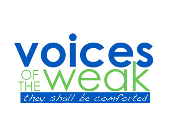
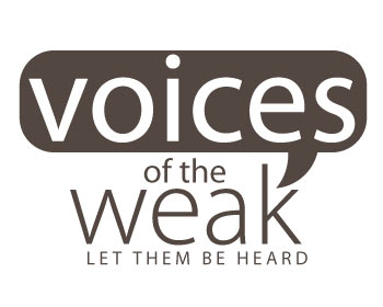
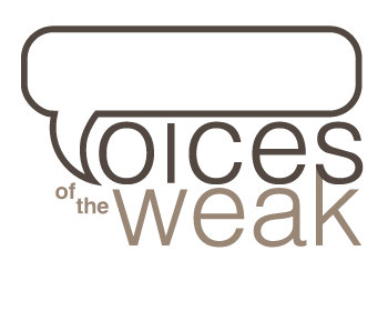
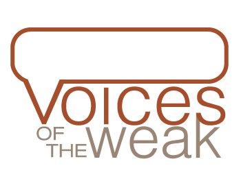
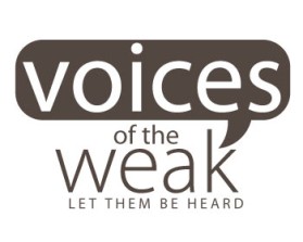
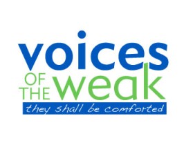
Thank you for your feedback. I guess I should feel encouraged that at least this design "isn't terrible" and the slogan isn't "too bad." Understood that "of the" may have struck you as awkward in that location. It was seeking to balance out the heavy dark area of the descending spike of the voice bubble and the "mouth" of the "k" on the far right. You mentioned that "the balloon looks like it is too big for the word 'voices'." Did you actually mean to say it seems the word "voices" is too big for the balloon? That would make more sense since the word is extending beyond the limits of the balloon. I hesitated to use a balloon in the first place. Like you, my first thought was that voice bubbles are trite and overused. But the intention with this design, where the white letterforms intersect the boundaries of the bubble, was to create a visually interesting interplay of negative and positive spaces. The double meaning is that the power of those voices extends beyond the limits of the "bubble," i.e. the power of communication transcends normal barriers and limits. I will take your suggestions into consideration and probably take another whack at it sometime tomorrow. Best regards, Matthew
MatthewW, thank you for your submission. This isn't terrible and is a small step in the right direction (not as big a step as your other submission); in another designer's submission, I had been very adverse to the "balloon" idea, your submission is making me question that decision! It's definitely a cool idea, but there are a few thoughts that come to mind. First of all, the balloon looks like it is too big for the word "voices", which I do not like. Secondly, I'm not sure "of the" is in the right spot, although I'm not sure where else you can put it. It looks a bit awkward in it's current location. And lastly, the slogan needs a bit of work; it isn't too bad though... I would suggest "let them be heard". Regardless, I appreciate your efforts, and am looking forward to your next submission/revision. Thanks!
Browse other entries from this Logo Design Contest
Browse other Logo Design Contest


Logo Design Contest: limoallstars.com
Limoallstars.com-CD of month membership
$150.00 Prize
96 ENTRIES


Fast. Awesome. Affordable
About the Creative
142
144
605
john12343 Bio
I am an Illustrator and Designer living in Los Angeles. I work for a nonprofit org full time.
Other entries by john12343:
Similar Entries