

- BACK TO CONTEST
- CREATIVE BRIEF
- ENTRY # 273491


Comments for entry # 273491
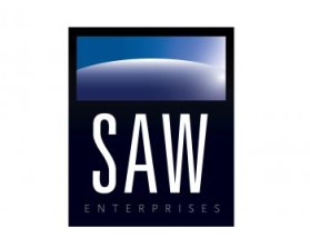
is there any other tagline you might want for your business or slogan? or i could try closing the circle in a bit
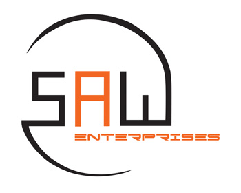
The logo looks better with the enterprises at the bottom. It seems kinds having a lot of empty space in between now. Don't know what to say. It looks better with the word then without. Yet I don't want to use the word enterprises. Any suggestion?
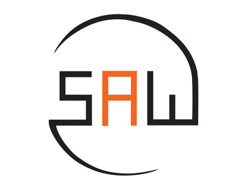
There it is without the 'enterprises' sub text. Let me know what you think about the balance of it because i can adjust it for you if you need.
Browse other entries from this Logo Design Contest


Fast. Awesome. Affordable
About the Creative
Similar Entries