

Logo Design Entry # 557778
by hma.purple- BACK TO CONTEST
- CREATIVE BRIEF
- ENTRY # 557778
Comments for entry # 557778
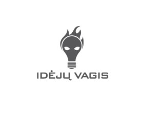
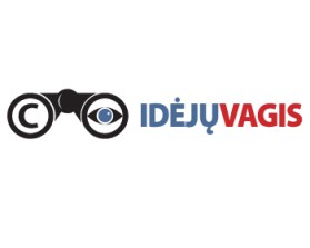
So I talked with my colleagues and they were of the same opinion, that your submission is closest to what we need. Still, they also had the same comment that I had, namely, that current graphic element does not really correlates with the idea of our service. I also looked at extra variations you have submitted, but none of them really fits what we need. I would suggest you try experimenting with the copyright sign instead of the lock. Perhaps flipping the C in the copyright horizontally. Or alternatively adding a chipped light-bulb or a glove of a thief or something like that. In any case it has to work conceptually, and the current alternatives do not, and it has to look very simple, so people could understand it both at high and low resolution.
Well, there are several ways to go about this. One would be to focus on social, open nature of our service - here one could work with graphic elements that are tied up to keywords like map, marker, report, crowd, crowd-sourced. Another alternative is to focus on intellectual property - here one could work with keywords knowledge, skill, markmanship, original, authentic, sustainable, creative, supportive. Finally, one could toy around with the idea of theft. Here one could work with keywords like theft, illegal use and associations that work with that, for example, black glasses, black glove, a shady guy in a hat, and so on.

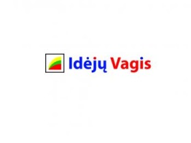
Thank you for the feedback. I suppose you read the description of the concept - that explains why I've used the open lock. Please let me know if you have some ideas to make this design even better, I will certainly think about it.
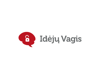
Now that starts to look like a logo. I like the fact that text is rendered in solid, but not distracting color. The graphic element seems to be more unique than stuff that I saw in other submissions. I am not sure though if open lock creates the right mental connection in the minds of users. Not sure about the choice of font too, but for now it definitely looks like the best submission so far.
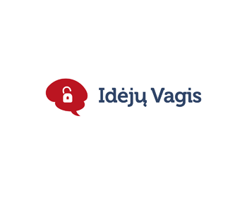
The brain shaped conversation bubble with the open lock in its middle stands for IP right violation. The conversation bubble represents your community driven platform that deals with sharing information – reporting IP right violations. I took the colours from your website and the font as well, to have some consistency. Hope you like the outcome!
Browse other entries from this Logo Design Contest
Browse other Logo Design Contest


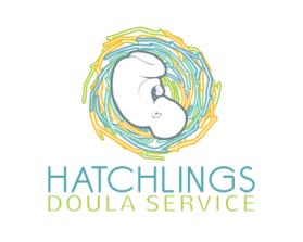
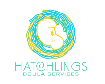
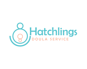
Logo Design Contest: Hatchlings Doula Service
Design a logo that stands out for a birt
$250.00 Prize
211 ENTRIES

Logo Design Contest: Centered Man Project
logo for Self-Development company
$100.00 Prize
36 ENTRIES
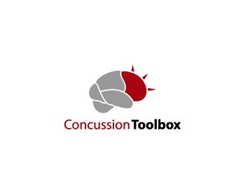
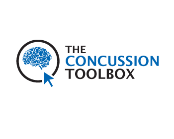
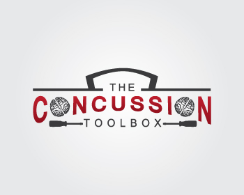
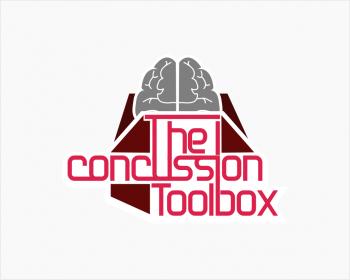
Logo Design Contest: Logo Design Contest for The Concussion Toolbox
Concussion App Logo Design
$130.00 Prize
89 ENTRIES
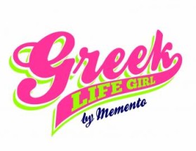
Logo Design Contest: Greek Life Girl
logo design for new sorority brand gifts
$200.00 Prize
87 ENTRIES

Fast. Awesome. Affordable
About the Creative
21
22
95
hma.purple Bio
If you like my work, feel free to contact me!
Other entries by hma.purple:
Similar Entries