

- BACK TO CONTEST
- CREATIVE BRIEF
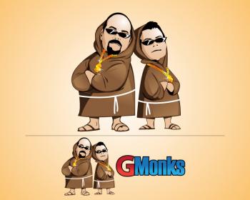
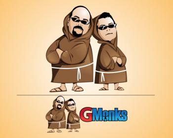
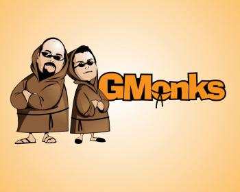
- ENTRY # 278784

Comments for entry # 278784
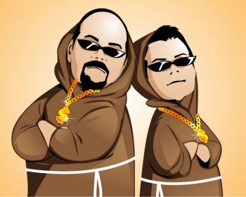
Also we like to see one logo with the dollar sign as the "s" like 278716 by: Konco did. Konco also did a better job making the guy on the right look like the picture, see if you can touch up your design.
Hi Filipi, We like your logo, we would like to see the legs and fet little wider. when we look at the style you designed the bodies in, the feet look small, smaller then the arms. WE also like the to the idea of two tones for the font and the "G" tilted. Like: #278213 by: Konco. We are not to happy with the color choices for text but we will see what you can do.
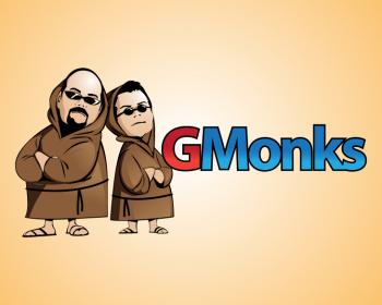
I like what you have done, will take it over in the morning and give you more feed back if needed. FYI.. Your Font is in second place.
Browse other entries from this Logo Design Contest


Fast. Awesome. Affordable
About the Creative
7
7
15
Other entries by Filipi:
Similar Entries