

- BACK TO CONTEST
- CREATIVE BRIEF
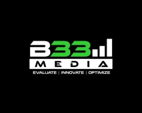
- ENTRY # 958522
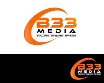


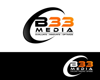


Comments for entry # 958522
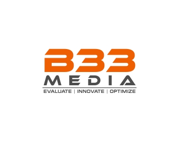
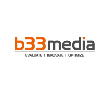
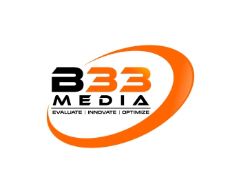
Great contrast between the orange and black (very similar to your previous green submission, which was great though a little yellow). Could you try and differentiate between the 'B' and '3's by making them separate colors? Such as the 'B' being the same color as 'Media'. You're definitely going in the right direction, but there needs to be distinction between the 'B' and '3's so that the name 'B33' is clear. The swoop also looks good, though maybe play with different thicknesses/angles if you like. Thanks very much!
Browse other entries from this Logo Design Contest


Browse other Logo Design Contest
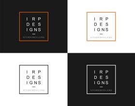
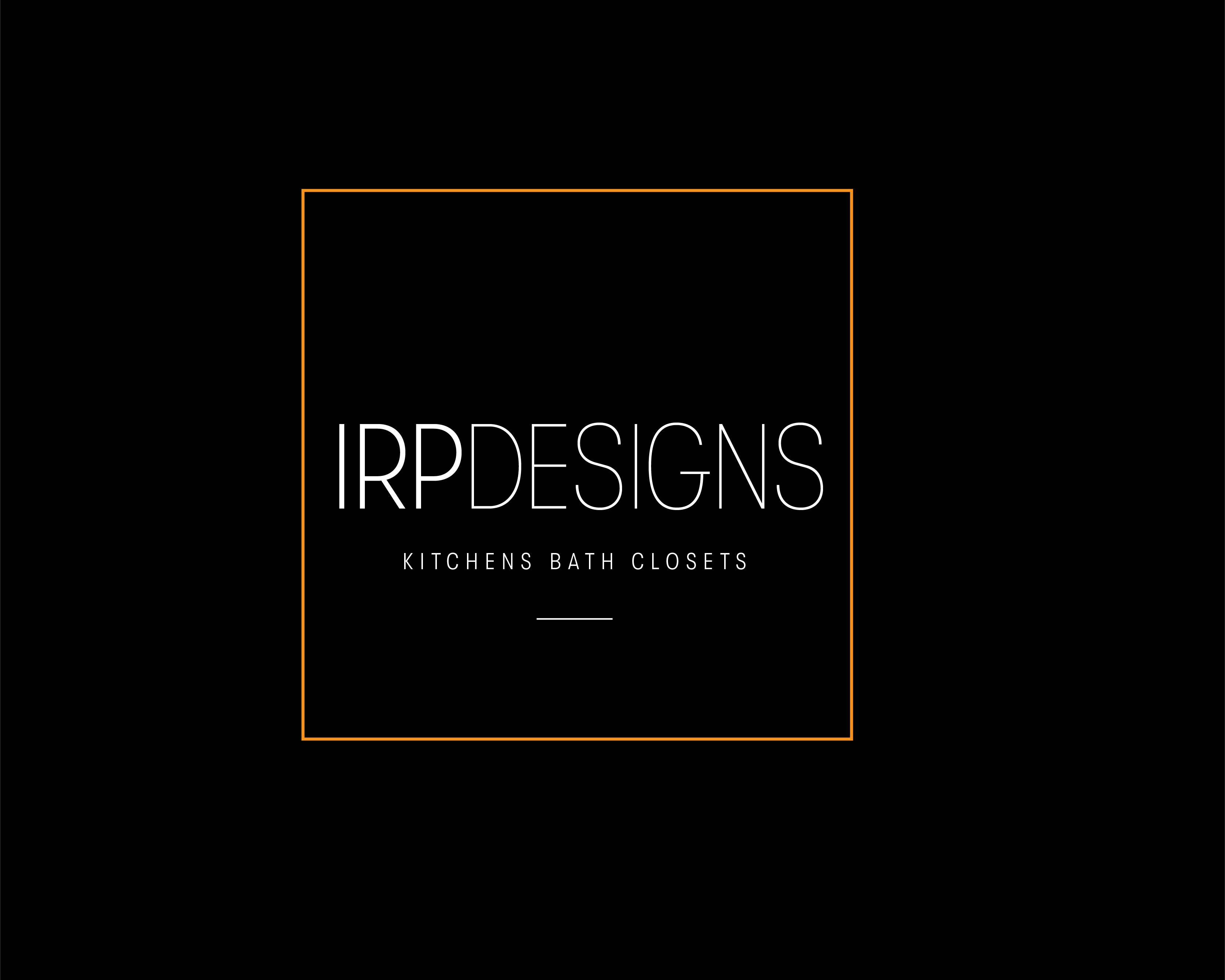


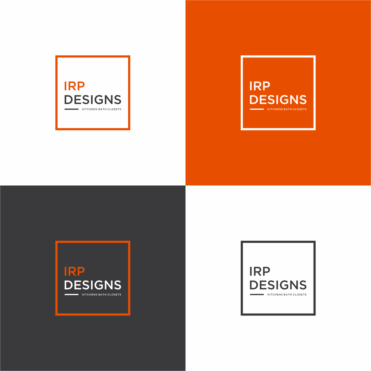
Logo Design Contest: IRP DESIGNS
re doing and modernize the current logo we have.
$150.00 Prize
439 ENTRIES
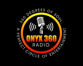
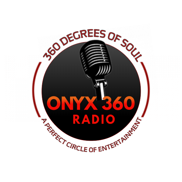
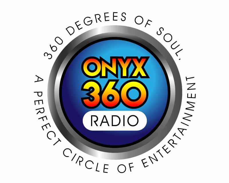
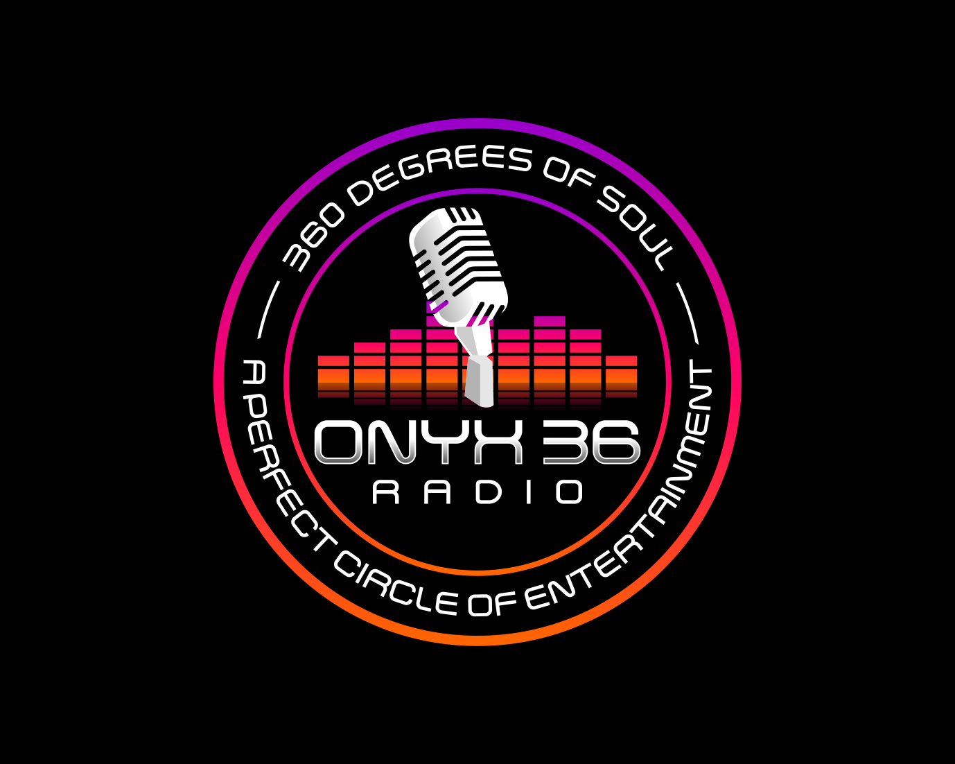
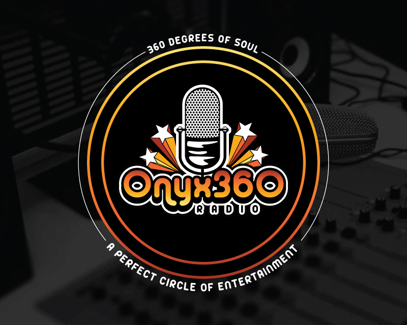
Logo Design Contest: ONYX 360 Radio
Need a logo for new business launch.
$150.00 Prize
67 ENTRIES


Logo Design Contest: Parks Digital Media
Fresh New Ideas for Digital Advertising
$210.00 Prize
318 ENTRIES


Logo Design Contest: Mark E. McKenzie, M.D., Consulting, LLC
logo to represent my brand
$250.00 Prize
169 ENTRIES

Fast. Awesome. Affordable
About the Creative
55
56
309
Other entries by cmyk:
Similar Entries