

- BACK TO CONTEST
- CREATIVE BRIEF
- ENTRY # 958518
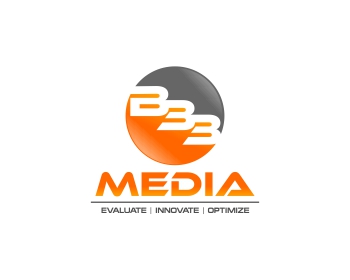


Comments for entry # 958518
'B' and '3's look a little too similar when placed in that manner. Also not crazy about the circle, looks almost like a traffic light. The 'Media' looks great over the tagline though. You could play around with versions of that in other logos if you wanted. Thanks!
Browse other entries from this Logo Design Contest


Browse other Logo Design Contest


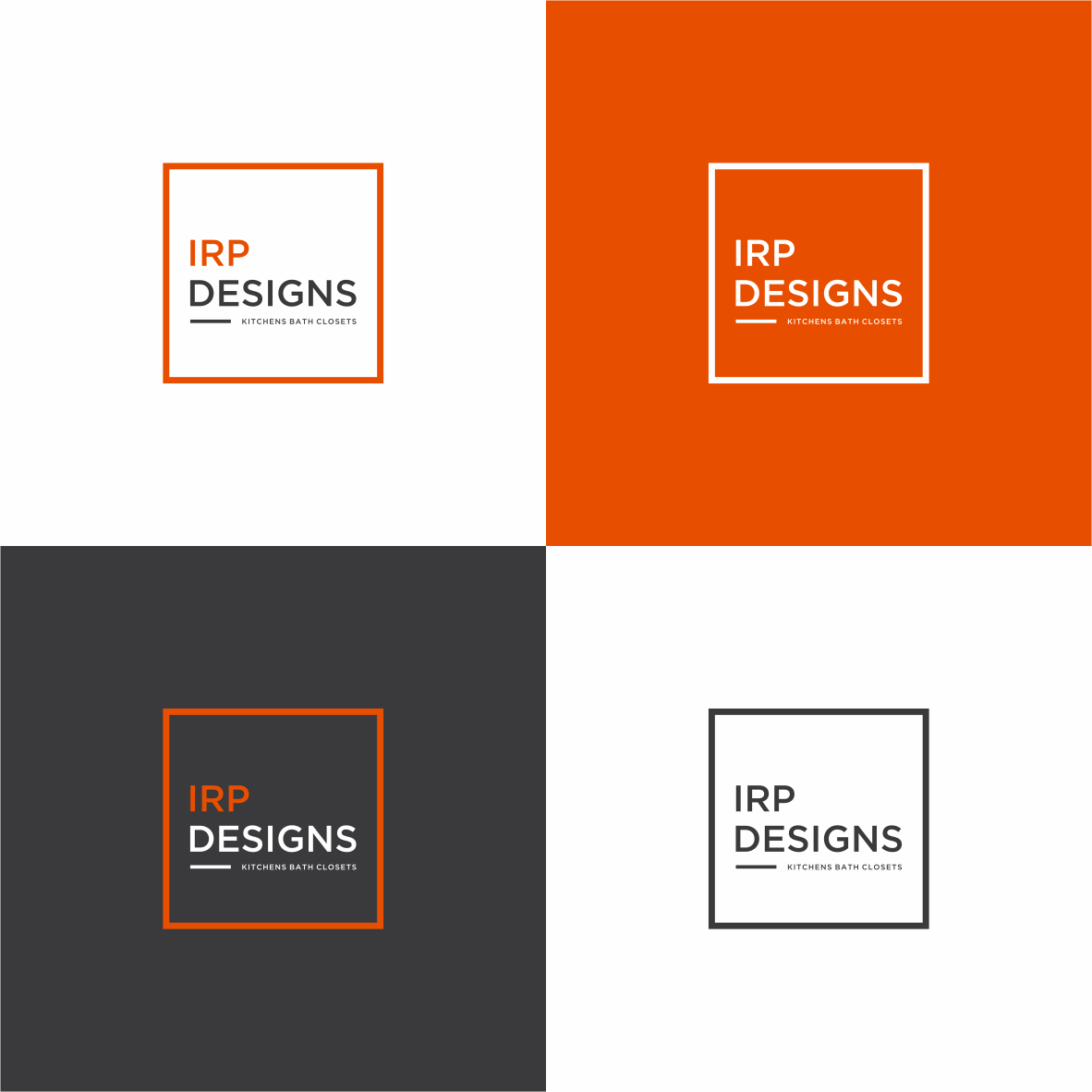
Logo Design Contest: IRP DESIGNS
re doing and modernize the current logo we have.
$150.00 Prize
439 ENTRIES
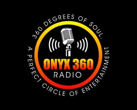
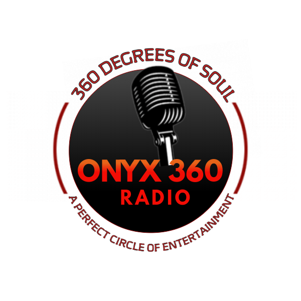
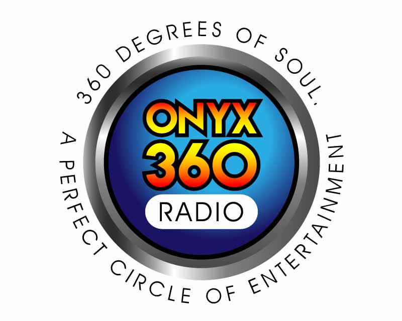
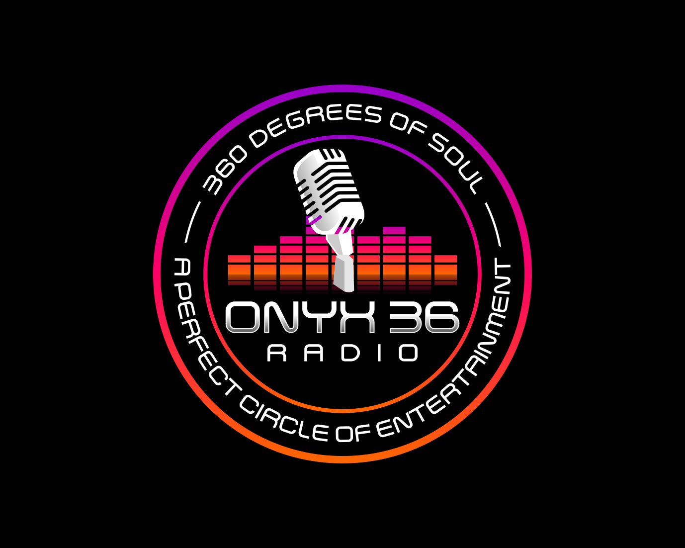
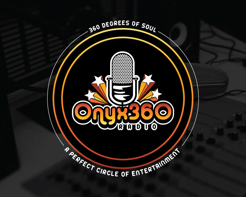
Logo Design Contest: ONYX 360 Radio
Need a logo for new business launch.
$150.00 Prize
67 ENTRIES
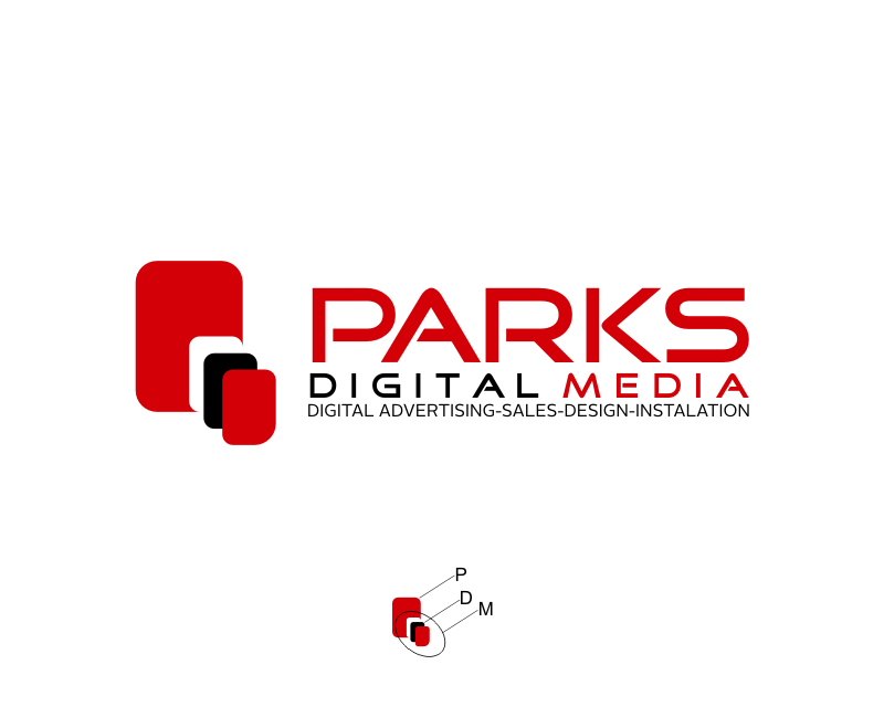
Logo Design Contest: Parks Digital Media
Fresh New Ideas for Digital Advertising
$210.00 Prize
318 ENTRIES


Logo Design Contest: Mark E. McKenzie, M.D., Consulting, LLC
logo to represent my brand
$250.00 Prize
169 ENTRIES

Fast. Awesome. Affordable
About the Creative
55
56
309
Other entries by cmyk:
Similar Entries