

- BACK TO CONTEST
- CREATIVE BRIEF
- ENTRY # 40239

Comments for entry # 40239
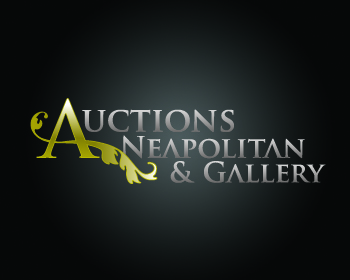
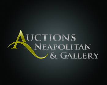
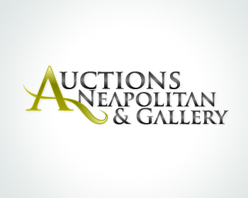
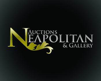
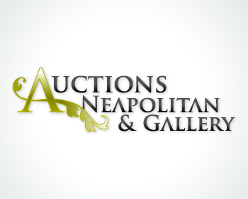
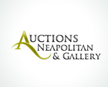
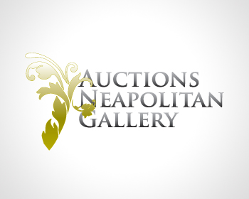
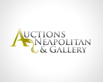
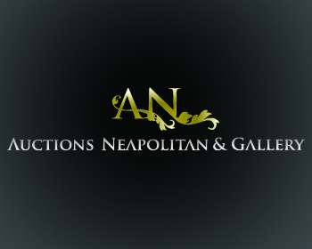
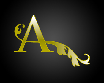
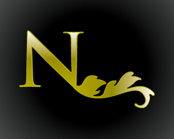
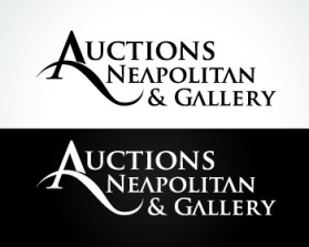
Hi Pelayo, We are down to three designs. You are among them. However, the jury is still out. If you would consider another revision, it would be appreciated. The new version with the simplified sweep is good (I rated it a 5 so you would know which one), but the over all design lost some of the punch. The A and sweep got whimpy. The traditionalists are fighting hard for this feathered A design because it is visually more powerful. However, another sticking point here is the size of "Auctions" compared to "Gallery". Since bringing more awareness to the "Gallery" portion of our name was one of the big goals, it is a stopper here. I am at a loss as to how to suggest a size fix and still retain the good balance that this design has. Any suggestions? Kate
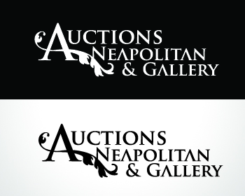
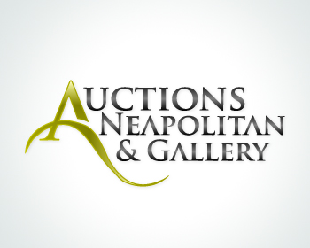
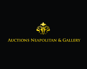
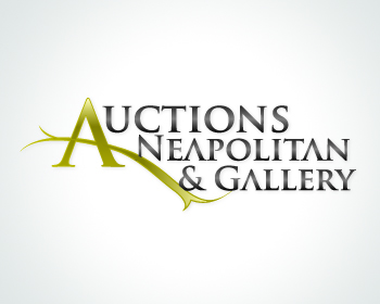
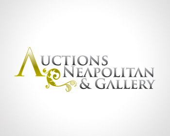
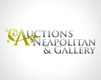
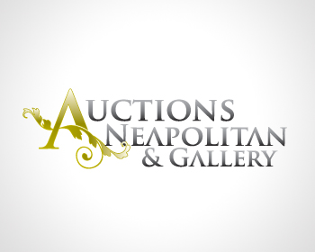
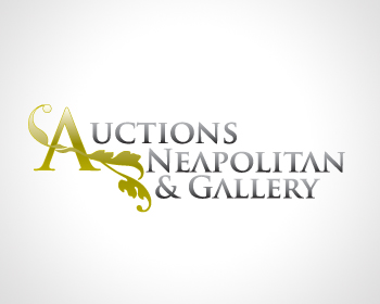
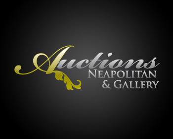
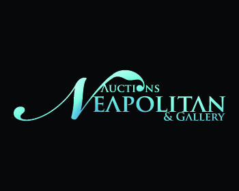
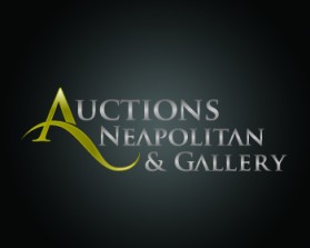
Hi Pelayo, Thank you for the variations. I'm sorry. I may not have been clear. This is the variation we like the best. But.... Would you mind trying something that is not a leaf or a vine for the bridge of the A? We like the sweep and would like it to be basically the same angle. However, we would like to compare something a little more sleek and linear to this more traditional design. Also, stark black on white background please. The color concept is good and if it is the winner we would probably stick with the gold and black for some ads, but we are also trying to judge each entry using a similar yardstick. Hope that makes sense, Kate
Of course, today I will upload some different ideas
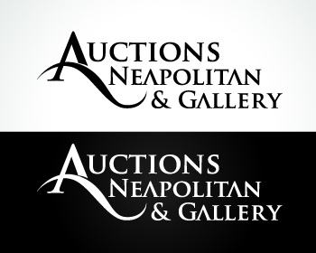
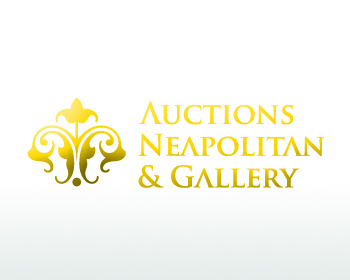
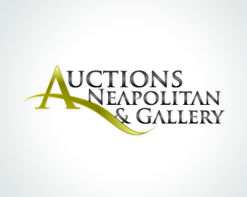
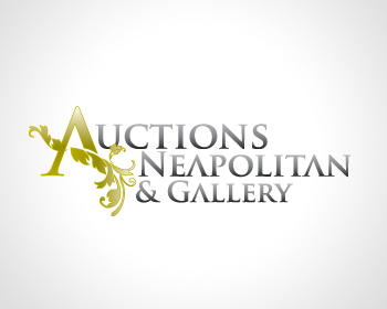
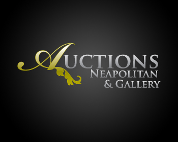
Hi Pelayo, If possible, would you give me another variation on this one? I like the sweep given to the bar in the A but am not crazy about the leaf. Also, I'd like to see it with a little more balance in the size of the remaining letters in Auctions to the words Neapolitan & Gallery. Also, a white background with black. Thanks, Kate
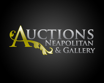
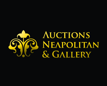
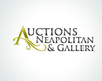
This is the same concept. I really like it because it has many ways to use it, to play with it and you can also play with colors. Professional, communicative, and based on the target market. Remember that all my logos are develop with branding strategies. Thank you very much
Browse other entries from this Logo Design Contest
Browse other Logo Design Contest
Logo Design Contest: AmericanDashCaps.com
Create an image that is unforgettable
$100.00 Prize
47 ENTRIES


Fast. Awesome. Affordable
About the Creative
1
1
8
Similar Entries