

- BACK TO CONTEST
- CREATIVE BRIEF
- ENTRY # 25002


Comments for entry # 25002
I look forward to it.
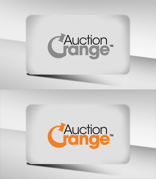
Thanks for the feedback. Tonight I will do a black and white version so you can see how it translates. I also have an idea on how to use the original arrow idea and add a gavel in the design.. we'll see how it turns out!
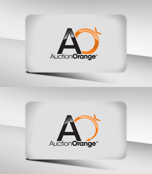
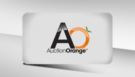
Another idea that has come in has involved the capital "O" in orange being used similar to your current icon to provide the same hint (perhaps with the arrow) with the addition of a new icon perhaps incorporating a hint of a gavel. We even had a suggestion of a horn speaker. These are the comments our staff has made today.
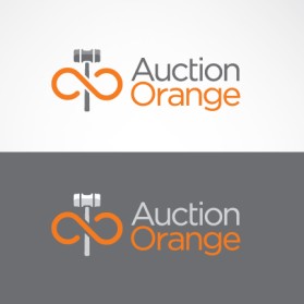
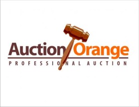
Brad, I like the balance. Overall it looks professioanl and polished. The orange is abstract, but I had a comment that it looked like an engagement ring. Here's our other dilemma. We are concerned about how the logo will reproduce in B/W. I liked the idea of the "arrow" that you had used earlier. Do you think there's any way a hint of a gavel could be incorporated. We're really close. Thanks for your work, Brad
Ok I simplified the icon on the left to be less busy, and reduced the layering effect at the same time. I have read all your comments on the board and understand you want something that strays away from a literal orange, and leans a little to the abstract. Do you feel that the icon I have been focusing on lends itself to that? or would use suggest that I head a different direction? Thanks for all your feedback to the community.. it's been a big help. -Brad
Browse other entries from this Logo Design Contest


Fast. Awesome. Affordable
About the Creative
3
3
2
Other entries by bradvr4:
Similar Entries