

- BACK TO CONTEST
- CREATIVE BRIEF
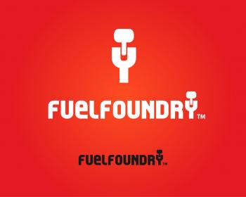
- ENTRY # 259266


Comments for entry # 259266
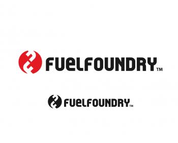
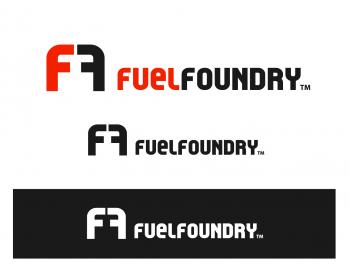
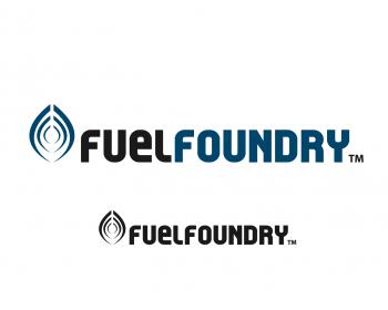
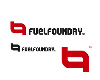
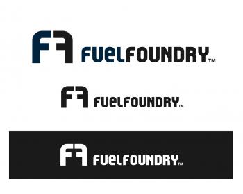
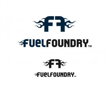
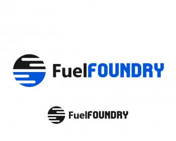
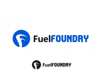
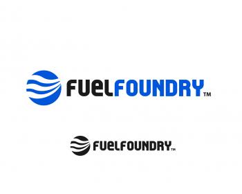
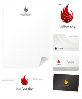
Thanks! Look forward to the outcome!... We like your approach.. so not to far away from your current vision... (*Perhaps a small split between the tip of the F's to clearly show two f's?.. One idea..).. Thanks again! Stuart.
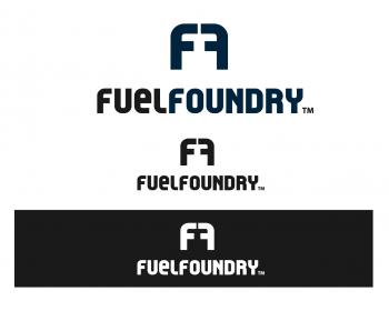
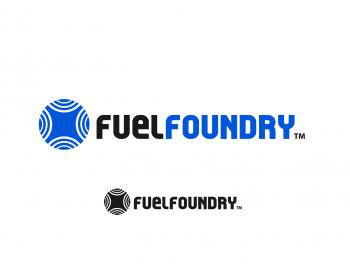
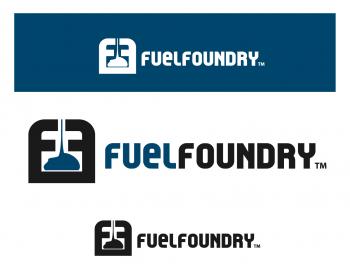
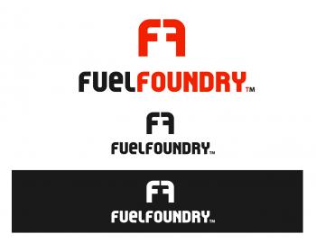
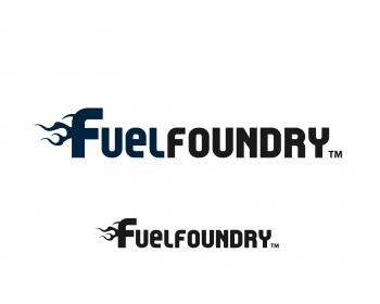
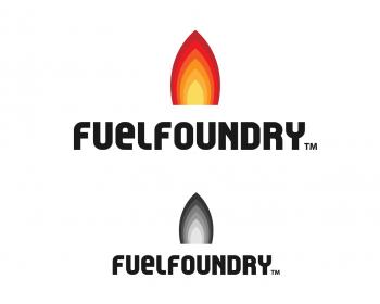
Thanks for the great comment :) Ok, I can do different versions with single tone colour and try to change the logo itself.
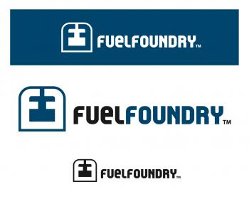
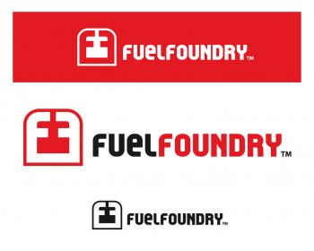
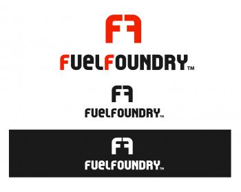
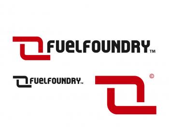
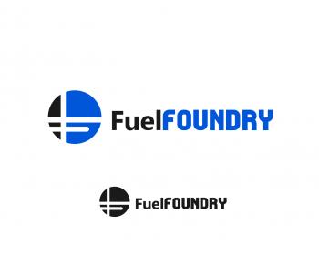
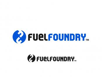
Etu, we are keen to see other revisions associated to the original submission (*Please leave this version available as we all like this one as well)Cheers, Stuart, Co-Founder/Product Wrangler, FuelFoundry.
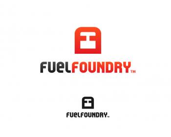
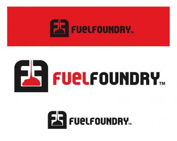
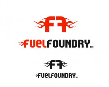
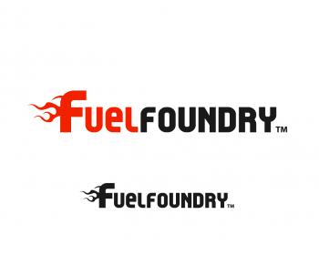
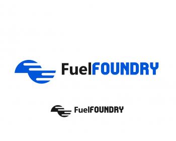
I like the image! What about a single tone color as apposed to the gradient? ..Like the font as well... Can we consider ass V1 and perhaps create more obvious FF in the logo? Thoughts?
Browse other entries from this Logo Design Contest
Browse other Logo Design Contest
Logo Design Contest: Mid-Valley Home Show
Logo for a consumer home show event
$400.00 Prize
237 ENTRIES


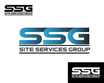


Logo Design Contest: Site Services Group, LLC
Engineering / Construction Firm Logo
$200.00 Prize
180 ENTRIES


Fast. Awesome. Affordable
About the Creative
1
1
10
Other entries by Etu:
Similar Entries