
Brandstorming Contest Entry #113524
by griffindesign- BACK TO CONTEST
- CREATIVE BRIEF
- ENTRY #113524
Comments for entry # 113524
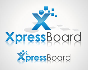
Actually, I'm not that sure on the background shape. I guess I'm just hunting for some more ideas on how the logo could look with just a little more depth. To tell you the truth, I really like what you have now. Things that we would likely do with it: - Blow the man up to a standalone size for poster ads with notes containing text messages/photos/votes as the bubbles - Use the man standalone on the splash screens of each of the product's different modules, with either a different base color, or maybe with a subtle change to give him a role-based outfit. These modules are: - Base product (runtime board - use the base logo) - Administrator (maybe a necktie or a key?) - Moderator (an authority figure hat?) - Operator (something to do with a mobile network operator - this is the "super-user" module) I'll leave the ideas up to you. Maybe what would be best is to keep something very similar to what you have now, and propose a zoomed standalone version with more detail on the notes as above, and/or one of the stylized versions. If we go with this name, we'd work with you on the others. Thanks again, Toby.

I see what you are saying about the cingular logo, didn't even think of that! I can try to change it a bit. As far as a background shape, was there something you might have in mind?
Given that this is the top of our list right now (and the only 5/5 entry), would you be willing to do a couple of permutations on the logo? I like the current logo very much because: - We can easily separate the first letter/logotype out into a separate logo for icon use (where a square format is required) - The long/wide version of the logo works well in a status/title bar - The communication bubbles look like notes that are posted to our board from the user. This is really good Room for improvement: - The man in the "X" looks a little too much like the old Cingular logo. Since mobile operators are one of our primary targets, I'm a little concerned we may run into trademark issues there. Maybe I'm being paranoid! Any way you can think of making him/her look a little less like the Cingular logo without destroying the base concept? - A little more complexity would be good - the gradient is very nice and smooth - maybe a background shape or something more in the bubbles? I might be overdoing it with the above comments, as your currently proposed logo may well be the best and simple as it is, but it would be good to see a couple of other permutations if you have a chance. Keep in mind that we will almost certainly need to separate out the first character - both as an product icon/mark, and as a standalone blown-up logo for promotional use. I'm thinking that in a high res version used standalone, the bubbles could actually be text messages, photos, votes etc.
Thank you for the feedback. I agree about the double meaning and you could use a tagline if you wanted to direct it to one meaning or the other. Please let me know if you would like to any changes. Best Regards.
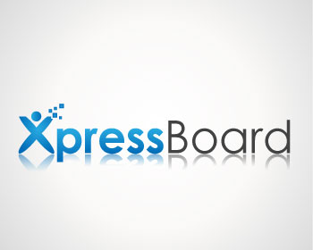
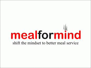
Now this is REALLY good. Best entry so far. It has a good segue to our company name, and the first word has a good double-meaning.
Another option.
Browse other entries from this Brandstorming Contest
Browse other Naming Contests
Brandstorming Contest: progressive meal delivery company
Need name, logo, and tagline!
$250.00 Prize
95 ENTRIES
Brandstorming Contest: a readymade brand marketplace
Create a new brand for a design site.
$200.00 Prize
181 ENTRIES

CREATIVE CONTEST
- Fast - see designs in hours
- Awesome - choose from dozens of custom designs made just for you
- Affordable - We have packages priced for budgets of all sizes

Fast. Awesome. Affordable
About the Creative
34
34
148
Other entries by griffindesign:
Similar Entries