

Web Design Entry # 514938
by astraldemon- BACK TO CONTEST
- CREATIVE BRIEF
- ENTRY # 514938


Comments for entry # 514938
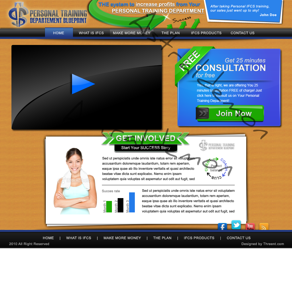
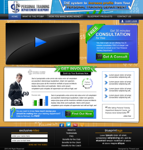
I have already submited another design before you made this comments with the changes you wanted earlier... Can you please make up your mind what you want? I didn't get this: "In the Get Involved Box mimic the top Get Consultation Button with the placement of the black tab part of the graphic so the dollar sign looks the same. " Put that button where? What dollar sign? I have already put it in that black box? "Use the Exclusive Video at the bottom of the orange background in stead of the bottom of this page. " Huh? Please refer to my latest submitted design, and please make up your mind what you want. I won't be available this weekend...
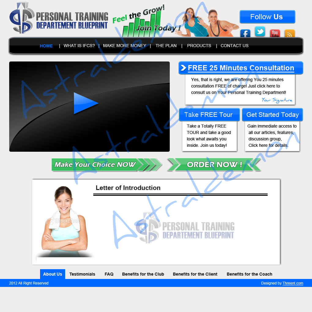
the last was 2 of my partners
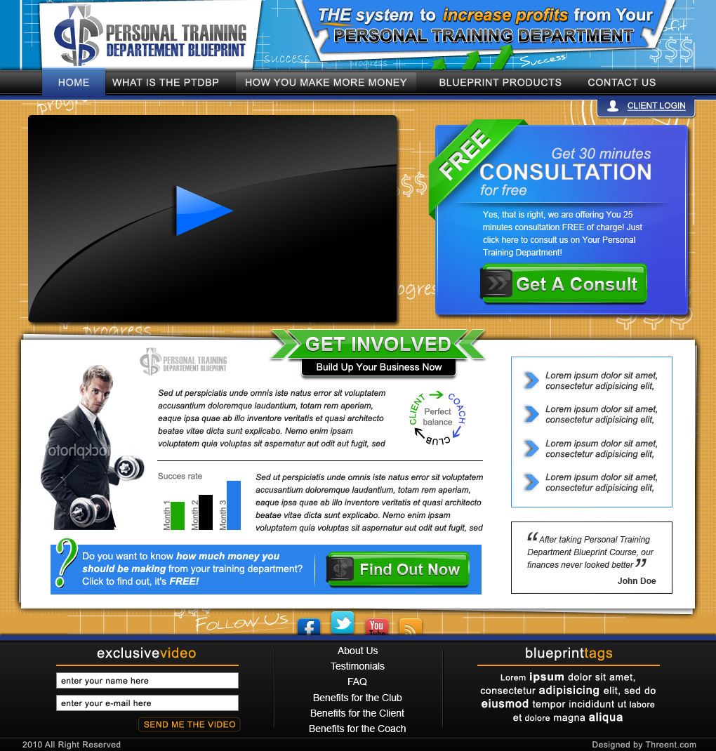
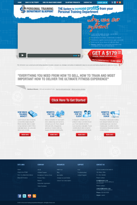
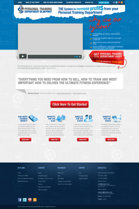
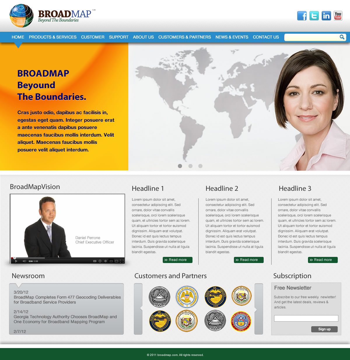
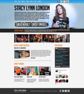
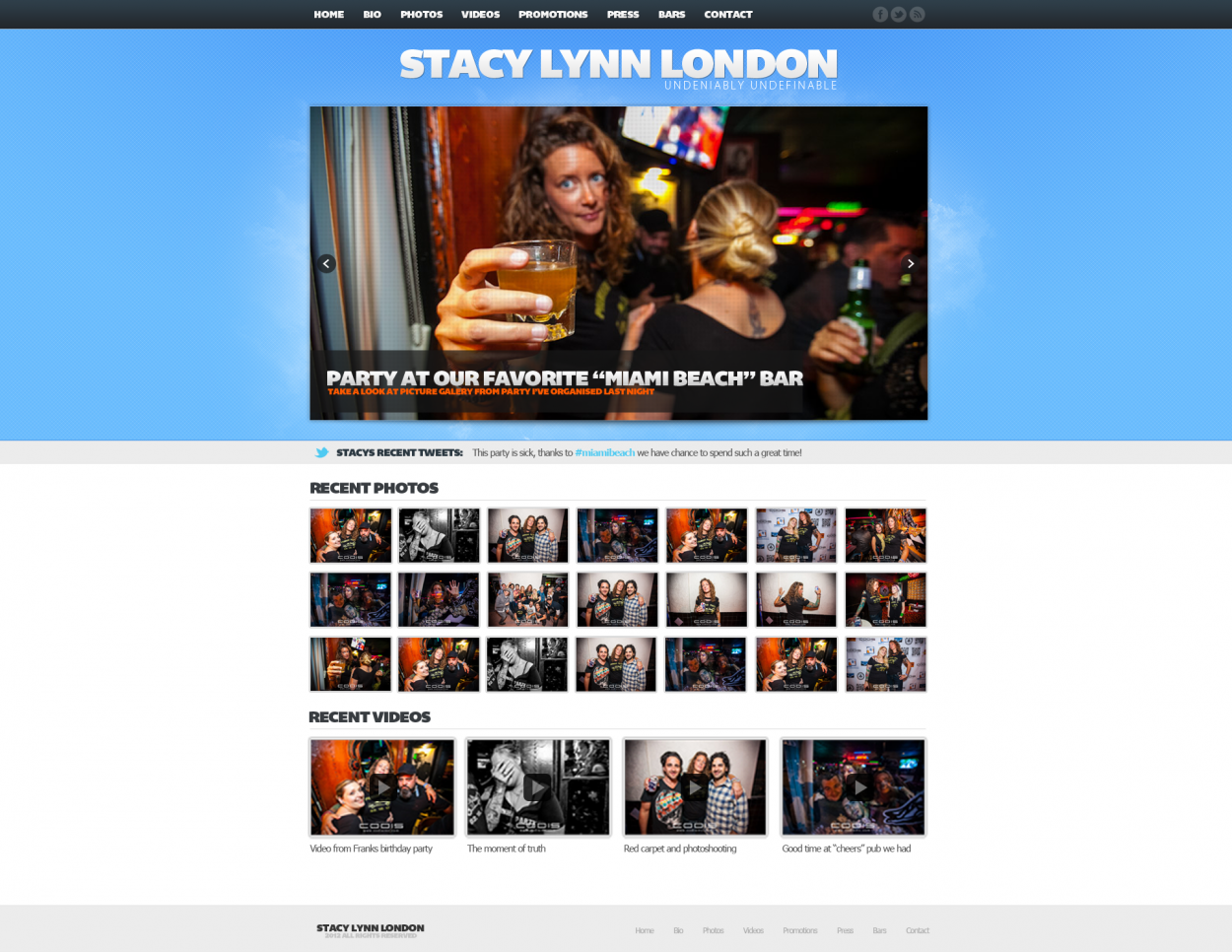
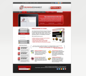
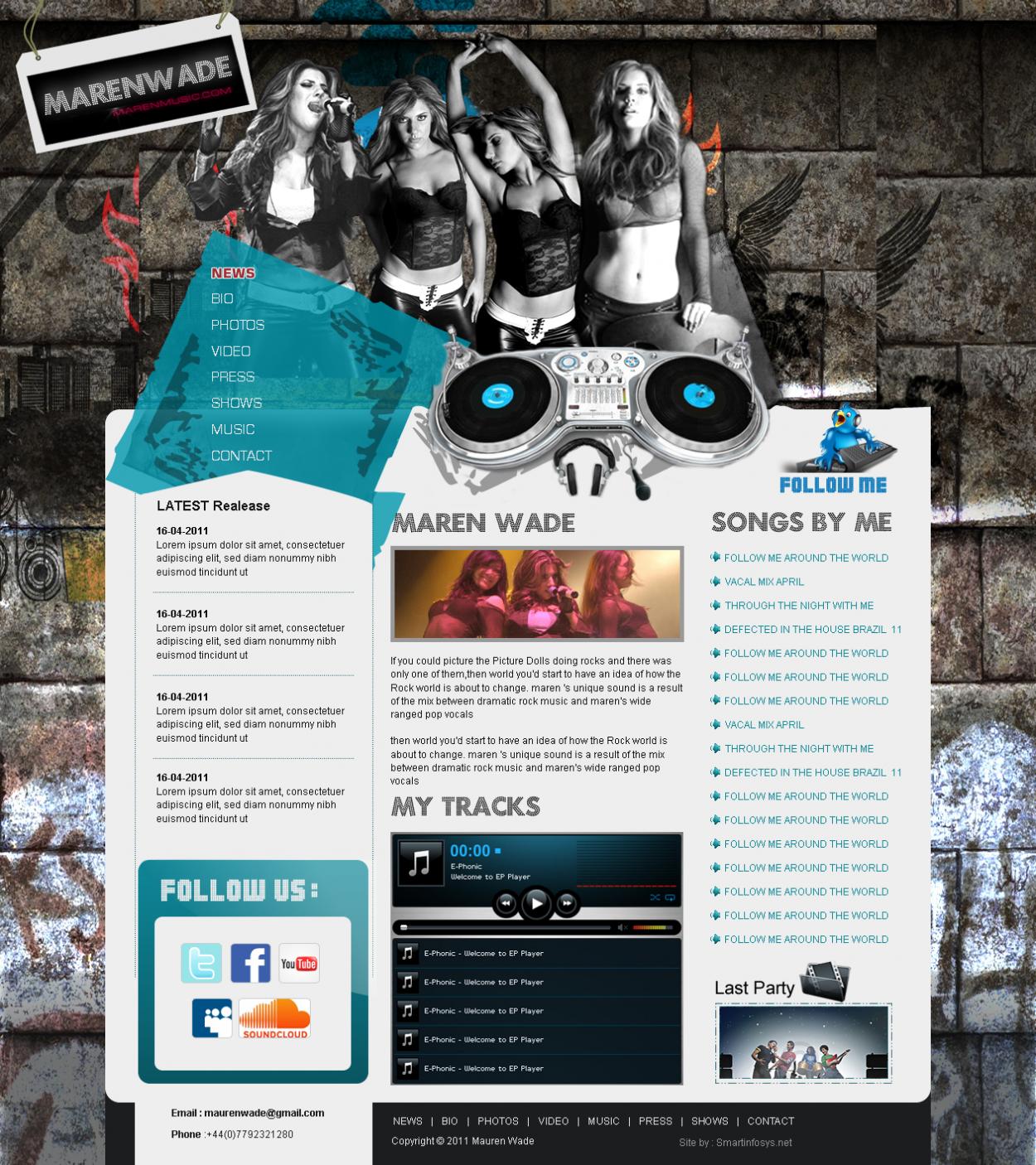
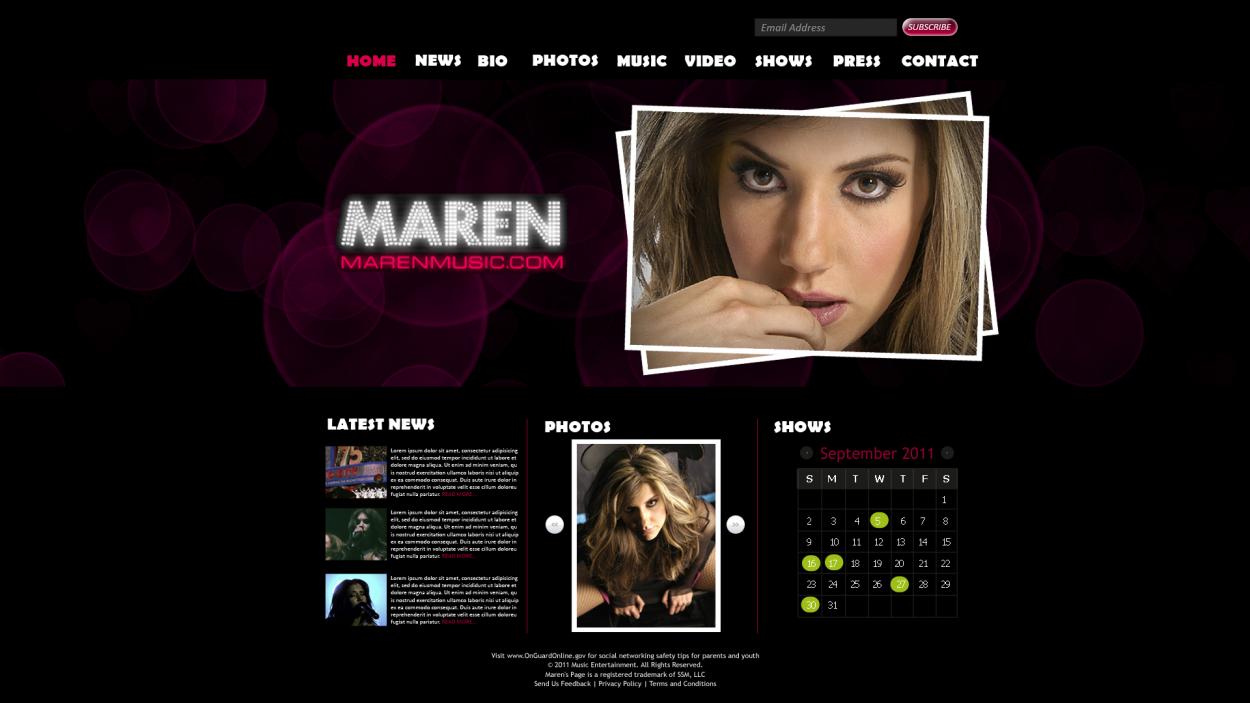
Can you take out the big green arrow on the top banner. Capitalize INCREASE PROFITS in the tag line. Make the navigation bar larger or stand out more. Take off the Learn More box and Exclusive Video box and center the Get Involved Box and make it larger. In the Get Involved Box mimic the top Get Consultation Button with the placement of the black tab part of the graphic so the dollar sign looks the same. Use the Exclusive Video at the bottom of the orange background in stead of the bottom of this page. Thank you, We really like your design.
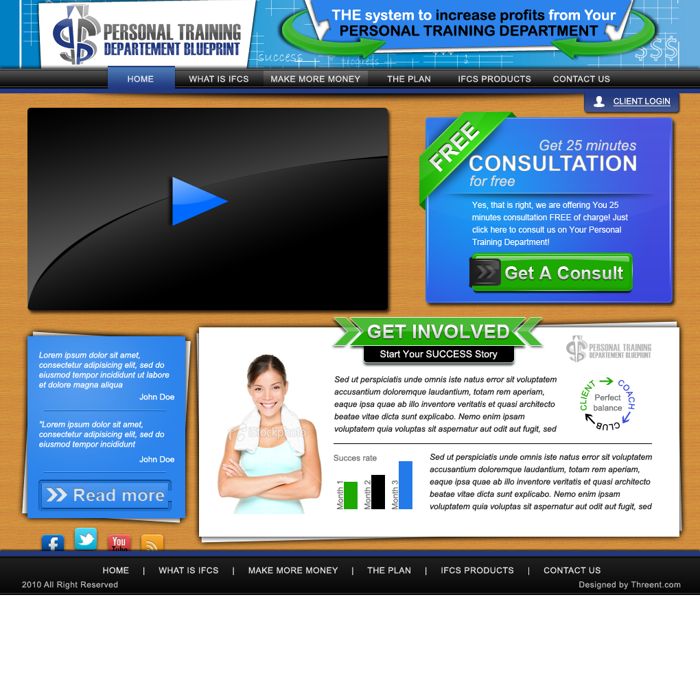
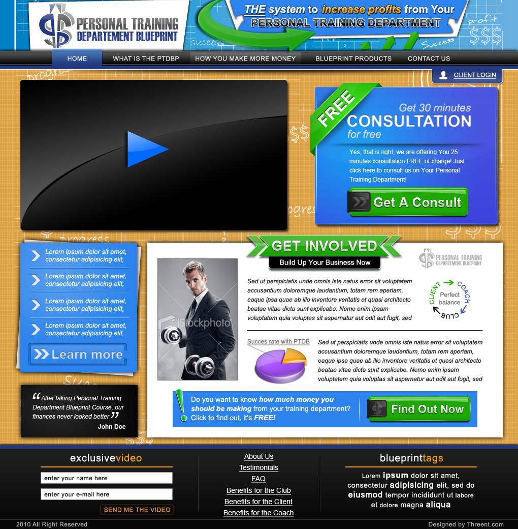
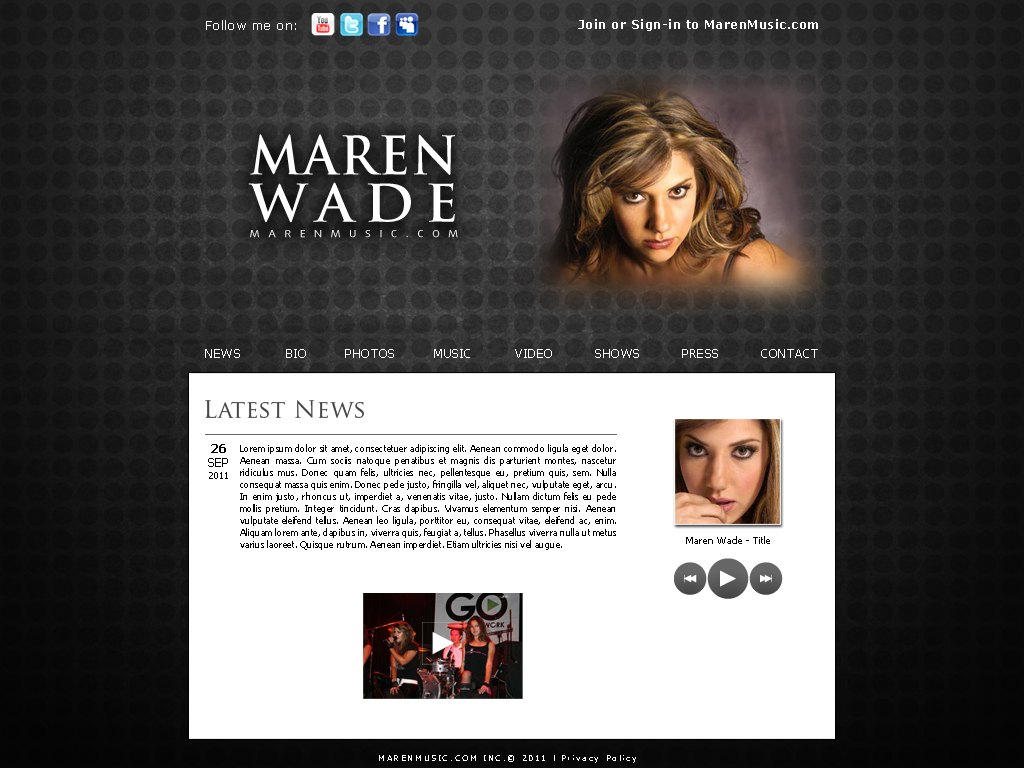
If I understood you correctly, you don't want testimonials there? About "how much money" button, we could do next: make small paragraf in place of this button saying: "Do you want to know how much money you should be making from your training department? Click to find out, it's free!" and then make button saying "Find out more" or "Learn More" Testimonials could go where "exclusive video" is now, there would be only one testimonial, but you could ask your programmer to make it like slider, so every 20 seconds your testimonial changes. Ofcourse, that area with testimonial would be smaller. About footer, please refer to my PM, but instead "contact us" form, there could go that video subscription button. Thank You
OK, you did what we told you and we made it worse…..lol Can we find a smaller way of doing the “How Much Money” Button? Go head and drop the 3 testimonials. Under that. I like the “THE” all caps and maybe underlined, but I like when “Increase Profits”was in orange. The girl need to be changed more to a guy/professional in a Polo or business suit, since this is all about making money and being more professional. We will either find a way to put the video offer in the footer and/or on an Exit Pop-Up, as to keep this page cleaner.
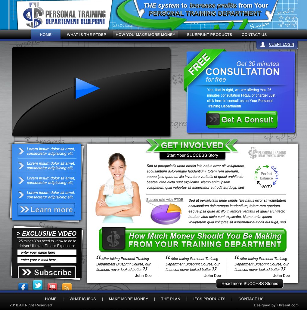
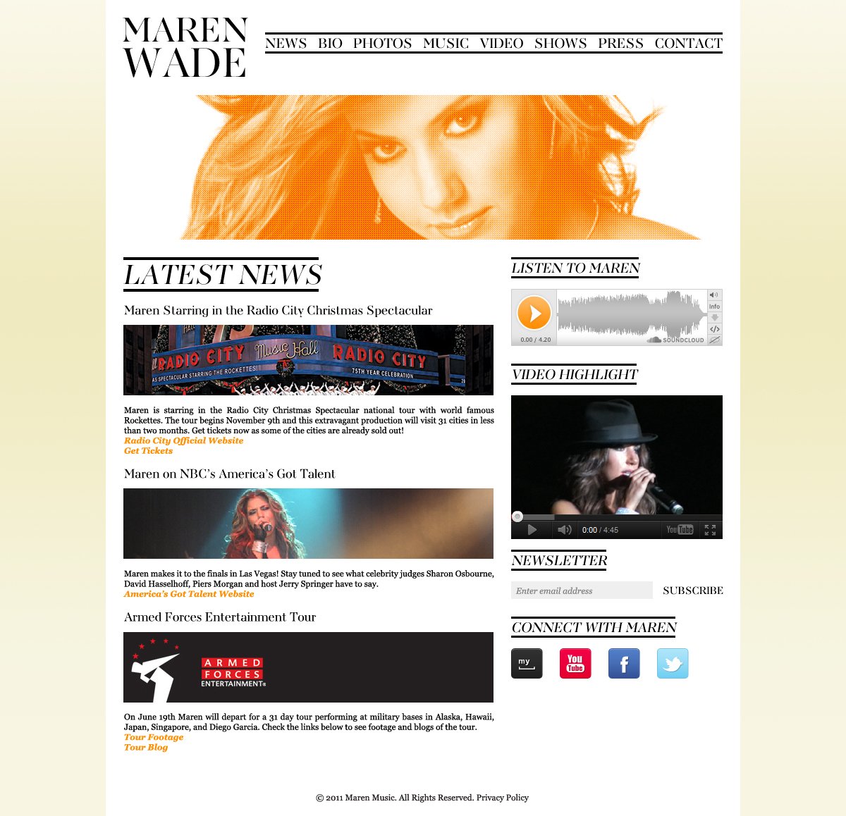
Green arrowsyou liked are back in header. Headline visibility improved (please refer to my PM about "THE" ) Navigation text changed as you asked, as consultation time from 25 to 30 minutes. Left side changed to features you'll provide with learn more button. Added button to "how much money..." i know u asked for testimonials first, but this looks better, keeps better visual identity and visibility, i felt like it's more important to have button right after introduction, it increases changes for people to click on it after good introduction. Success rate graphics changed to pie. Testimonials added below the button, along with "Read More" button. I know u asked for bigger footer, but since I had to increase height of white area, I have put "exlusive video" on the left side, with nice contrast from the letter and features, so it's clear and visible. Background changed, hope you'll like this one, one has black letters, and other white letters
Browse other entries from this Web Design Contest
Browse other Web Design Contest
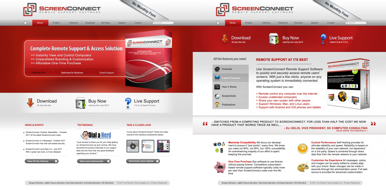
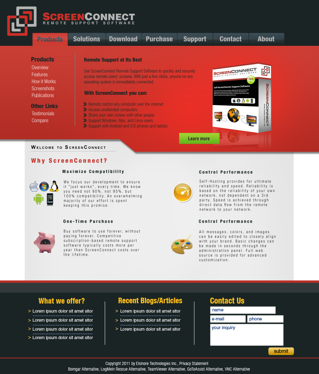
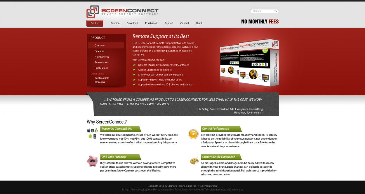
Web Design Contest: ScreenConnect
Software company needs new website
$500.00 Prize
79 ENTRIES
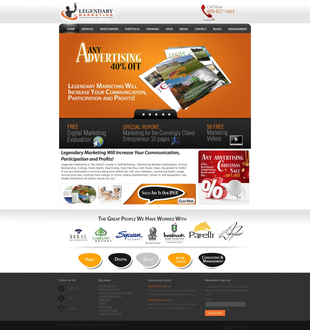

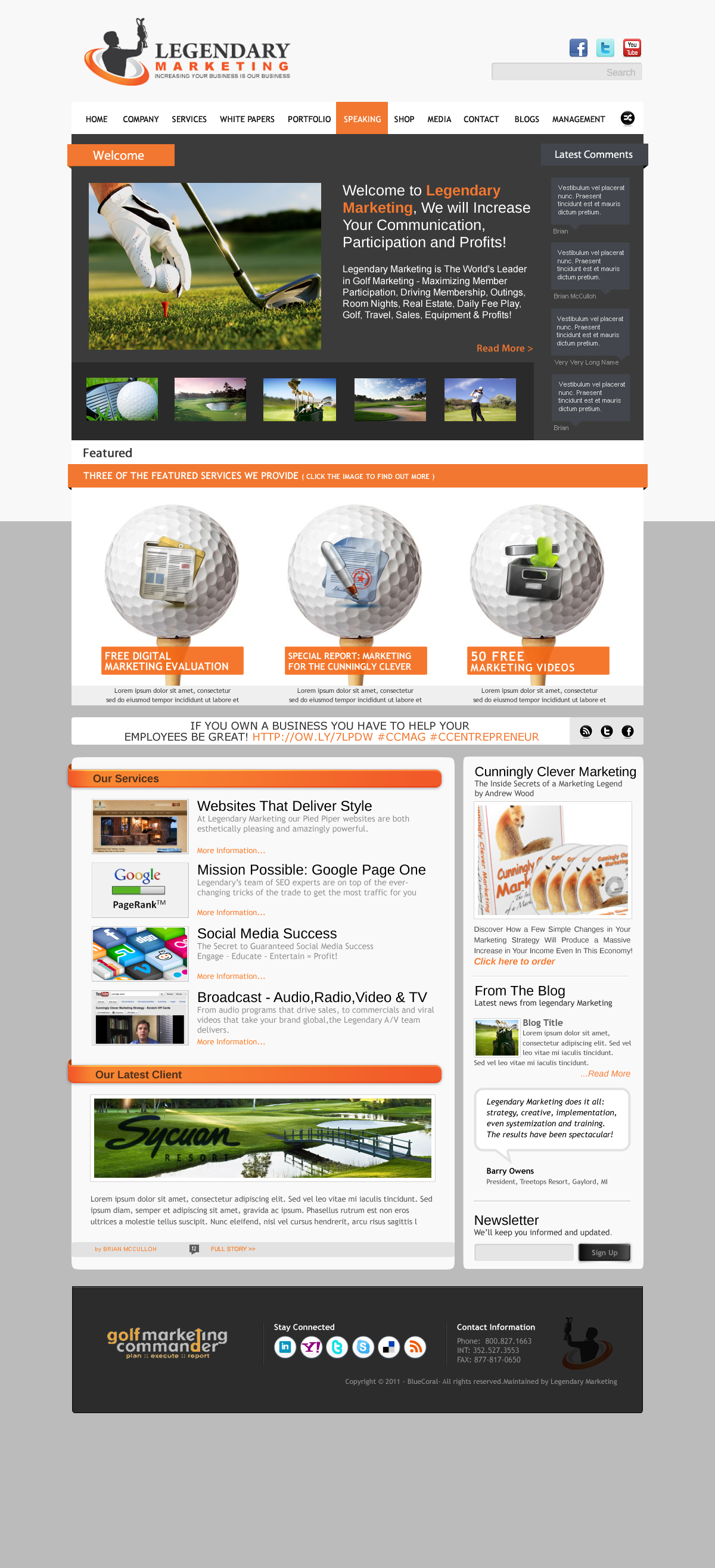
Web Design Contest: WWW.Legendarymarketing.com
website and 2nd page for ad agency
$300.00 Prize
34 ENTRIES
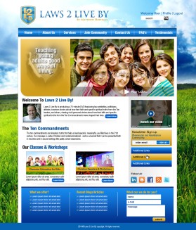
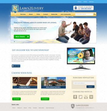

Web Design Contest: Laws2LiveBy.org
To find a unique website design idea.
$350.00 Prize
41 ENTRIES

Fast. Awesome. Affordable
About the Creative
3
3
6
Other entries by astraldemon:
Similar Entries