
Midwest Hose
by mwhryanContest received 8 entries and the contest holder has awarded a winner.
- BACK TO CONTEST ENTRIES
- CREATIVE BRIEF
- ALL ENTRIES
Company or website name
Midwest Hose
Links to the website
www.midwesthose.com
Describe your company and organization and target audience
We are one of the largest manufacturers of hose assemblies. We sell to businesses and the public. We're proud of our logo which has a fitting on one side and a flange on the other.
The design should have the following
1. I like this design http://austinhose.com/
It reminds me of http://marketing.spirit.com/how-to-fly-spirit-airlines/en/ which I like how it splits up the page as you scroll down.
2. a competitor of ours, their website looks good http://jgbhose.com/ and I like the clean organization.
3. I like the color scheme - it's similar to our colors https://www.apache-inc.com/
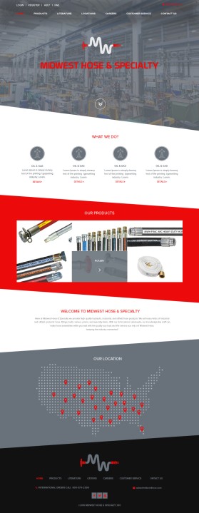
4. here is our current webpage http://www.midwesthose.com/ it just seems really plain. We have great catalogs with TONS of info on every page. Go to literature section to see our catalogs. We want to stop printing catalogs and give the webpage the same feel which means filling the pages with lots of info.
5. http://www.wrshose.com/products.html shows tons of product in sections just like I want to show on our site.
6. I imagine keeping the picture scroll somewhere on many pages tied to each product line but it doesn't have to be the main thing on each page. The main page should have it but then once I get to product pages it should show information about the items and the option to look at a picture scroll.
7. include corporate headquarters phone number
8. include customer service hours and chat like this website http://www.powermovingforward.com/
9. https://medium.com/@erikdkennedy/7-rules-for-creating-gorgeous-ui-part-1-559d4e805cda#.9nw56lz5y I especially like the color last rule and spacing
Phrase We Use
Keeping the Industry Connected