

- BACK TO CONTEST
- CREATIVE BRIEF
- ENTRY # 710148
Comments for entry # 710148
Hi, Thanks for your reply. If the changes are easy, and you are able, please do them. If the final design is not submitted prior to the deadline, I will not choose your design. I have several other designs which are completed. If you'd like to be considered for the final design, please make the updates and re-submit. Thank you.
Hi, Thanks for letting me know. To be honest, though, I'm not comfortable doing that. I understand you're moving, so if you can't participate further, I will understanding. But I would like to have everything done before I choose a winner. Thank you, Tristan.
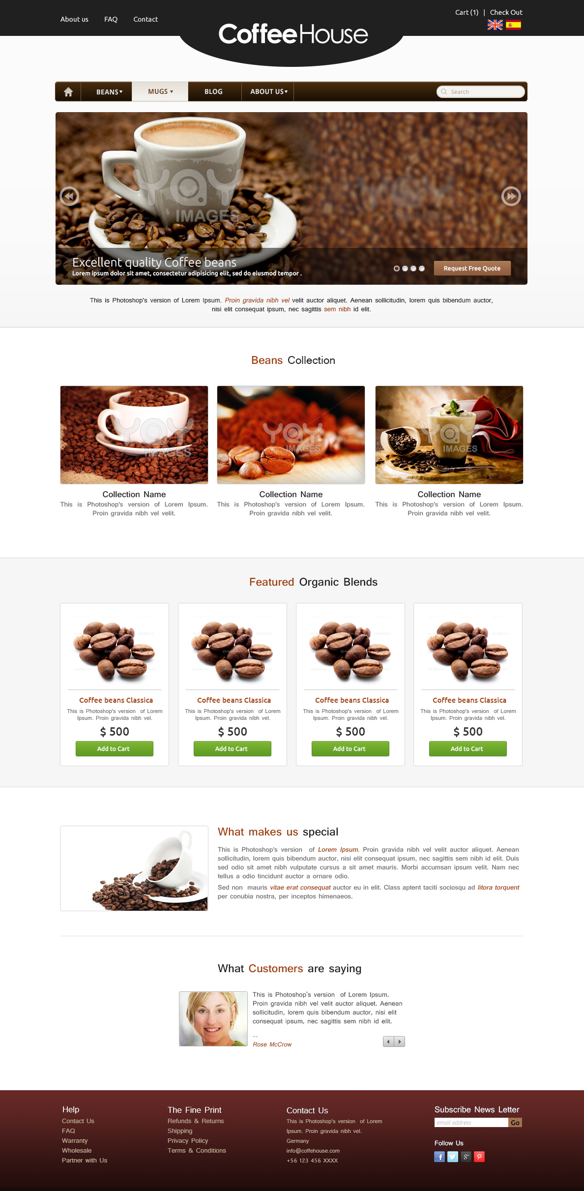
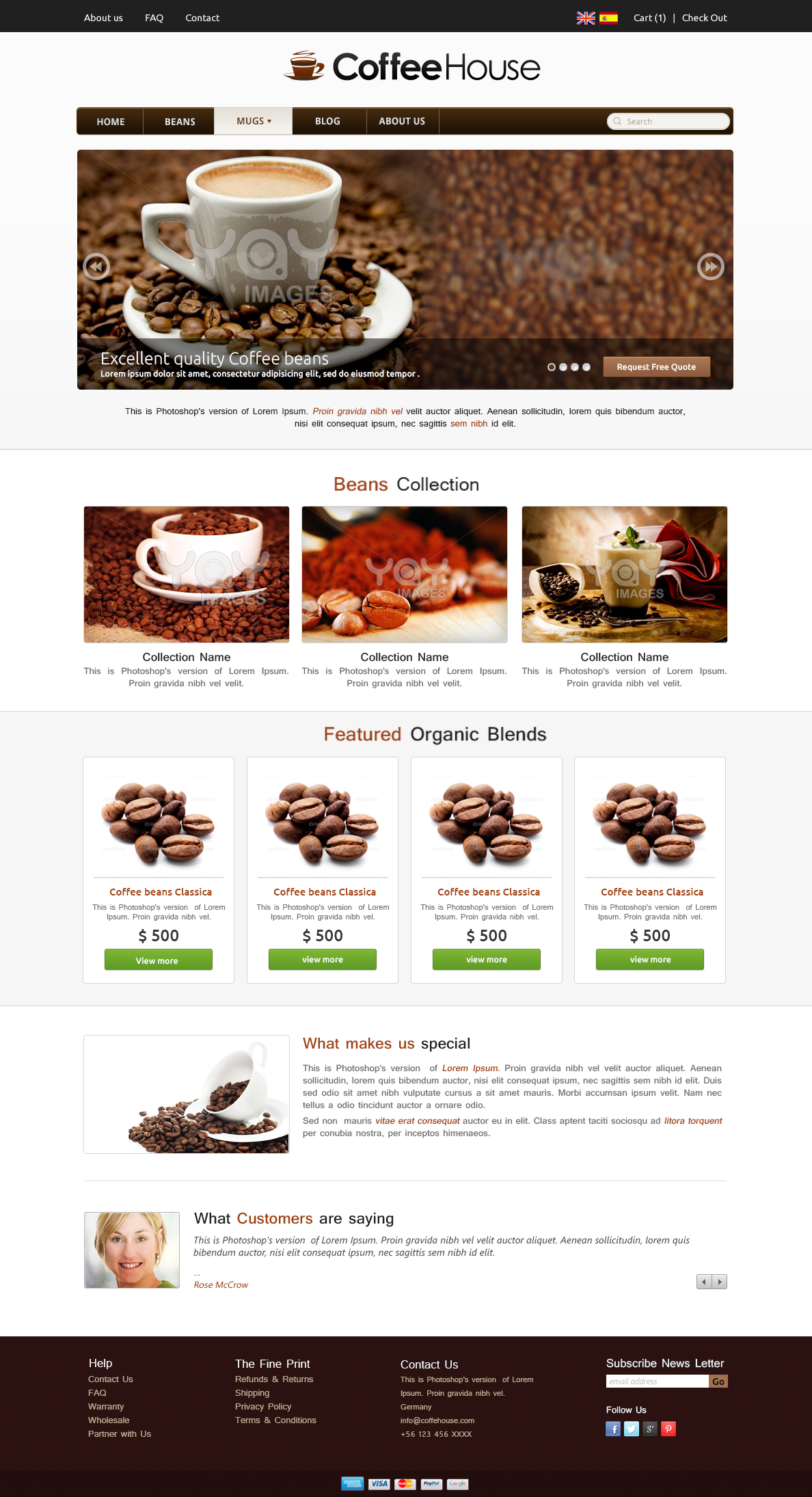
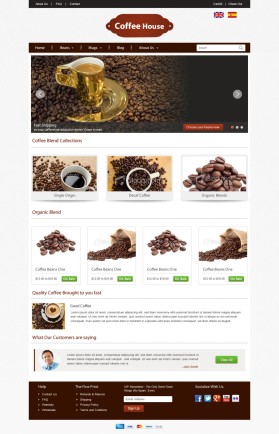
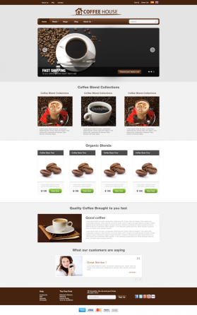
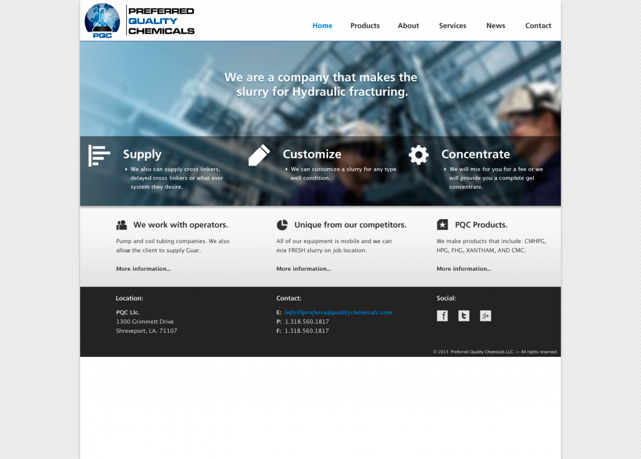
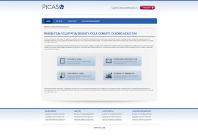
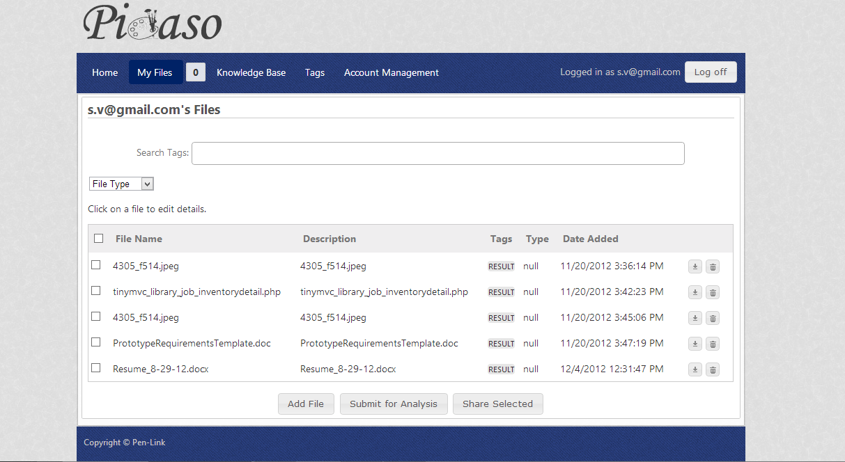
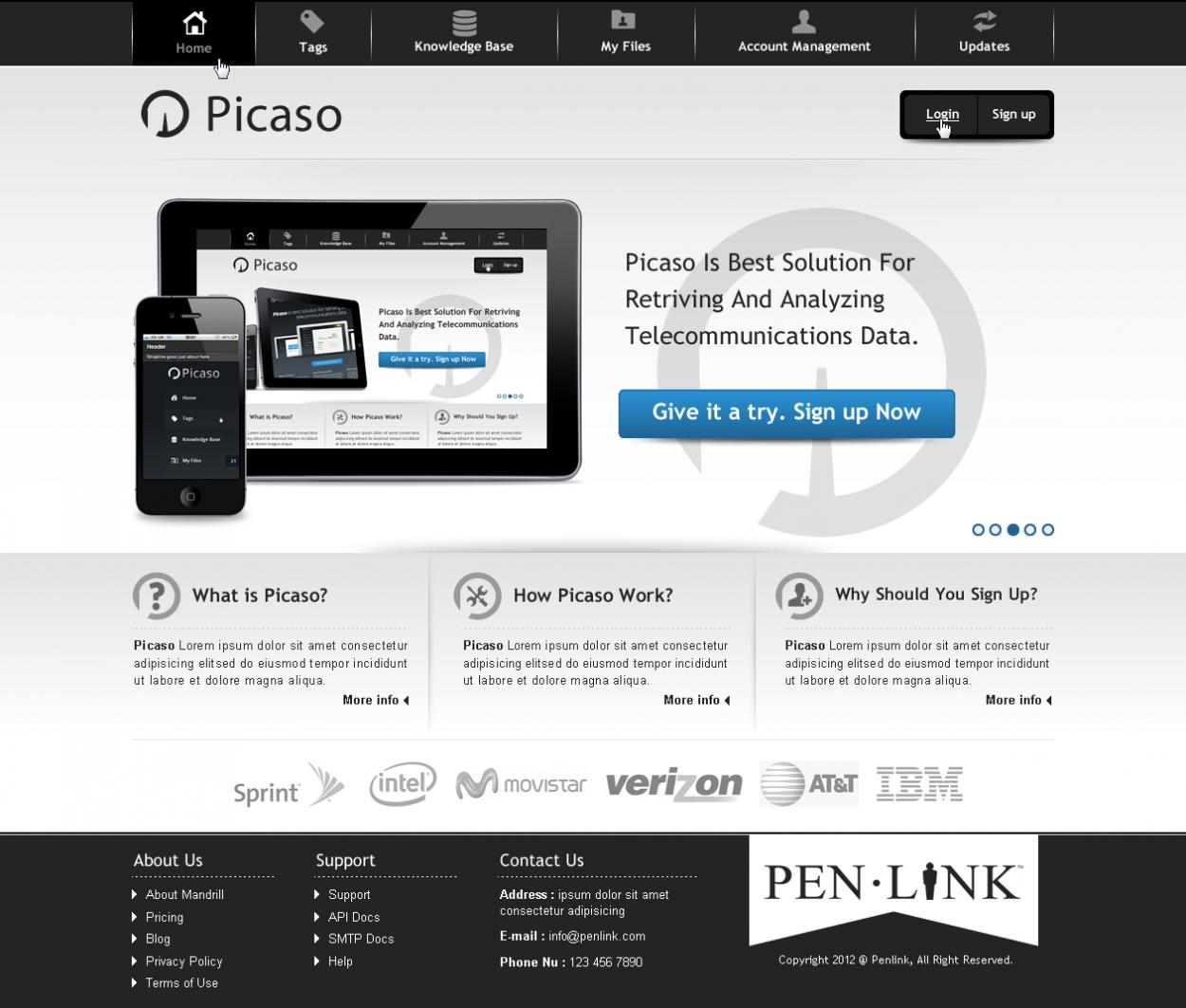
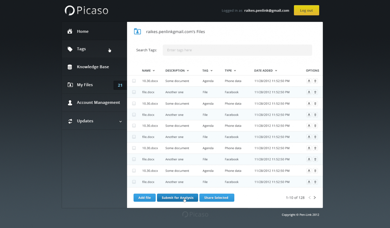
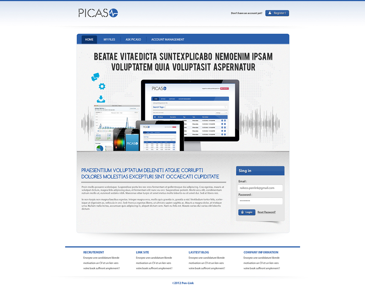
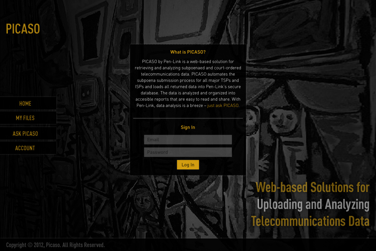
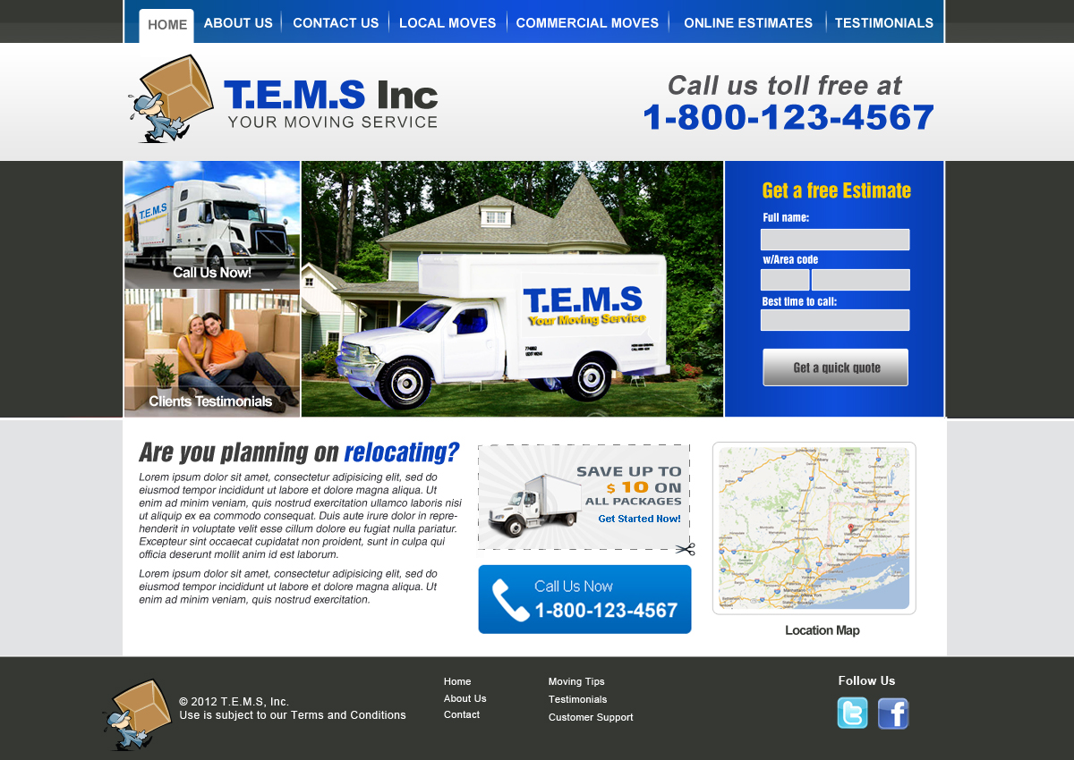
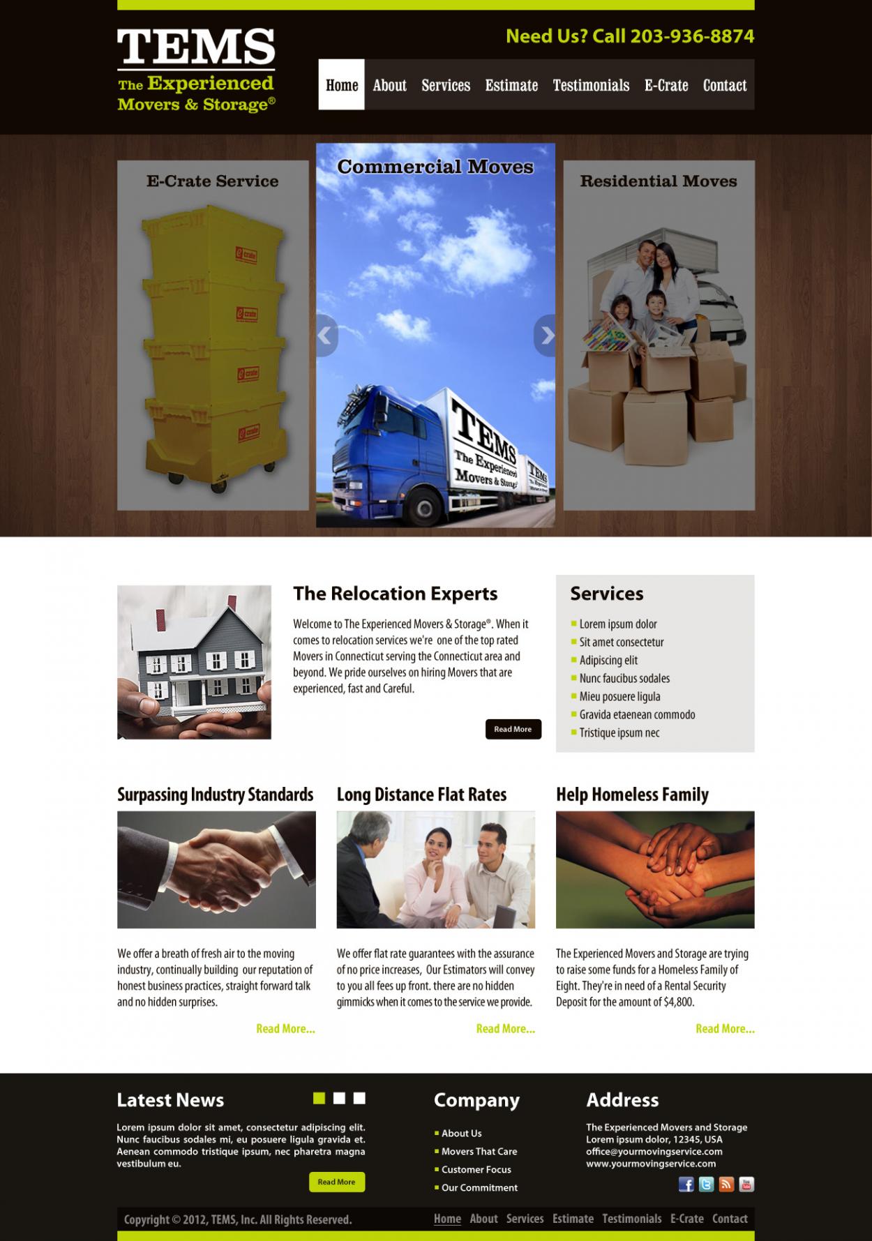
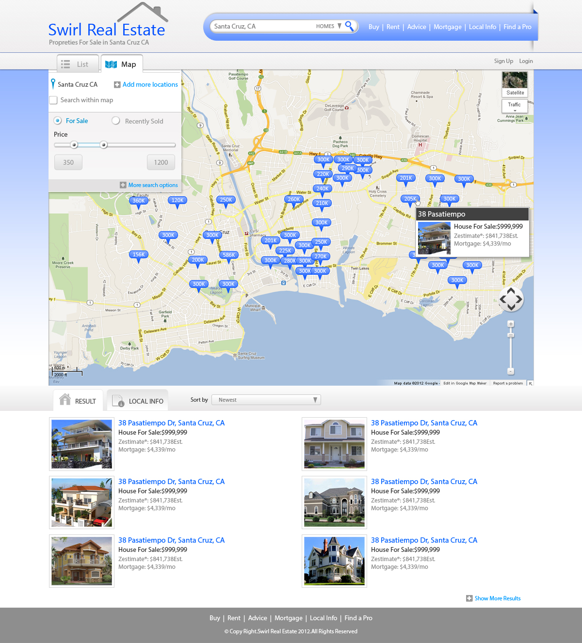
Hi there, Thanks very much for your submission. It's a nice prospect. Let me provide some feedback below. Things I like: I like the fonts, the colour scheme, and the design is very clean. The shading on the menu bar is also nice, and I like the formatting on the hero slider. I also really like how the sections are vertically coloured: slider, white, grey, white. Great images too. Things I didn't like so much: There's a bit too much spacing for my liking, which pushes other areas down the page. For example, above and beneath "Beans Collection" and each of "Collection Name" sections, there could be half that spacing or less. Also, the logo looks good but won't work for my design. As it's part of the top bar (black). I need the logo to be independent of the top bar. I actually really like the logo / font itself, it just won't work for me in that shape as it needs to 'stand apart' from the header bar. Also, I can't add to cart from the homepage, so the buttons would need to say something like "View >" instead. Lastly, I need the testimonial section to be full-width, the same as the other elements. May I request a revision with the following? Here's a visual illustration of the changes I'd love to see > https://www.dropbox.com/s/rtz6r48ufpp2zv6/Revision%20Request%20-%20%23710148.png Here's the brief: - Please reduce the padding above and below the links in the top bar to about half of what's there now. Also at the top/bottom of each section, please reduce the padding (above & below Beans Collection, above & below Featured Organic Blends, above What makes us special, above What Customers are saying) - Please make the logo stand apart by itself. It would be great if you can take it out of the top bar, and just place it between the top bar and nav menu, as black text on the light-grey background. Same font/style, just black text (same colour as top bar). - Please replace the home icon with the word "Home". The house looks cool, but I can't use that on my system - only text. - Please change "Add to cart" to "View" instead. - In the footer, I need to keep the same structure as I currently have. Would you mind swapping the elements around to keep the same as what's in my mockup? Also, please remove the gradient and have it as one single colour, the darkest brown in the gradient. - Please make the testimonial section the same width as the other elements Thank you so much for your submission and help.
Browse other entries from this Web Design Contest
Browse other Web Design Contest
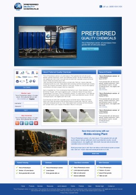
Web Design Contest: Preferred Quality Chemicals, LLC
Web design for oilfield chemical company
$500.00 Prize
45 ENTRIES
Web Design Contest: Pen-Link, Ltd.
Help us design a website for law enforce
$300.00 Prize
36 ENTRIES

Web Design Contest: yourmovingservice.com
looking for professional modern website
$400.00 Prize
34 ENTRIES
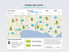
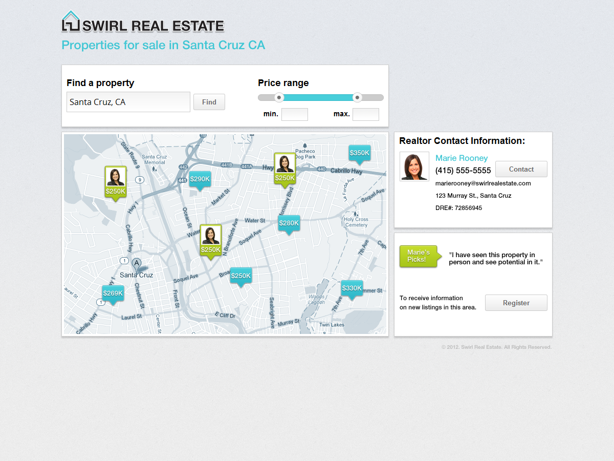
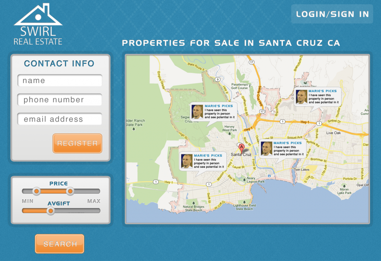
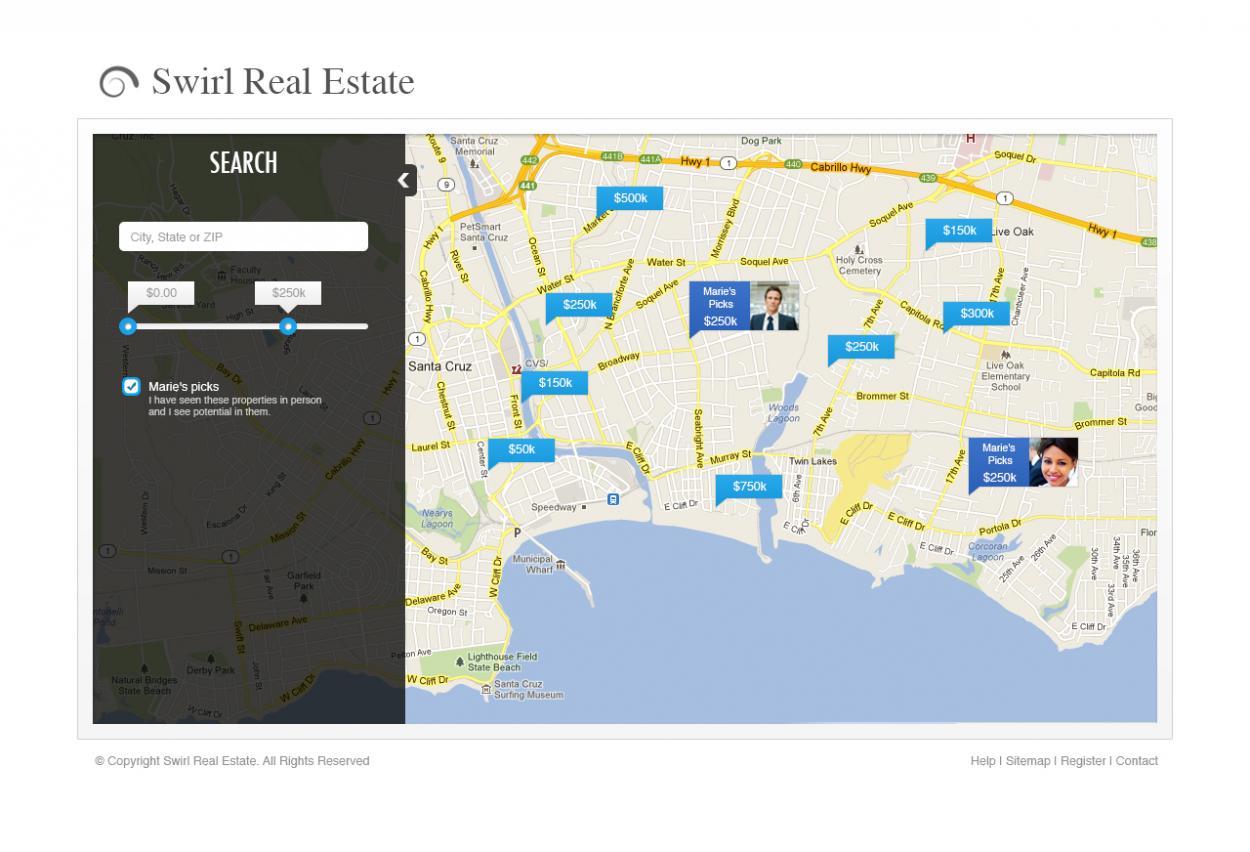
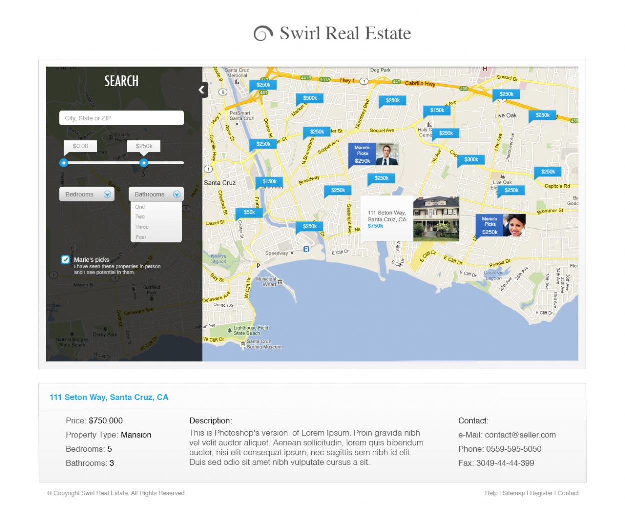
Web Design Contest: Real Estate in Santa Cruz CA
Real estate landing / search page
$200.00 Prize
67 ENTRIES

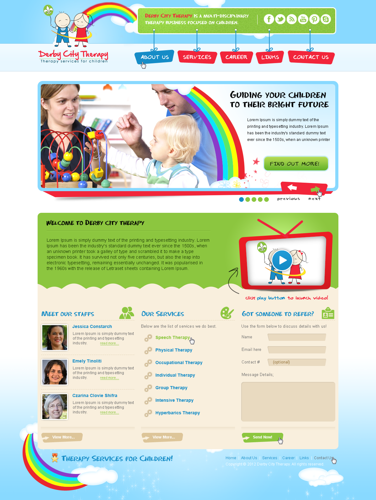
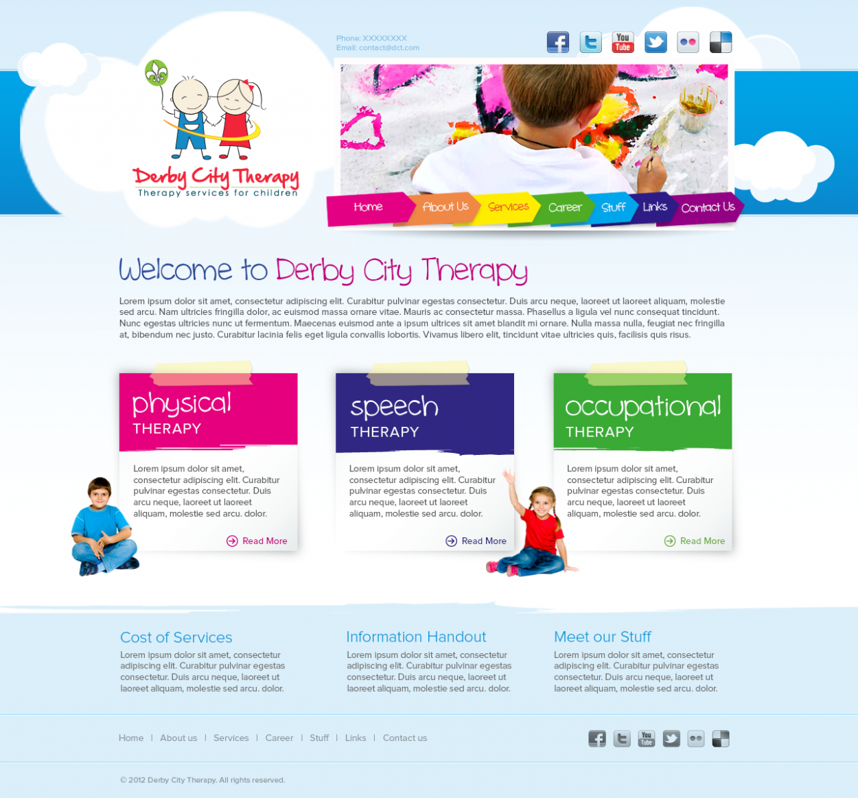
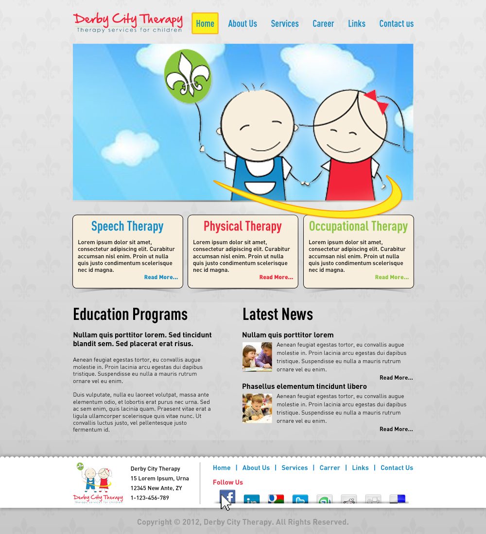
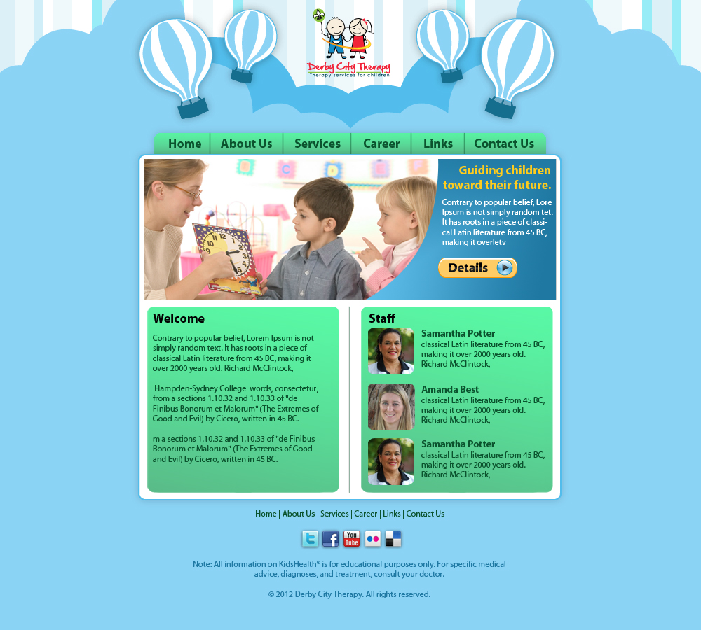
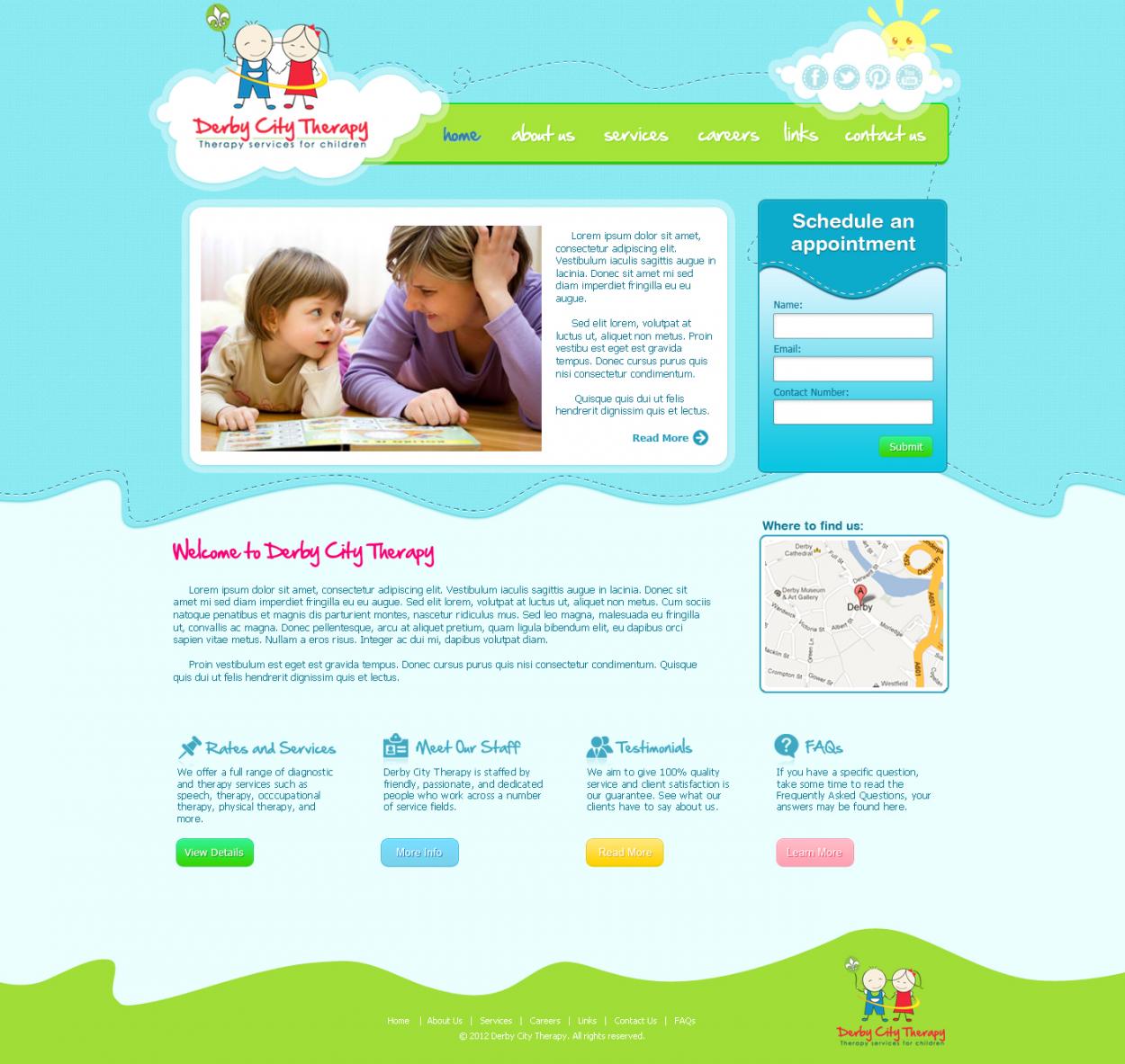
Web Design Contest: A speech therapy services website
Speech therapy service provider website
$250.00 Prize
32 ENTRIES

Fast. Awesome. Affordable
About the Creative
15
15
42
Other entries by wirepaper:
Similar Entries