
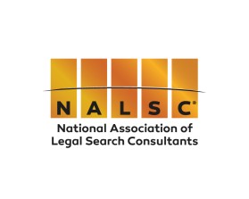
NALSC®
by Stephanie AnkusContest received 159 entries and the contest holder has awarded a winner.
- BACK TO CONTEST ENTRIES
- CREATIVE BRIEF
- ALL ENTRIES
Company or website name
NALSC®
Slogan or Tagline
National Association of Legal Search Consultants
Describe your company and organization and target audience
NALSC® (National Association of Legal Search Consultants) is the national professional organization for the legal search profession and is committed to upholding the highest ethical standards in the field by requiring adherence of its members to the NALSC Code of Ethics®.
NALSC currently is comprised of 160 member firms and individuals from all over the United States and Canada, as well as other international locations. An increasing number of legal employers incorporate a clause requiring adherence to the NALSC Code of Ethics® in their recruitment contracts.
In addition to maintaining a strong Code of Ethics, NALSC is dedicated to:
- Enhancing the image of the legal search profession through national public relations
- Providing education and information on trends and issues in the marketplace
- Monitoring and responding to legislative and regulatory activity that may impact the legal search profession
The target audience would be legal recruiters, law firms, lawyers and corporations.
Our website is currently in the process of being modernized and redesigned so we wanted a new logo as well!
The design should have the following
The logo should be bright and eye-appealing but still fairly conservative with the acronym "NALSC" above the words "National Association of Legal Search Consultants" preferably on two lines so they are easy to read when the logo is shrunken. Also, the logo could have lines above "NALSC," below "NALSC" and at the bottom. The attached is an example which needs to be modernized in a new logo. The trademark registered symbol at the end of the acronym "NALSC®" should be superscripted (this text box is not allowing me to superscript it- but it should be). We currently have 2 logos that we use (but only need one for the future). One logo has been gold and black representing a critical element of our "gold standard" branding. However, the current gold color seems too dull and should be brighter and more metallic-looking. In addition, our other logo has been simply black and white. The tag line has been important in both but difficult to read especially when the logo is shrunken in print, etc. General organization colors have been royal blue and white.
Our website is currently in the process of being modernized and redesigned so we wanted a new logo as well!
This logo will be used for
- Online (Website, facebook etc.)
- Print (business cards, letterheads, brochures etc.)
- Merchandise (mugs, t-shirts etc.)
- Signs (including shops, billboards etc.)
What style of logo would you like?
Colors to use in the design
The logo should be bright and eye-appealing but still fairly conservative.
We currently have 2 logos that we use (but only need one for the future). One logo has been gold and black representing a critical element of our "gold standard" branding. However, the current gold color seems too dull and should be brighter and more metallic-looking. In addition, our other logo has been simply black and white.
We want the logo to be visually interesting and the use of color and design is a perfect way to accomplish this.
Our website is currently in the process of being modernized and redesigned so we wanted a new logo as well!
General organization colors have been royal blue and white.
Briefly describe your contest
Seeking a fairly conservative corporate logo to be visually interesting via the use of color and design.