
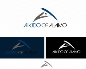
Aikido of Alamo
by aikidoofalamoContest received 170 entries and the contest holder has awarded a winner.
- BACK TO CONTEST ENTRIES
- CREATIVE BRIEF
- ALL ENTRIES
Company or website name
Aikido of Alamo
Slogan or Tagline
No
Describe your company and organization and target audience
Aikido of Alamo is a school based in Northern California offering lessons in the Japanese martial art of Aikido. Aikido is a way of defending yourself without trying to hurt the person attacking you. It originated in Japan in the 1920s and is based around a spiral form where the attacker and defender connect. It involves throws, rolls and falls as opposed to strikes and kicks in Karate and other martial arts. The target audience is male and female students aged 35 and older who have an interest in not just a martial art, but learning the philosophical aspects of a traditional art.
The design should have the following
Here are a list of things that may be useful to take into account for the logo: - All the core movements in Aikido are based around three shapes - a circle, square and triangle - The original teachings of Aikido relate the circle to a stalk of bamboo, the triangle to a three-pointed cluster of pine needles, and the square to a Japanese plum blossom. - The spiral is a key of the martial art as a unifying form - Aikido is about non-aggression. It doesn't have strikes or kicks like Karate. It is about blending with the attacker rather than taking them head-on - Japan is the spiritual home of Aikido - elements that reflect Japanese culture might be useful - The dojo is located in a suburban area of Northern California full of trees and underneath Mt Diablo which has a unique shape (google it and you'll see). The building the dojo is housed in has a clocktower - maybe this could be incorporated - Simplicity is important. Not looking for a overly complex logo. Something striking and memorable would be great, but that stands out. The school is premise-based rather than rote-learning movements. Students are encouraged to find their own way rather than being told specifically how to move and attack / defend. - Incorporating the words "Aikido of Alamo" in the logo would be fine if it looks good and is done well. - Here are some keywords to think about to generate some ideas: blending, spiral, Japan, bamboo, sakura, pine needles, tradition, non-violence, love, Mt Diablo, Northern California, mature, community, calm, coffee We would like the following logo treatments from the finalists: - Letterhead, brochure layout, business card, T-Shirt, Basic website logo usage (e.g. logo positioning, colors, treatment, table layout), color pallette
This logo will be used for
- Online (Website, facebook etc.)
- Print (business cards, letterheads, brochures etc.)
- Merchandise (mugs, t-shirts etc.)
This design should not have this in the entries
Don't want: - Something overly stylized or complex - Anything that incorporates Mt Diablo too obviously as there is another dojo in the area called "Diablo Aikido" - Not particularly enamored by the use of the Japanese characters for Aikido in the logo, however if they are artfully incorporated this wouldn't be a key issue - Don't particularly like the circular brushstroke (Enso - http://en.wikipedia.org/wiki/Ens%C5%8D) that is commonly used for martial arts schools
What style of logo would you like?
Colors to use in the design
Black, Grey, Blue, White
Briefly describe your contest
Japanese martial arts school logo