
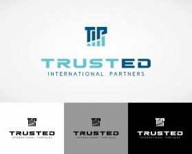
Trusted International Partners
by shomarihines86Contest received 226 entries and the contest holder has awarded a winner.
- BACK TO CONTEST ENTRIES
- CREATIVE BRIEF
- ALL ENTRIES
Company or website name
Trusted International Partners
Describe your company and organization and target audience
Help businesses establish trust and a global presence through effective branding and marketing strategies.
The design should have the following
Overall Design Considerations
- Target Audience: Small to medium-sized business owners seeking trustworthy, results-oriented marketing and branding guidance.
- Style: Professional, modern, approachable, and instantly recognizable.
- Color Palette: Primarily Navy Blue (trust, authority), Teal (global, fresh), Golden Yellow (optimism, value). Use these strategically, with potential for lighter shades of blue/teal.
- Fonts: Sans-serif fonts with excellent legibility. Open Sans, Lato, and Raleway are great starting points. Experiment with weights for a bolder impact.
1. The Connected Globe
- Icon: A stylized globe. Include arcing lines symbolizing international reach or supportive hands encircling the globe.
- Color: Teal globe, accented by Navy Blue lines or hands. Consider Golden Yellow accents on specific continents or connections.
- Text: "Trusted International Partners” in Open Sans or Raleway, Navy Blue. Play with the placement (e.g., below, around the globe, or creatively incorporated).
2. The Growth Arrow
- Icon: A prominent, upward-pointing arrow with smaller, segmented arrows merging into it.
- Color: Gradient from Navy Blue at the base to Golden Yellow at the peak. Smaller arrows in varying shades of Teal.
- Text: "Trusted International Partners” in Lato, Navy Blue. Emphasize the company name with a bolder weight. Optional tagline in a lighter font weight.
3. The Interlocking T.I.P.
Icon: Create stylized, interlocking versions of the initials "T," "I," and "P" that form a visually cohesive, secure-looking unit.
- Color: Primarily Navy Blue and Teal, with subtle Golden Yellow accents highlighting the connections between the initials.
- Text: "Trusted International Partners” in Raleway, Navy Blue. Slightly emphasize the initials for clarity.
4. The Guiding Lighthouse
- Icon: A stylized lighthouse silhouette. Include a powerful beam that extends outwards.
- Color: Navy Blue lighthouse, powerful Teal beam. Golden Yellow for accent details (e.g., windows, optional water).
- Text: "Trusted International Partners" in Open Sans, Navy Blue. Consider a slightly italicized font for a touch of dynamism.
This logo will be used for
- Online (Website, facebook etc.)
This design should not have this in the entries
Color Palette
- Avoid: Neon or overly bright colors that might appear unprofessional. Stay clear of using red, which can associate with danger or urgency, unless carefully balanced with other colors.
Fonts:
- Avoid: Script fonts that are difficult to read, decorative fonts that might clash with the logo, or overused fonts like Times New Roman or Comic Sans MS.
What style of logo would you like?
Colors to use in the design
Color Palette
- Navy Blue: Projects trust, professionalism, and authority
- Teal: Modernity, open-mindedness, global connection
- Golden Yellow: Warmth, optimism, and value
- Use: Stick to the proposed primary colors of Navy Blue (reliable, professional), Teal (modern, international), and Golden Yellow (warm, optimistic). Consider variations like a lighter blue or a muted teal for secondary accents.
Fonts:
- Use: Consider modern, clean fonts that are easy to read across various sizes. Sans-serif fonts like Open Sans, Raleway, or Lato can be good options.
Types of files I need for this design
- .EPS
- .SVG
- .PNG
- .GIF
- .PSD
Briefly describe your contest
I honestly would like you all to take the notes and ideas as a base and not a strict guideline. I do want to stick with the colors and fonts but please lean on your expertise and take my notes into consideration but not a strict guideline.. I like the idea of using the initials since the name is so long.